When you are designing a brand logo, you want to create a logo that can easily be remembered. When judging print, you want everything within tight tolerances, to preserve that unique brand color. But our color memory seems to think quite different about unique colors…
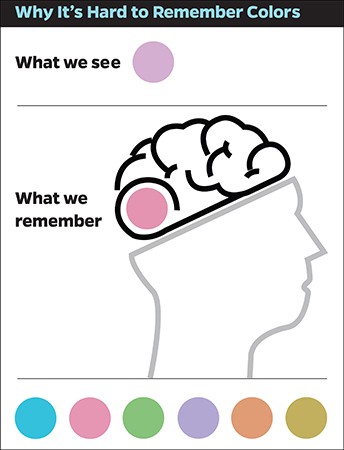
Color is something very complex and there still is a lot about color and color perception that we don’t understand. E.g. this study from 2015 from researchers at the Johns Hopkins University: they did a study on color memory. And what they found is quite interesting: although we can distinguish between millions of colors, our brain will generalize any color to the ‘best’ versions of a limited set of basic colors.
Take e.g. the difference between azure, navy, cobalt and ultramarine blue (or in terms more familiar to designers, printers: Pantone Reflex Blue and Blue 072). When you see them, certainly when shown together, you can easily tell them apart. But your memory will label all of them as ‘blue’…

A practical example is paint. If you need to touch up your living room wall, you know what color it is. Until the moment you arrive in the store and see all those different variations of that color, then your memory will completely fail on you.
Another example: in the past I’ve collected packages of Kellogg’s Special K, for educational reasons. When shown apart, you would recognize the red brand color on each package as the Special K brand. But when shown together, there were obvious differences between them. So when comparing colors next to each other, we are much more critical then when comparing a printed color to a memory color.
Why is this important?
Well, for two reasons.
First: if you are designing a logo, you want to create something that can easily be remembered. So you have to choose a color that can be easily remembered. Colors that are in between the basic colors are more difficult to remember correctly. So that slight ‘twist’ that you want to put into a brand color, might not have the effect you would like it to have…
Second: when checking a print job on color, small deviations in color just don’t matter! People will catalog the printed brand color into the right, quite broad, category. And therefor see it as the ‘right’ brand color. Only when print products are placed exactly on top of each other, think wall covering and floor covering, small deviations matter. When there is some space between two printed products, think packages on a shelf, deviances are becoming less visible. The bigger the space, the more difficult it becomes to see differences. And even if you can see tiny differences, your memory will recognize it as the right brand color…
You can find the original research paper here.
PS: in case you are a brand owner or designer, you might be interested in my article on brand colors and printing in CMYK and in the color management tutorial for brand owners and designers.
UPDATE 11/08/2017: I’ve published a new article titled “The uncertainty principle of visual color evaluations‘, which relates to this article.
UPDATE 07/11/2017: In case you want to check your own color memory, try this short test!


This has been well known by printers for many decades. It is why, when a press operator is checking color against the proof and the job is a critical color match they will cut the press sheet through the important area and then lay it on the proof so that they are aligned. If the color appears the same across the proof/press sheet transition then they know they have a match. If the job is less color critical they will simply look at the the match and switch back and forth viewing and comparing the whole proof to the whole press sheet.
Thanks for your comment Gordon. But I think you are missing my point: should we care so much about small deviations in print and put so much effort in very tight tolerances if in real life people (consumers) can’t even remember if the logo of a brand is Pantone Reflex Blue or Blue 072? It’s just ‘blue’ in their memory.
Print buyers should be aware of this. That’s why I’m sharing – and promoting – this study. If print buyers would understand this and act accordingly, life of printers would be a lot easier… And the print user: he wouldn’t notice any difference. The brand logo would still be ‘blue’.
Hi Eddy, I’m not sure that your point about small deviations holds true in today’s packaging environment, when the same package is sourced from multiple different suppliers, the same supplier with multiple sites, or has different components… then the colour deviations which individually seem small, inevitably can end up on shelf next to each other and then those differences become very very visible indeed.
Hi Raf, thanks for your comment. The packaging industry is indeed something special, where a brand color is reproduced over and over again.
But first: what are ‘small’ deviations? Let’s say delta E76 around 2? Would this impact the buying decision of a customer? Would he/she even see it when rushing down the aisle to do his/her shopping? It seems that it takes 8 seconds or less before we make a buying decision (according to some studies). That’s a short time to evaluate small color differences.
And even more: the packages (let’s say cardboard boxes) are not perfectly aligned, which means that the light will fall slightly different on them, probably altering the color perception a bit… maybe even altering the color perception more than the color deviations within one production run, between different production sites.
My point: the printing & packaging industry, print buyers should be more realistic when it comes to the reproduction of their brand colors. A grocery store is not a standardized environment. Shopping is a very different activity compared to quality control and deliberately searching for color differences (to get a discount).
That.s the reason why we employe the DeltaE 2000 in packaging industry , including acceptance variation depending of the Lch axes