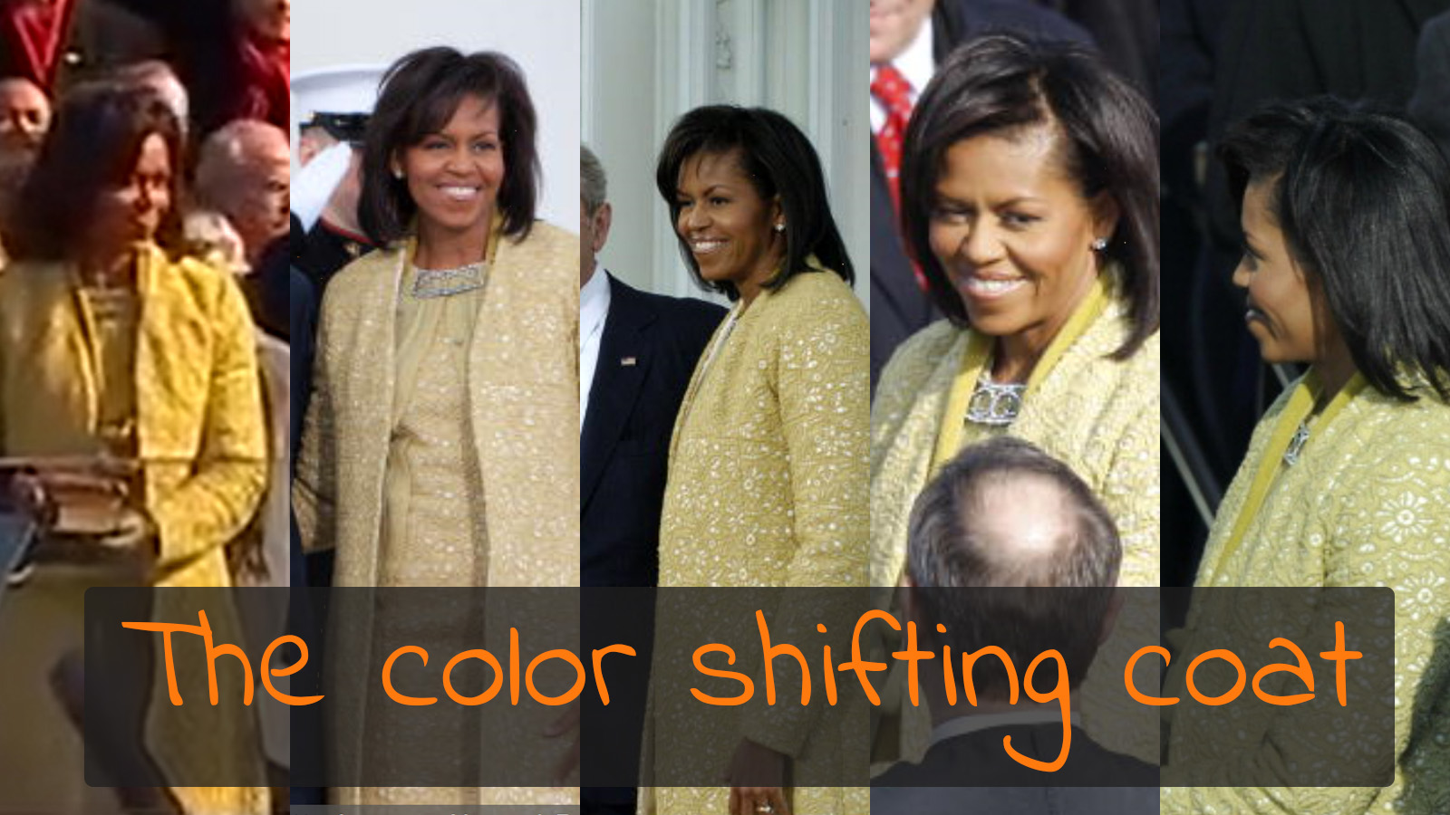
Do you remember the first inauguration of Barack Obama as president? It seems like ages ago, but I clearly remember one detail: Michelle Obama’s coat. And more specifically: the color of her coat. When watching the journal on TV I saw a dress that looked a kind of gold to me. But when I picked up my newspaper in the morning, it had changed into green… What happened?
CONTENTS: So what happened here? | There is a solution… | Why is this important? | Updates
In case you don’t remember, let’s first look at the video of the inauguration. This is the color I remember from the TV journal: gold.
And below is a slideshow with 4 pictures. The first two were taken at the same moment. The second two also. The last one appeared on the cover of my newspaper
So what happened here?
Well, color is something complex. In certain conditions changes in the light source can cause a color shift, I once bougth a pair of pants that looked brown in the shop but looked green everywhere else. But that’s not the case here. Differences in post-processing are probably not the cause either: in photojournalism speed is key, they don’t ‘waste’ time on color correction. This color shift is caused by the cameras used…
We usually don’t think about it, but cameras aren’t 100% accurate at capturing colors. You may have noticed that different brands of cameras have different colors renderings. But this does not only differ between brands, even different models of the same brand can have a different color rendering.
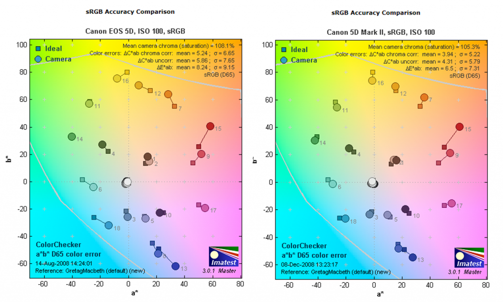
How a camera records colors can be tested, Imatest is widely used for this purpose. And camera review sites use this software to test and compare cameras. One of them is Imaging Recourse. And these test results show what happened to Michele Obama’s coat…
The day after the inauguration, I was looking through the photos that were published on Getty Images. At that time, Getty Images published some metadata from the picture, including the camera model. And I soon saw there was a difference between the pictures from the Canon 5D and the Canon 5D Mk II, both were very popular with photo journalists at that time.
So I went to the Imaging Resource website to check their tests. And the graphs from the Imatest did show a color shift in the 5D, where yellow shifted a bit towards green. Fortunately I made a screenshot and saved the pictures in a special place: now they show different graphs… No idea what happened, maybe something went wrong with the redesign they did.
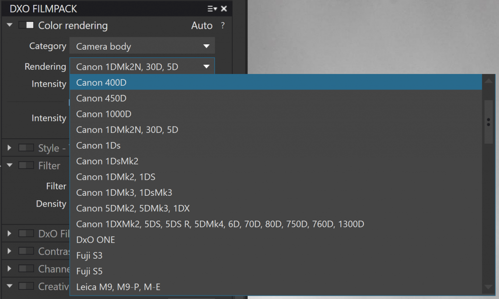
The differences between cameras can also be seen in some image processing software. My favorite RAW conversion tool, DxO OpticsPro with the DxO FilmPack option, has the feature to simulate different cameras.
There is a solution…
So we know that cameras are not perfect, but what can you do if accurate color reproduction is important, maybe even mandatory. Think e.g. product shots, especially clothing and similar things. There you can’t afford to have colors drifting off to a different hue. Marketing and selling cloths depends on accurate color reproduction.
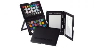
What you should do, is use a tool like X-Rite ColorChecker. One of the products in the ColorChecker range is the Passport Photo. One side of it has 24 test targets. Based on a picture of the test target, the software that goes with it can calculate a camera and situation specific profile, which later can be used to tweak all pictures taken with that camera and that specific lighting. It kind of ‘warps’ the colors recorded by the camera into the ‘correct’ colors. BTW: if you are not really familiar with color management take a look at my article ‘Color management, explained for designers and brand owners’.
Please note that a different lighting, direct sunlight vs cloudy, will change the camera profile generated with the ColorChecker. Which means it is more difficult to use the ColorChecker outside than in a studio environment.
Below is a short tutorial that explains the process. And a review can be found at Luminous Landscape.
Please note that ColorChecker is not only available for photos, it can also be used for video.
Why is this important?
If color accuracy is very important to you, you will need to take extra steps. The standard workflow will not provide the results you are aiming for. E.g. in product shots this extra accuracy might be needed, certainly for fashion. The tools are available, but you – or your photographer, videographer – need to know them, need to use them. Otherwise, gold might turn into green…
PS: in case you couldn’t really remember the exact color of her coat, don’t worry: our color memory is really bad… BTW: can you remember Coca-Cola red correctly and pick it from 6 variations of red? Do the test!
UPDATE 26/02/2017: here is another nice, well documented article on color shifts in cameras.
UPDATE 07/11/2018: Tony Northrup did an interesting test, with four different cameras shooting the same scene. He asked 1500 people to pick the ‘best’ picture. The results, and the setup of the test are really interesting! He also mentions a test from PDN where they checked the color accuracy of different digital cameras. Here’s the link.



Be the first to comment