There is only one first impression. As a company you want to be sure that you catch your potential customers attention during that first moment. But why, oh why, are vendors making really stupid mistakes when they launch new products, when they exhibit at trade show? Why, oh why do they keep sabotaging these events? Here are a few examples from the past few weeks…
CONTENTS: Trade shows: thou shalt excel! | Press release = last action | Why is this important?
Trade shows: thou shalt excel!
This month I’ve briefly visited two trade shows. First I went to Interpack in Düsseldorf (the same place as drupa, the same size as drupa) and then I went to Hamburg for FESPA 2017. One of the reason I wanted to visit Interpack, is that there were samples of Landa Nano… And I did see them, at the Edelman booth (one of their beta-customers, they should get their beta press by the end of this year).
There were a handful samples you could see (and touch). I looked at a label and a small package. I admit: I did use a loupe. First the good thing: the dots look very sharp, maybe even too sharp, but that might be a matter of taste. But the label clearly had a banding issue… And the package had a registration issue. The registration issue was smaller than some samples I saw last year at drupa (even without a loupe and from behind the rope protecting them I could see a registration problem at that time, now I only saw it with the loupe).
I just can’t understand this… They only had a handful of samples at the booth. These should be handpicked and checked upfront, to make sure that they don’t have any, really any defect. But that wasn’t the case with these Landa Nano samples… Why???
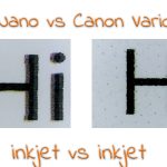
After visiting Interpack, I drove to Hamburg for the FESPA show. But also at that show, there were really bad examples… The picture below is what I saw standing in one of the isles, in front of the Ricoh booth. These are printed on an EFI printer that is also sold by Ricoh. And I just can’t figure out what the intention was. If the person who put them there believes that these are really nice examples of color consistency, he needs to have his eyes checked (women usually have better color sight, so it must have been a man). Looking at it, both from the perspective of a photographer and of a consultant in the printing industry, there is a very clear difference between both. This is not how you are going to convince printers to buy this kind of device!

If there was a logical explanation, it should have been printed on the samples! Otherwise it is very confusing. And even damaging the corporate image.
The last example from FESPA is not from me, but from a friend of mine, who always takes some t-shirts home. From the 3 t-shirts she got at different booths, only 1 survived the first encounter with the washing machine… And that’s such a shame. Yes, I know, t-shirts are rather expensive promotional material, but handing out ‘stuff’ that falls apart when you wash it, that doesn’t make a good impression, even if the print was excellent.
Press release = last action
Trade shows are not the only example how vendors sabotage their product launches. Last week Acer sent out a press release announcing a really interesting new tablet, the Iconia Tab 10. One that has a ‘quantum dot display’, which means that it could have a really wide gamut. Think AdobeRGB or even wider. That’s a toy that I, being a photographer, would like to see!
I read about it in a short article by Engadget. Since that information was rather limited, I immediately went to the Acer website. But, alas, no info there… I checked multiple regions and also the corporate website, but no more info than the press release… Even today, the Acer website only lists the older version (A3-A40).
This is not the first time that I see this: companies sending out press releases about new products and referring to the website for more information, while there is no information to be found on that website. I’ve really seen this numerous times… With all kinds of companies, with really interesting products. But they lost my attention when I couldn’t find more info on their website. I am not going to put a reminder in my agenda to come back to the website in one or two or three weeks to check if the information might already be in place.
So, to make it clear, to make it very clear: sending out the press release is the LAST thing you will do when launching a new product! Put this advice on the wall of the marketing and PR departments. Make sure they are all aware of it. And that all of them are aware of the complete launch plan.
A product launch should be a well-coordinated project. A nice example of how it should be done, is the launch of the Sony A9 camera, about a month ago. Since I am a Sony A7R shooter, I’m always eager to know the latest rumors and check out the newest info. The very moment that the press conference started, the information on the (corporate) Sony website was updated with the information about the A9. Some online shops started listing it. Multiple journalists who attended a press meeting a few weeks earlier, started posting their first ‘hands on’, a week later they started sharing pictures and videos made with the camera. The timing was coordinated by Sony: the journalists had very strict embargos. And they complied. And that’s the way it should be done.
Why is this important?
You only have one occasion to create a first impression. Make sure you get the most out of it! You need to prepare it meticulously: make sure all the product information is available the moment the press release is sent out. And you need to make sure that all the samples that will be shown, all the stuff you hand out really reflects your company values. And that is probably not print with quality issues or stuff that falls apart when being used.
UPDATE 02/06/2024: it’s drupa time and during my visit yesterday I found a perfect example how one of the most famous brand names is undermining its one and only value proposition: Pantone had leaflets where the color used for their logo on the one side was different from the other side. Who always claims that even the slightest color deviation ruins a brand? Yep, Pantone. Good job! 🤣


Be the first to comment