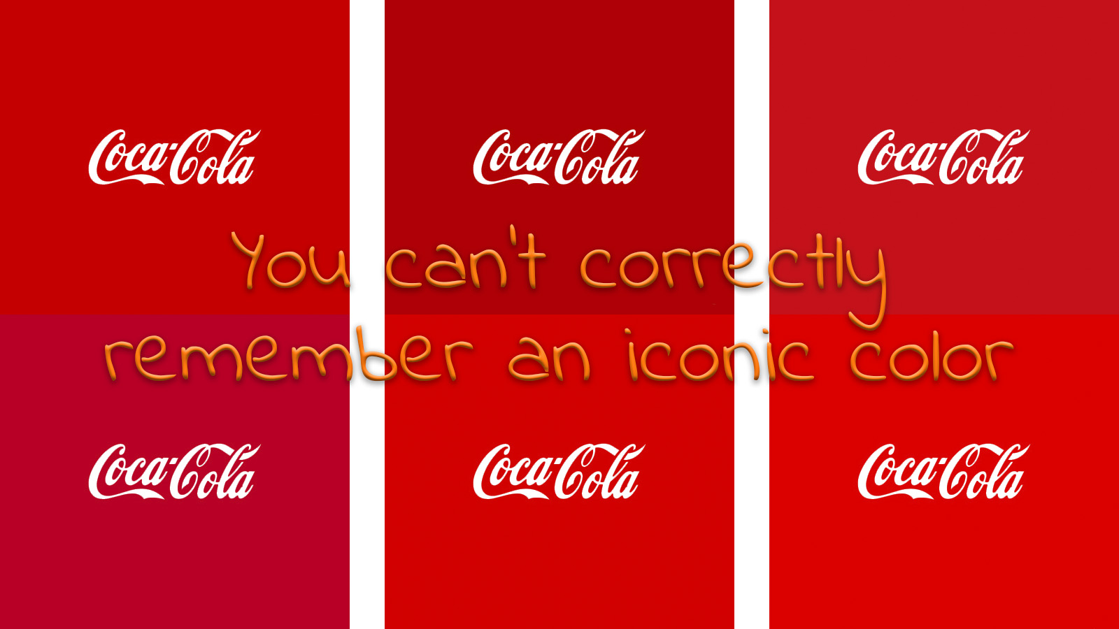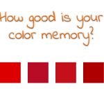
A few months ago, I published an article about color memory, including a short test. The test was to check whether you could remember an iconic color, Coca-Cola red, correctly. Although the number of respondents is still limited, my statement seems to be confirmed: you can’t correctly remember an iconic color. Not even that famous and ubiquitous Coca-Cola red.
CONTENTS: The test | Yes, but… | Why is this important? | Updates
BIG UPDATE – 04/07/2022: I just published a completely new article on the results of this test! With 399 participants, it was time for a big update… Please follow this link!
The test
In the test, I show six variations of Coca-Cola red, chosen from other brand colors, like e.g. Tesla and Adobe. And this is what makes it so difficult: they are all variations of red. If you read my first article on color memory, based on a Johns Hopkins University study, you will already know that our color memory is rather ‘rough’: we will know something was red, but not the exact kind of red. That was also the reason why I developed the small test.
The six variations had a Delta E 76 up to 21, a color deviation that would not be acceptable in print. So let’s take a look at the results.
![]()
As you can see in the graph above: the right color was not the most popular color! The one with the highest score had a Delta E 76 of no less than 11! And another interesting observation: only very few people picked the closest color (Delta E 76 of 4).
Yes, but…
Yes, I know, there are a few remarks to be made with this test. First: the number of participants is still limited (so if you think this is the issue: do participate, right now! – UPDATE 01/11/2018: the number of participants has grown significantly, from 19 when the article was first published, to 312).
Second: most people didn’t look at the colors on a calibrated screen (only 3 of them did, none picked the right color – UPDATE 01/11/2018: at this moment 69 did the test on a calibrated screen, only 14 (20%) picked the right color). And while this is correct, think about this: when do you ever, in real life, watch a TV commercial, a web page on the right type of (calibrated) screen and in the right environment (ISO standards 12646:2015 and 14861:2015). Or when do you ever look at a product under D50 light, conforming ISO standard 3664:2009? Probably never and certainly not in your local supermarket. And that’s just the point: the viewing conditions are never what ISO standards mandate, except when judging print quality… So only when you check a press proof, you will see the colors in a stable and known environment. All other times, the amount of light will be very different (on the beach versus a dark pub), the color temperature will be very different (at noon at that same beach in Florida, or in the evening in a park in Antwerp, Belgium). So, please: be realistic when judging color differences. Print defects are much more important than (small) deviations in color.
Why is this important?
When judging print quality, print buyers can be too rigorous. Small color deviations compared to the ideal color, to a previous batch, between proof and print, don’t matter. We can’t even remember the most iconic color in the world correctly, this test proves it.
PS: I will update the results when I have more participants, so do participate in this test! And you might also want to check my article about ‘The Uncertainty Principle of Visual Color Evaluations‘.
PS2 (addes: 31/05/2018): if you want to read a very good review of some important scientific test regarding our color memory, please check this article by John ‘The Math Guy’ Seymour!
UPDATE 18/05/2018: thanks to the endorsement by color scientist John ‘The Math Guy’ Seymour on LinkedIn, and mentions in the newsletters of Grafoc and Tao Colorist, the number of participants has grown significantly. When I first published the results, there were only 19 participants, now we have 312 (01/11/2018), making the results statistically more relevant. Below are the both original graph and the new version. And I also filtered the results, to see whether it matters if participants used a calibrated monitor, whether they are active in the printing industry, whether there are genetic differences. These filtered results are below the general results.
Original results
![]()
Update 01/11/2018
![]()
Filtered results
![]()
![]()
![]()


I didn’t participate in the test because you required me to submit my email address. No thanks.
I’m sorry to hear that. The e-mail address is only used to send you the number of the right color and to update you on the results.
And you could of course also create a specific e-mail (free) address with e.g. Gmail, that isn’t linked to your private or professional life and which is only used for this kind of uses, or for receiving all kinds of newsletters. I know people who do it like that.
I think this is an intriguing study, and would be interested to see the result of a much higher volume of respondents.
As someone in the commercial printing industry, I don’t agree with the conclusion that color deviations don’t matter. Yes, they may not affect the brand recognition, but that’s not the only concern. The biggest concern I see is consistency.
Take the simple example of stationary… Let’s say we print envelopes and letterhead for clent x in January. They use up the letterhead faster than their supply of envelopes. So they place a new order of letterhead in March. The color on this run deviates slightly from the last. Now the envelopes they have no longer match their letterhead. And I don’t think it would be unreasonable for client x to reject the new order.
So yes, in my opinion, it matters very much. While true that the client won’t be viewing the product under ISO standards, but these standards allow us a basis to work from, and allows clients to maintain consistency between vendors, if using multiple.
Thanks for your feedback Katelyn!
The number of participants has grown since you read the article. From 63 to over 150 (and still growing). And I personally would like to see the same test with printed samples. If a student would like to do his thesis on this, I would be glad to help him/her out!
Please don’t read my conclusions wrong: I didn’t say that color deviations don’t matter at all, I said that *small* deviations don’t matter. And, to be complete, not just any small deviations: it also matters what kind of deviation. We humans are much more tolerant for changes in Saturation and Lightness than in Hue (that’s the reason why for some standards and applications color are measured in LCH and the delta is calculated/defined for each individual channel).
The reason for my test, my statement is the fact that press checks are often much more about psychology (‘framing’) and ego than about getting to a good product. I’ve heard from packaging printers where different account managers of the same FMCG products had a different ‘taste’ for color, resulting in different packages. The individuals forced the printers to print according to their taste… The most ridiculous anecdote that I ever heard was of a print buyer that approved the print job on site, while being printed, but rejected it when it was delivered: it looked different now that it was dry… That’s why I’m advocating to become more realistic in print quality assessment.
The consistency of stationary is an interesting example, this is one I see on a regular basis. And I’ve also covered it a number of times, the most recent one a few weeks ago: https://www.insights4print.ceo/2018/03/why-invest-in-preprinted-letterheads-your-brand-image/
And especially when looking at cross product consistency, choosing ‘good’ brand colors is extremely important. Some people believe that color management software will fix everything, but I don’t. Printing will always have limitations, e.g. the minimal (stable) dot size. Taking these limitations into account when choosing brand colors is essential. And this includes the CMYK translation of a brand color. But that’s another discussion, which I covered in this article: https://www.insights4print.ceo/2017/01/brand-colors-printing-cmyk-better-safe-sorry/, with this article as a follow up: https://www.insights4print.ceo/2017/10/brand-colors-better-safe-than-sorry-again/
It’s true that we can’t remember colours very well. But we are very good at noticing colour variations. And most of the time you see several product from the same brand on the shelf. Therefore it’s important that they all have the same colour. And the easiest way is of course to have well defined brand colours.
So its more about consistency than hitting a specific colour.
Yes, you are right, we are better at noticing color variations. But also this is limited: it depends on the conditions. If you put the reference and the sample on top of each other in a light booth, you will be able to see the tiniest color variations. But if there is a distance between the two colors, e.g. 1 cm of paper white, it will already become much more difficult. And with packages on the shelves, there is also a shadow effect, influencing the color appearance. You might might want to check the article I published yesterday, about real-life factors influencing color appearance in packaging: https://www.insights4print.ceo/2018/05/real-life-factors-influencing-color-appearance-in-packaging/ Just look at the variation in the color appearance in the top image… Probably nobody ever noticed that.
Having both art and science backgrounds, I’ve long been interested in color perception. Our eyes are marvelously adapted to provide us with a sense of color constancy in natural settings, but this is actually a phenomenon of complex interactions between the eye’s pigmented color receptors, neural paths which both filter and emphasize certain signal patterns, and lastly the brain’s final processing and reorganizing into coherent perception. We take for granted without hesitation, when we view cloud shadows passing over a landscape, that we are looking at the same colored fields and trees, not ones rapidly changing colors or brightnesses.
Average people can differentiate very subtle color differences when juxtaposed, but to date I’ve not seen studies suggesting anyone has been found with “perfect color,” in the way some have perfect pitch, and your study supports this conclusion. People likely will have an easier time sensing variations in multi-colored comparisons, but monochromes will be hard to judge.
Thanks for the comment! I couldn’t agree more… 🙂 If you take a really objective look to what happens to packages in the supermarket, you will see all kinds of shadows, reflections changing the color perception. But still our brain says that any perceived Coke red is the ‘right’ Coke red. (more on that: https://www.insights4print.ceo/2018/05/real-life-factors-influencing-color-appearance-in-packaging/)
PS: I’ve added one line break to the comment, to make it a bit easier to read.
No offense, but this entire thing is rather silly. I understand the premise and I understand what you are trying to prove. You have chosen a color that has evolved more times than the salamander or the fish. As a person looking to restore an antique vending machine I came across your page and have to say, almost every color you show in your swatch has been used, at some time, by the coca-cola co. There are more than 25 different codes just for vending machines, and I cannot imagine what the number would be for advertising purposes. Just food for thought, an older person may pick a deeper red, a younger person may pick a more vibrant red, and both are correct.
Thanks for your comment Tyler!
And I agree, it’s rather silly to make such a big deal about small deviations. Consumers don’t notice it. And Coca Cola even changes its brand color during the holiday season (then the red is a bit darker).