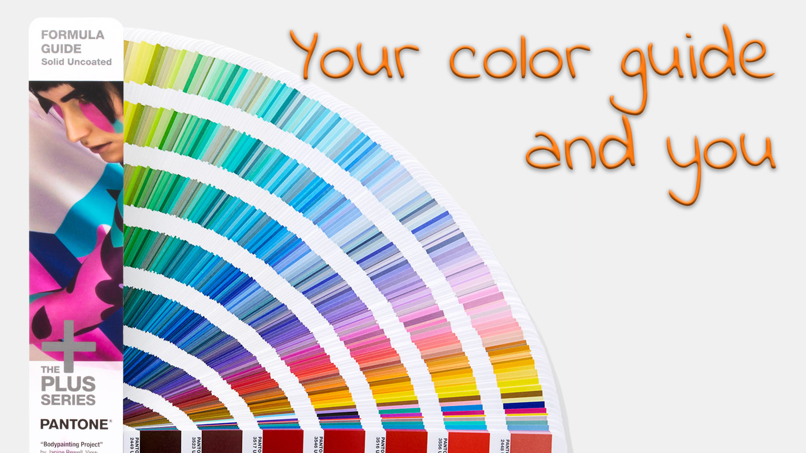
Would you like to be part of an interesting, crowdsourced color research? Then I have a few questions for you. I would like to get a better understanding of the use of Pantone guides. With a dominant position, you can’t neglect these guides. But usage can differ: some only use it to pick a color, others use it as THE reference for print jobs, for press checks. So, please, fill in the form below be part of the most interesting, crowdsourced color research of the year!
Let’s get to down to business right away!
Why is this important?
Pantone swatch books are used a lot as THE reference for print quality. With this research, I would like to get a better understanding of the use in real life of these swatch books. And, of course, I will share my findings with you, with the rest of the industry!
PS: When you submit your measurements, I will send you a comparison showing how your readings compare to others (average deviation, minimum, maximum). Please note that this is not an automatic reply, I have to assemble that info manually.
If you want to compare your measurements directly to others: David Hunter from ChromaChecker.com has build a specific ‘track’ in his – btw excellent – software where you can upload and directly compare measurements. Send me a private message for more info!
UPDATE 22/11/2018: I just published the first results of the Color Guide tests. On average the deviation between the 15 measured guides and the ideal value was 4,5 dE00, with a maximum of 11,9 dE00. Which are well above the values that Pantone specifies in its documentation.


There are several things that you didn’t define about how the readings were taken – I hope this was part of the test so I won’t list them here… However in your drawdown answers there was no place to talk about using the digital standard for measurements and the book as a visual example which would be our application. Just measure your Pantone book against the digital standard to know how different your book is from what it was “supposed” to be! It’s printing you know, so it has to have a tolerance just like all of the other printing out there.
Thanks for your comment Steve! I will respond to it in more detail later this week or next week.