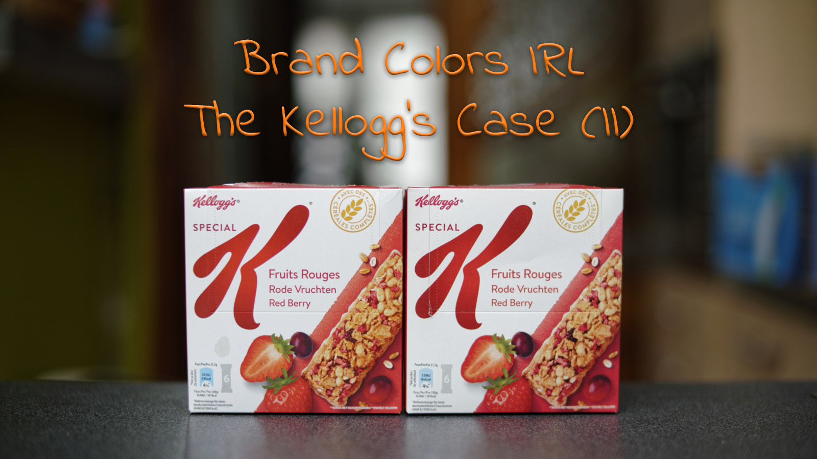
When I went shopping some time ago, I noticed that a box of Kellogg’s Special K Fruits looked very different to me. The red in the logo looked much lighter than usual. So – contrary to what the average consumer would do according to some people – I would certainly not leave it on the shelves, I had to buy that package! Right away! But when I was back home and compared it to other samples, there was some surprise…
CONTENTS: A different color | ISO 3664:2009 | Eye-tracking research | Why is this important?
If you are a regular reader of my blog, you will have noticed that I’m challenging the age-old wisdom that consumers will not buy products if the packages look a bit different than usual. With a package of Kellogg’s Special K Fruits that looked very different to me, I had a perfect study case. When I saw it in the shop, the red looked much lighter than usual. So, I bought the product and took it home to compare it.
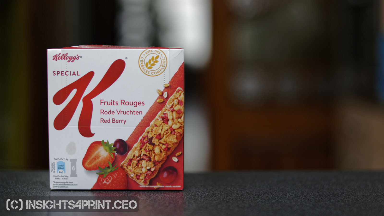
But when I placed it next to one of the older samples I had, there was a big surprise: it only had a very slight deviation… just below 2 dE00… Check it yourself in the picture below!
(I measured the top flap of the box, where the red is solid)
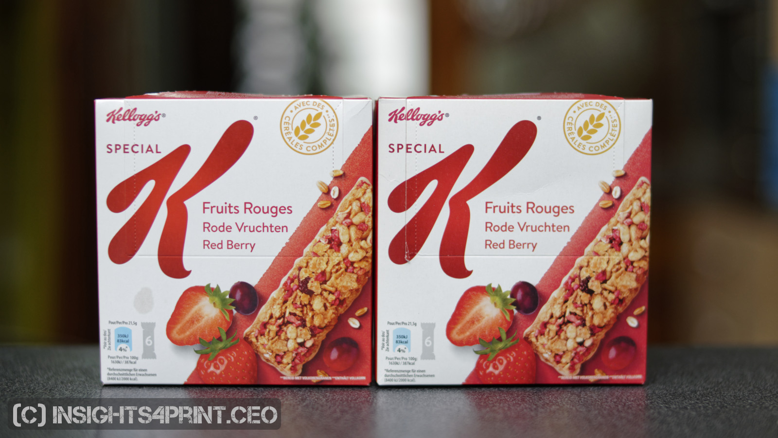
So, what happened? It really did look very different to me…
Well, as I showed you before: our color memory sucks. And next to that: the viewing conditions might have influenced my color perception. There is a rather big difference in lighting between the shop where I do most of my purchases and the one where I bought the last one.
I do my shopping for groceries in four different shops, depending on the day of the week, the products that I need. To get an idea of how much light there is in these shops, I installed a lux meter on my smartphone and went shopping.
In the middle of the aisle, I got the following readings (approximately):
- Shop 1 (where I do most of my shopping): 1300 lux
- Shop 2 (where I bought the ‘different looking’ product): 800 lux
- Shop 3: 650 lux
- Shop 4: 500 lux
Now within each shop, the amount of light also varies. E.g. in Shop 1, respectively the top, middle and bottom shelve showed the following readings: 1300 lux, 1000 lux, 650 lux.
And in Shop 2, the Kellogg’s product was on the bottom shelve: 400 lux.
In Shop 3, the Kellogg’s product was in the shadow: 50 lux only!
So, these differences in light may have influenced my color perception.
ISO 3664:2009
Since the illumination influences color perception, there is an ISO-standard for that: ISO 3664:2009, Graphic technology and photography — Viewing conditions.
This standard makes a difference between two types of comparisons: P1, a ‘critical comparison’, and P2, a ‘practical appraisal of print’. For the P1 condition, the amount of light needs to be 2000 lux, +/- 500 lux, for P2 this is 500 lux, +/- 125 lux.
Next to the illumination, there are also other important, maybe lesser-known requirements in this ISO-standard. E.g.:
4.1.5: Ambient conditions
The visual environment shall be designed to minimize interference with the viewing task. (…)
In addition, no strongly coloured surfaces (including clothing) should be present in the immediate environment.
NOTE The presence of strongly coloured objects within the viewing environment is a potential problem because they can cause reflections that cannot easily be baffled and that can influence viewer adaptation. (…)
4.2.4 Surround and backing for reflection viewing (P1)
The surround and backing shall be neutral and matt. (…)
For P2-comparisons it should also comply with 4.2.4, unless communicated otherwise.
Do supermarket environments conform to these requirements? Probably not… There are all kinds of strongly colored objects screaming for attention (packages), the surround is not neutral and matt. So, can you do a correct, reliable color appreciation in a supermarket?
As a side note: what are people wearing when doing a press check? What color of clothing are press operators wearing? It does matter, that’s why article 4.1.5 explicitly mentions that strongly colored surfaces, including clothing should be avoided when judging color…
Eye-tracking research
It’s is an interesting moment to take a look at eye-tracking research of the behavior of consumers in a shopping environment. I found a number of them over the last months.
The first study shows that shoppers were on autopilot. In only 5 percent, the researchers observed comparison-shopping. Shoppers were frequently buying the brand they saw first.
And this study, that also includes a good overview of older studies, concluded the following in a test: “They typically pause in a department for just 3 to 4 seconds, and fixate on 8 to 10 different shelf locations, before deciding to move on to another department.”
Reading these findings, I wonder if it is possible to make a good, reliable color appreciation in only a few seconds time? What do you think? It would be an interesting research topic to check if there is a relation between the time spend comparing colors and the reliability of the judgment, to define the minimum, and possibly also maximum, time needed for a reliable visual color assessment. If such a research already exists, please leave a comment with a link to it, I’ll update the article afterwards!
Why is this important?
The example of the Kellogg’s Special K Fruit box shows how unreliable our color memory, our color perception in a shop is. I had the impression that there was a huge deviation, but it was within a 2 dE00 tolerance. Which shows that brand owners, printers, print buyers can not control the color perception, the color impression consumers have. Which makes it impossible to avoid missed sales due to ‘deviating colors’. If it were true that consumers would buy another brand when the color of packages deviate, which I proved wrong in one of my previous articles.
PS: check out my other articles on Brand Colors and on Color Perception!




Fascinating case, nice work Eddy!
I can definitely use this in one of my weekly business networking presentations. If you’re interested in attending one of our meetings on Tuesday, just leave a message or give me a call.
Thanks Chris! 🙂