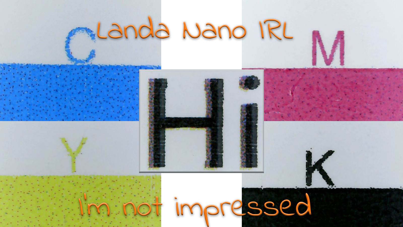
There was one reason why I definitely wanted to attend drupa 2020: to finally get my hands on samples of Landa Nano. As you know, the show was canceled, and it seemed I had to wait a long time for a new chance. But then something interesting happened: someone put a video on LinkedIn, bragging about his newest machine and offered to make prints for everyone who wanted samples. I ordered mine, I’m not impressed.
CONTENTS: Background | The offer | The print quality | The secret sample | A valuable lesson | Why is this important? | Updates | About a year later
Please note: this article is from 2020!
Here is the review of more recent samples, from drupa 2024: Landa Nano: The Good, The Bad, The Ugly.
When Landa Nano launched at drupa 2012, I was probably one of the few people who saw what it actually was: a fundraising show. There was nothing but an idea, mock-ups of machines, and a few terrible samples. But the hype started. Everyone wanted a piece of the action, over 400 people signed a letter of intent and paid a deposit.
BTW: the most important innovation that drupa was the ‘on the fly’ plate changes on sheetfed offset presses, making (very) short runs viable on this kind of presses. And an innovation that was available almost immediately.
When I talked to a VP R&D of another digital press manufacturer at drupa 2012, he said: “Nano ink something new? Every inkjet ink is on a nanoscale, otherwise your nozzles will get clogged or damaged.”
A few months later, when I was giving training to some R&D people of yet another digital press manufacturer, someone confined me that they had tried working with a rubber blanket to offset inkjet printed images. But they stopped that project: too many hurdles to get it right in a reasonable amount of time. The next drupa they had their digital press ready, it sold like hot buns, I’m told, with high uptime, high productivity level as main advantages. And this year, they have launched the next generation, which seems to attract a lot of interest.
At drupa 2016, not being a VIP, I had to settle with the framed examples, in a barely lit corner of the booth, behind a rope. Still, from that distance and with a minimal amount of light, I could see it had serious registration issues. A year later, at Interpack 2017, I did see a small sample of Landa Nano, at the Edelmann booth, a disappointment. (more on the history of Landa)
The offer
Early October 2020, I saw a video on LinkedIn. The company was bragging about its newest machine: a Landa Nano S10P. In the video, it was compared to a Komori offset press and an HP Indigo digital press. An ‘independent jury’, consisting of one person, declared all the samples looked great. And then – le moment suprème – there was the offer to print samples, for everyone who would like them. I immediately sent them a mail.
A small note for those who speak Dutch: De Grafische Vakpers was at that same event, but not part of the jury, and could take home some test sheets. Their evaluation is here.
The test file I included was the same file I sent to the different printers in this article: a few pages from my ‘corona photobook’. I included the same info: it is an RGB PDF/X, with XCMYK as output intent and the link to more information on that profile. But if they could do better than XCMYK: please feel free to do so! And that’s what they said: we are going to use our own, dedicated profile. And I asked to print it on uncoated paper, the same paper type as the book.
When I got the sample, it wasn’t on uncoated paper, but machine coated. When asked, the answer was: “I’m sorry, we don’t have uncoated paper in stock.” Which is weird: this is a large printer, with over 200 people, multiple printing presses, and delivery times that are very short. I have a very hard time believing they don’t have uncoated paper in stock. Which leads me to this conclusion: either the Landa Nano press needs special paper (at least for uncoated stock), which wasn’t in stock, or it can’t handle uncoated stock at all. So be aware to check this if you are interested in such a press!
The sender also asked how I liked the prints. I gave an honest answer: “I’m not impressed” and pointed to several flaws, in my opinion. Which triggered some excuses: we are still in a testing phase, we used the wrong settings to print your file. Yeah, right. If you offer to print samples for (potential) customers or even whoever, especially when it is on what you consider your most valuable machine, you check every step. To make sure that what is sent to the (potential) customer is the best you can do.
I was promised a second round of samples, but by the time I published this article, I hadn’t received them yet. When I get them, I’ll publish an update.
The print quality
So let’s get into the print quality. Several images below will contain comparisons with the samples I got from the Xerox Iridesse and an HP Indigo 7900 (see this article).
The first thing that was immediately visible was the color conversion. The dark, deep blue was close to purple. Now, I have to agree: these images are very challenging, with most standard ICC profiles, the conversion doesn’t go well. But with a machine that is touted to be the next revolution, and a big one step forward, especially when it comes to color, I had expected something better.
Also, other colors looked slightly different, compared to the Iridesse sample, compared to my photo book.
Second: there is either banding or failing nozzles in the B&W images. Again, the B&W image I used, isn’t an easy one, but they should get this straight. Otherwise, Landa customers will run into trouble on a regular basis when printing B&W images.
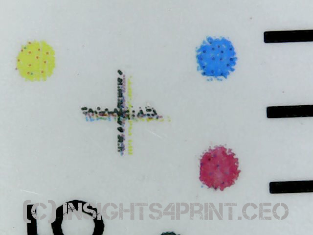
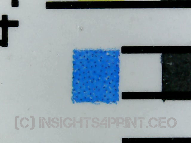
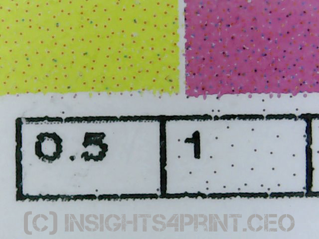
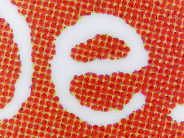
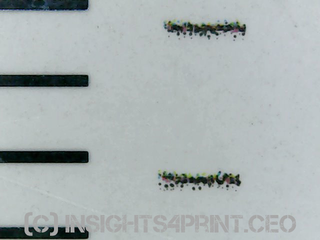
When I took out my loupe, something weird revealed: the solid tints are not solid tints. The 100% cyan, magenta, and yellow also show dots from other colors! Why is that? Are they using very different pigments and need these ‘adjustments’ to get to the right Lab-values? I’m curious…
Added 02/07/2024: I got feedback from Landa after my ‘the good, the bad, the ugly’ article (drupa 2024) and it seems the way the solids in the control bars are build up, depends on the ICC profile used. Fair point, but why did it take almost 4 years to point this out?
(you can click on all the images below to see them in a larger size, all close ups were taken with the same magnification factor, some include a ruler)
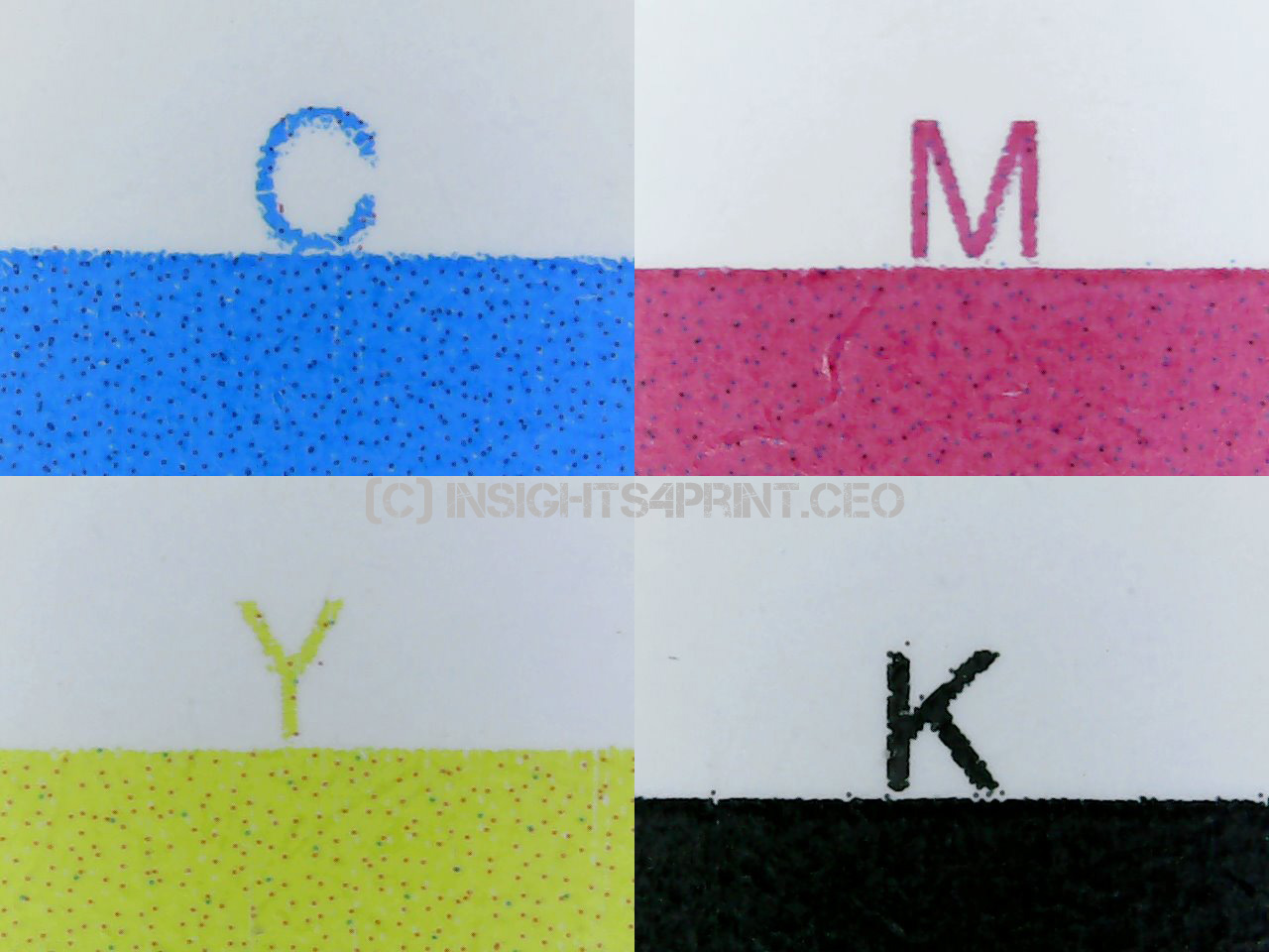
And adding extra colors to a solid comes with a risk: depending on the amount of other colors, it might look ‘dirty’. The yellow e.g. seems a bit greenish to me. As I described in this article, it is often better to have a sligthly larger dE when compared to the perfect color, but keep your printed colors clean, than having a slightly smaller dE and have a ‘dirty’ color.
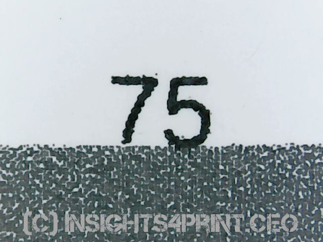
Also interesting: the text. The original Adobe InDesign document has text only in 100% K and 75% K. I can’t remember where it went wrong, but in the PDF, that K became CMYK (in the final photo book, it’s only K). In the case of the slightly lighter text, the RIP converted the composite black into only K. But in the case of the 100%, it stayed composite black. As a comparison, I’ve included the same text, from the same text file, but printed on the Xerox Iridesse and the HP Indigo 7900. In both cases, all text was converted to K only. And just look at the text… Landa Nano left, Iridesse at the center, HP Indigo right. The text is a 10 point Alegreya Sans Regular.
The screening is maybe not what you expected. No traditional screening.

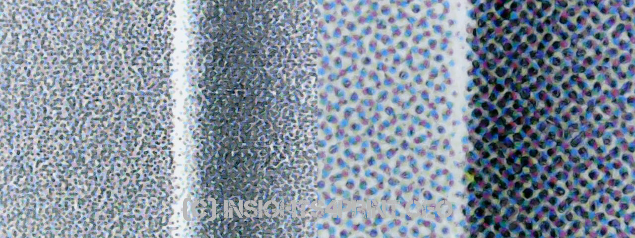
The following pictures show fine lines, registration marks and the finest dots you can get: 1%. Several pictures include black lines from a ruler, these lines are 1 mm apart, to give you an idea of the size.
And, as a conclusion, let’s look at the bigger picture, not just the smaller dots.
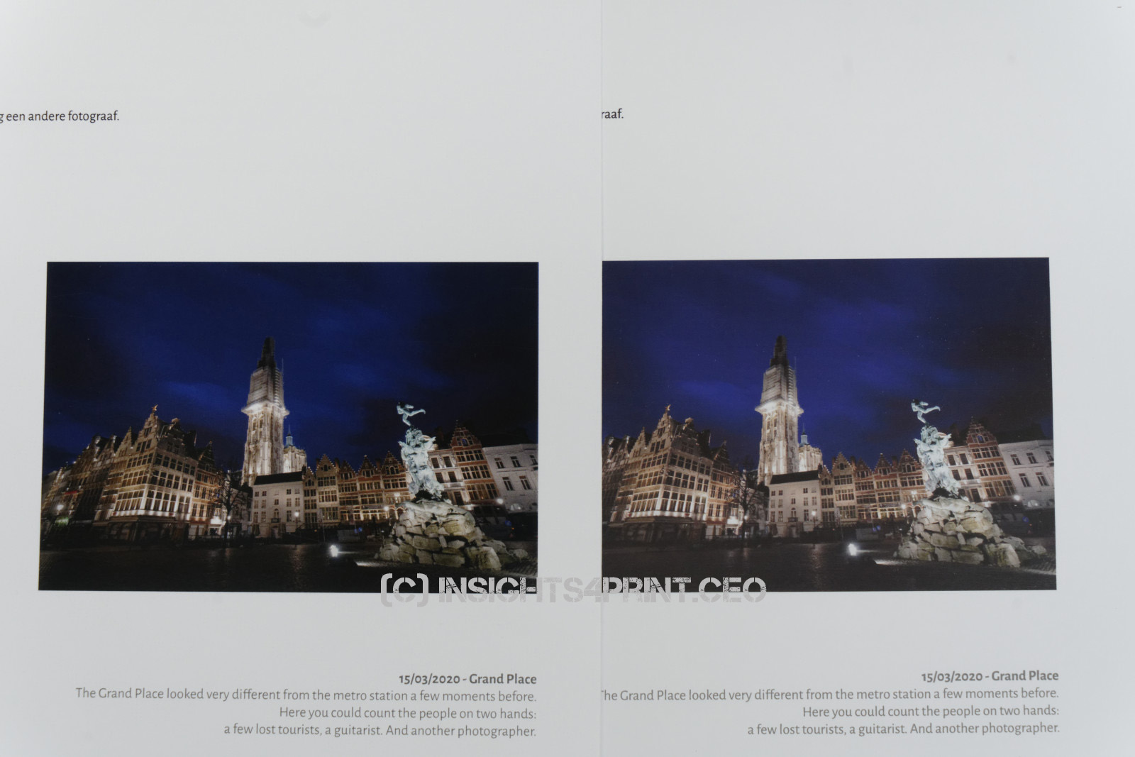
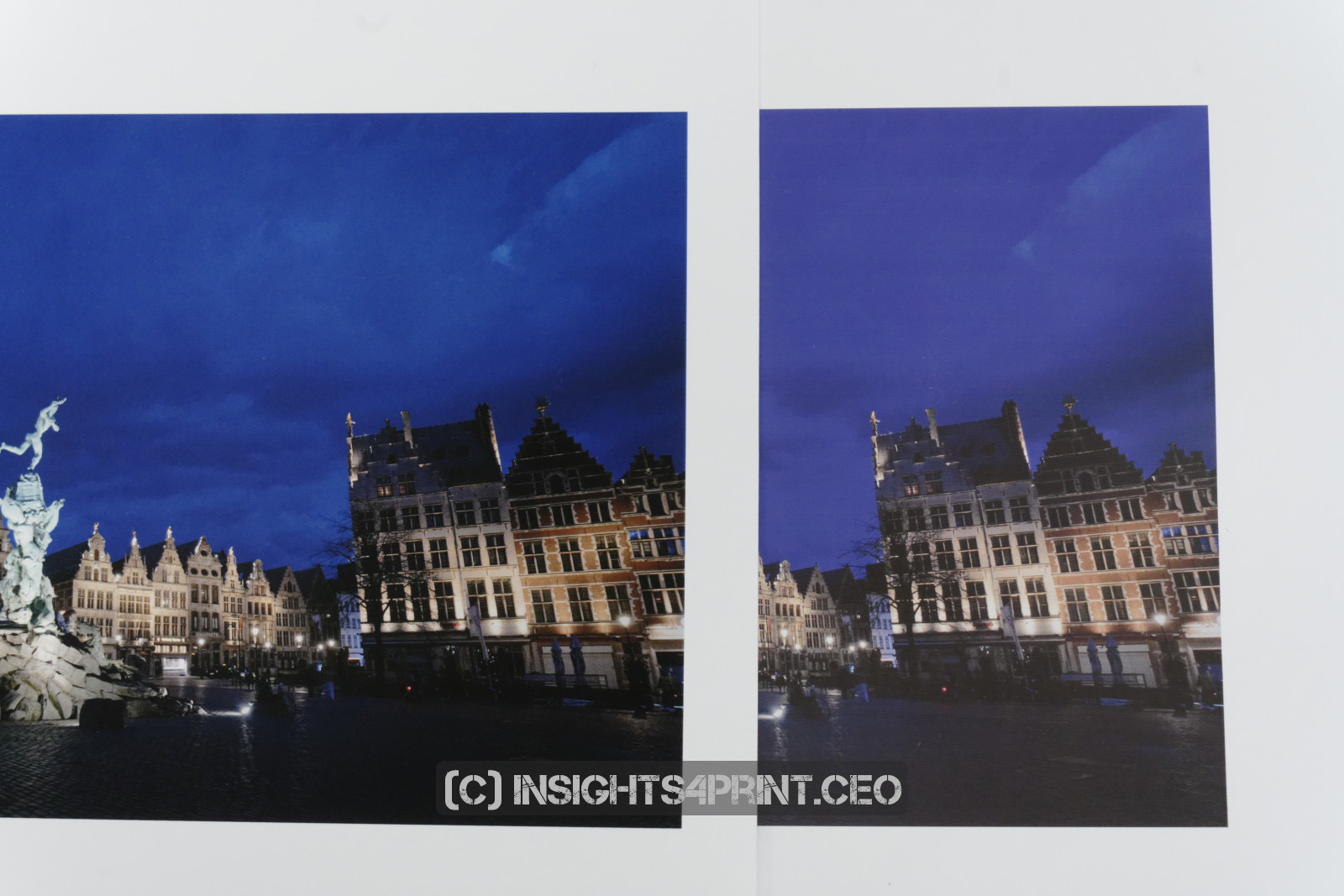

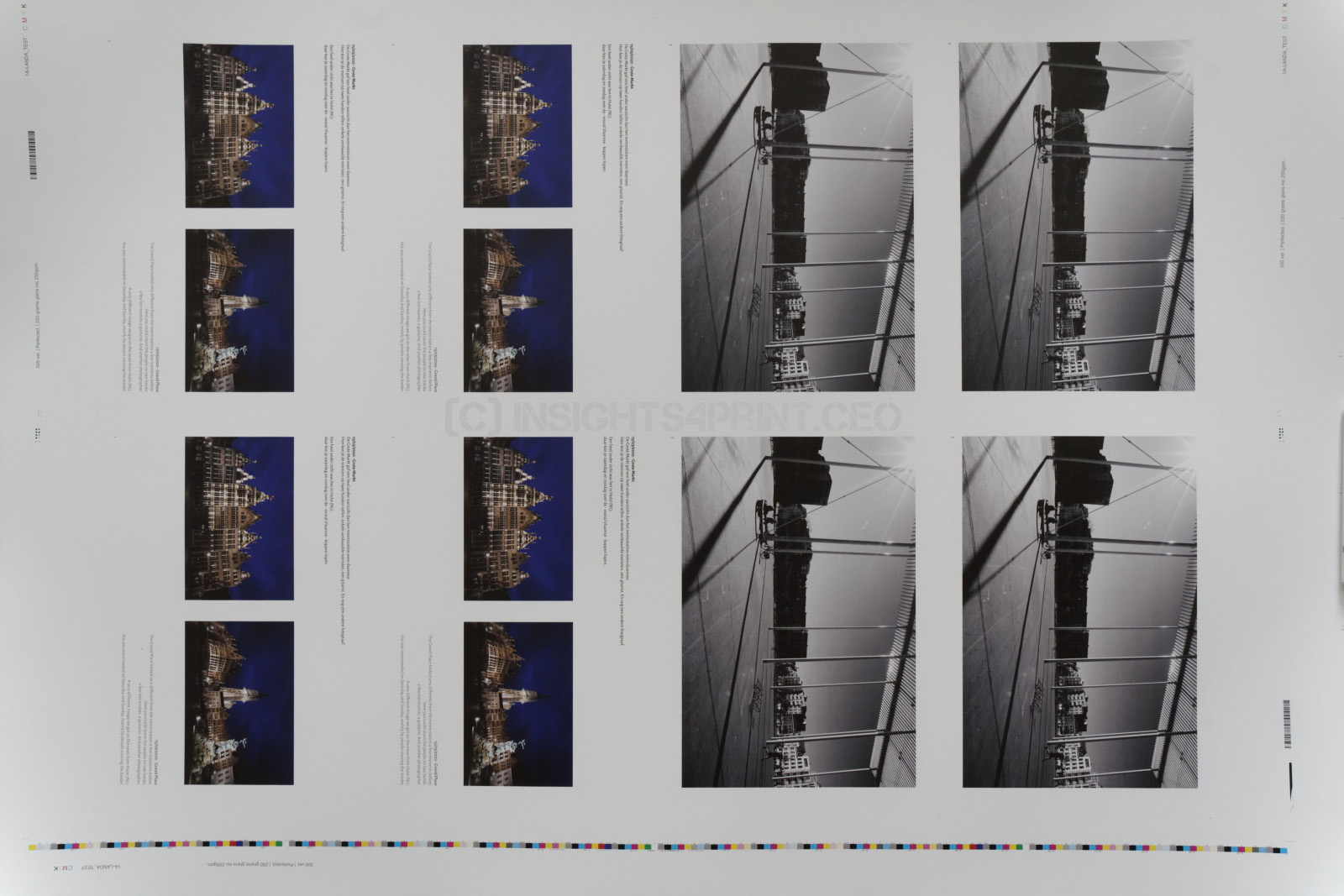
So, when looking at these samples, when comparing them with other samples from the same file, I’m not impressed. This isn’t the quality you would expect from a technology that is touted to be a real breakthrough, one that uses the slogan: “printing will never be the same again”. The other samples I got from the Xerox Iridesse and HP Indigo 7900 are better, when it comes to color gamut is the Xerox Iridesse even much better.
Over the last eight years, since the launch of Landa Nano, the amount of digital solutions available has grown significantly. Check what is out there. You might be surprised.
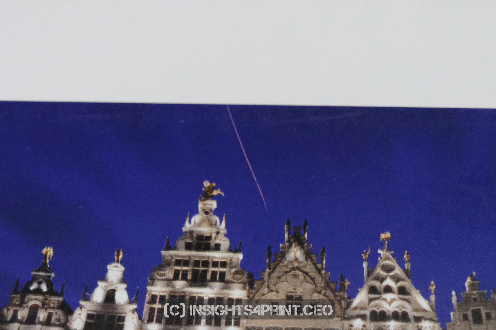
After having handled the samples a number of times, I noticed a serious scratch in one of the images… I guessed it might have been caused by the edge of the sheet (it is printed on a 250 gsm paper, which has firm, sharp corners), so I tested it and yes: I did create another scratch just with the edge of the sheet… So scratch resistance might also be an issue. Make sure to put a varnish or lacquer on it!
The secret sample
Now I have to be honest: these samples weren’t the first I laid my eyes on… Some time earlier this year, I had the opportunity to look at official Landa test pages, which are used for machine acceptance. Since there is a strong claim on them and I don’t want to bring the person(s) that gave me the opportunity to look at them into troubles, I couldn’t take pictures, I can’t show images of that print. So you have to trust me on this, but as you will see, it is in line with what I told you above: I’m not impressed.
The official Landa test page shows the Roman 16 pictures. I immediately saw there was something not quite correct with the skin tones. Especially the Asian lady with the white dress didn’t look healthy. Also, some other portraits didn’t look well. Unfortunately, I didn’t have a printed set of the Roman 16 to compare the images to.
Next to these portraits, there is another portrait of a woman, which was shown several times at the top of the sheet. Her skin tones looked great, it was in clear contrast with some of the Roman 16 skin tones. But… there was a clear issue with the rendering of her skin. This wasn’t a smooth skin, there was a clear structure in her forehead. And not a natural structure. So if you want to test the Landa (or any other printing press), do include skin tones. And make the images large enough so you can spot these kinds of defects!
A valuable lesson
If you want to invest in new technology, and you are not the first customer: order a paid print job, e.g. a customer file, at another printer that has that machine. That’s the only way to assess what it will look like in real life! When you go with your test file to the manufacturer, the chances are that it will be printed on an exceptionally well-maintained machine, with the most seasoned operator possible. Neither of these you can afford in daily production. It’s a small price to order a print job at another printer, it’s much cheaper than investing in a printing press and then discover it doesn’t fit your expectations.
This is BTW the reason why I sent the original mail from my private e-mail address, with no link to this blog. It was only when I mentioned my blog in the feedback mail that the printer might have known who he was dealing with. And at that moment, I got a VIP treatment, which I wanted to avoid. I want real-life samples, one that a regular customer will get. Not a print that got a lot of extra care, just because I am a Very Irritating Person.
Why is this important
“Printing will never be the same again”, for eight years already, we have heard this slogan, this promise. It creates expectations. High expectations. But when checked in real life, Landa Nano doesn’t meet these expectations. What I saw, was no more than average, at the most. I’m sorry to bust the hype.
If you need a production machine right now, look for it in a different direction. There are a lot of capable digital and conventional presses on the market. With a short delivery time and producing the quality you expect.
BTW: I wonder how many of the 400+ companies that signed a letter of intent in 2012 are still on the list… And how long they will have to wait to get their order. At this moment, only a dozen have gotten theirs.
UPDATE 17/10/2020:
From a few people, I got the feedback that the Landa Nano machine I got samples from is “only intended for online jobs, it’s not for the high-quality jobs like your photobook”. Really? Do online print jobs equal to ‘low quality’? Let us do a quick check: my business cards as an amateur photographer. This summer I ordered 100 copies, 25,25 euro (excl. VAT), I had them within three days (could have been the next day, but I didn’t want to pay the premium price for that).
This is what it looks like.

Do you see the text? The white text at the top is a 12 point John Doe, the line just below is 6,2 point John Doe. That becomes challenging… Registration becomes key to be able to reproduce this correctly. And it was no problem at all… With the results from Landa Nano I showed you above, this would probably have gone wrong, the text probably would have either had a halo, or have become illegible.
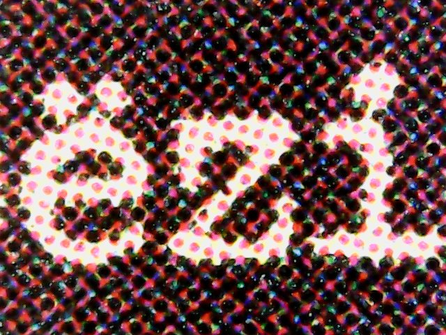
And it’s this quality we expect from online print jobs these days: it’s supposed to be perfect.
I’m not sure whether the business cards were printed in offset or digital (correction 19/10/2020: it was printed digitally!), I have no idea where on the sheet my business card was (in the middle makes getting registration easier than in the outer corners). But I do know: this is the quality I expect from an online printer. This is the quality we as customers have become accustomed to. And it will be hard to make customers accept lesser quality prints. It will lead to many customer complaints and reprints. Don’t forget that!
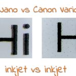
UPDATE 18/10/2020: when browsing through my newspaper (the printed version of course), I wondered: how would the registration issue with the ‘Hi’ compare to a newspaper print? From a conceptual point of view a completely unfair comparison: newspapers aren’t supposed to be high quality print, expectations aren’t as high as for commercial print or packaging.
But take a look at the picture below, take a look how good or how bad the registration is in all three of them. Left is the ‘Hi’ from the Landa Nano print I got, the middle is page 8 from 12 of a newspaper section, the right is page 9 of that same section. And yes, the same magnification factor was used for all the three images.

UPDATE 19/10/2020: my friends at De Grafische Vakpers in The Netherlands, which published the first report on Landa Nano print quality, based on prints from a classic test form they got, confirmed the ‘contaminated’ solids. So it’s not only on my sheets, also a classic test print showed the contamination of the solids with other colors.
UPDATE 21/11/2020: don’t forget to check the second article, which is a comparison with the Canon Varioprint iX!
About a year later…
The Dutch website PrintMediaNieuws recently published an article on Simian, who installed the first Landa Nano press in the Benelux, about a year ago. (the original article in Dutch – a Google Translate version in English) Although Wouter Haan says he is ‘moderately satistied’, there are some points he makes that seem strange given how Landa Nano is positioning its presses.
“The Landa isn’t running as much as we had wanted, but we had fewer orders than expected for this machine.” This seems weird, very weird to me. Isn’t the Landa press the most versatile on the planet? Can’t you print on any substrate, in any size (up to the maximum sheet size), in any quantity, at the most cost effective price in digital? To quote the Landa Nano website: “For general commercial print applications, the Landa S10P Nanographic Printing® Press combines the versatility of digital technology with the lowest cost per page among digital presses.” So does Reclameland mostly have offset jobs? And a lower than expected number of digital jobs? That would be a bit suprising.
The answer might be in the following statement: “100 A1 posters in a few minutes, without the need to make plates, isn’t that awesome?” So did they mainly (specifically) invest in this machine for this kind of work, A1 sized posters?
“This summer we will go to a 2 shift system on the Landa, making the ratio of intermediate cleaning more favorable. And (…) everything is being done to get the ‘time in between jobs’ to zero.” So you need to take into account a non trivial amount of cleaning each day. And the changeover time between jobs is certainly not zero.
He also points out that Landa is continuously working on improvements. Shouldn’t Landa Nano first have done their homework and improve the press so that it delivers what is being promised before installing it at paying customers? Well, maybe I have it all wrong…
UPDATE 12/04/2022: a world record! Reclameland.nl is the first to pass 1 million prints in a month. And they celebrated that. But when looking at bit closer at the numbers, I don’t see any reason for a celebration… The average production was only 40% of the advertised speed…
UPDATE 08/06/2024: I got home from drupa with multiple samples from Landa presses. You can check my observations in this article: Landa Nano: The Good, The Bad, The Ugly. And The Alternative.
UPDATE 15/08/2024: if you are considering purchasing a Landa Nano press, please check the power requirements, the power usage before you sign anything. I received info on that, but I’m not sure if it 100% accurate. But one thing is certain: check this upfront. (BTW: you should always check that, no matter what equipment you are considering)




Hi Eddy
Re the inpure CMYK this is odd. If yourRGB file had been converted in their DFE to the CMYK Landa device profile, for max gamut reproduction the CMYK should be ‘pure’. So it looks like the colour management workflow is a little odd.
Only if they were using a simulation CMYK profile would this happen, but why potentially reduce the colour gamut by doing this?
Hi Paul, the solids I showed are from the control bar, they are not part of my testfile.
Looks like FM.
It indeed looks like something stochastic Ingi. But where in offset you can still see clear ‘dots’ (or pixels, what should I call it?) and there still is a clear, defined pattern visible, these samples look a bit messy to me (but that is a personal opinion, tastes might vary). Look at that 75%, that same % would look a lot ‘neater’ in offset when using FM.
Hi,
“ when it comes to color gamut is the Xerox Indigo even much better.”
What is it: Xerox Iridesse of HP Indigo?
Oops… sorry, typo! Good catch! No, it was the Xerox Iridesse that had the largest gamut!
Thanks for point it out, I will correct it right away.
To the point, zoals ik je ken. Inderdaad een verschil, maar zeker niet dé ‘AHA-erlebnis’ die aangekondigd wordt….
This is a very impressive and hard work. Thank you. I just wonder who have financed this work? Can I be sure that you have worked independently?
Hi Peter, thanks for you comment!
Regarding the financing: nobody financed this post. This blog is advertising free, there is no paywall. So no need for me to satisfy advertisers, nor readers. I have a full time job in another industry, where I make enough money to have a comfortable live. I don’t need to get paid for writing articles on my blog, it’s a hobby (or passion, whichever you like). That makes me completely independent. That’s why I can afford it to write stuff about things that need to be told, even though some/many in the industry don’t like it. Did you already check this article: https://www.insights4print.ceo/2019/02/color-increases-brand-recognition-by-80-the-real-contents-of-the-loyola-study-revealed/ ? I got some really nasty responses to that, since it shows that one of the fundamentals when it comes to color quality is non existing.
The samples from Xerox and HP Indigo I got from printers, since I wanted to publish a photobook with very challenging pictures (read the other articles; the books look great btw, everybody who bought a copy is extremely enthousiast about it, even seasoned printers). The samples from Landa Nano was an offer from a printer that was bragging about his new machine in a video on LinkedIn, offering anybody who liked samples to get these. An offer I accepted with gratitude. And which resulted in this article.
Eddy, the quality issues you mention, could it be that those originate from ‘bad’ color settings in the workflow? Solids inks being mixed with other colors, bad skin tones and gray balance sound to me like incorrect profile/conversion settings. I actually liked the screening definition shown in your pictures even though some registration issues are visible too. That would be a hardware issue to me, not the overall look and feel of the color? Of course, I can only reply to your comments and to the pictures you posted, I have never seen real life prints from the Landa. I’m more interested in stability and indeed, the options to print on different stock.
Cheers
Erik
Hi Erik, thanks for your comment!
First: you have to make a distinction between ‘my’ prints (with the pictures I’ve shown in the article) and the official Landa Nano test sheet I saw earlier this year. It was in that offical test sheet that there were, in my opinion, issues with skin tones. But only in some skin tones, not in all of them. So that doesn’t seem to be a color setting issue. Also the rendering of one of the portraits (with good skin tones), showed a strange pattern in her forehead, probably due to the screening type (which you seem to like, I don’t really like it).
The solids on ‘my’ prints are from the color bars that were added by the printer, not by me. So where in the workflow could they have applied bad color settings to get those ‘dirty’ solids? I you have an idea, please elaborate!
And the registration issue is of course not due to color settings. That’s a stability issue.
If you happen to be in the neighbourhood of Antwerp, let me know, I’ll be happy to show you the samples I have, from the different presses. But in return you will have to buy my corona photobook (which shows excellent digital print quality btw). 😉
Eddy
It looks that there is indeed a color conversion problem and quality/stability issue. Did you measure the CMYK-patches printed from your file and the additional CMYK-patches from the printers test strip? Is there a substantial difference? If the original colours are very pure and do have a high C-value and a low L a certain amount of “dirt” could have been added by the Landa system to obtain the proper Lab-values. They have to deliver ISO 12647 offset quality and have to be able to switch from Komori to Landa or Indigo. That’s their job.
The partial increase of ink density in the (you call them “Landa Style”) patches could be a transfer problem – as I have been told. Your friends in Alkmaar (Grafische Vakpers) did get a number of identical prints from a test file provided by the same printer. Ask them to inspect the colour patches on evenness, repeatability and consistency.
Hi Henk, thanks for your comment!
I had no CMYK patches on my test print, my test file consisted only off a few pages from my photobook, with some text and several pictures. No traditional test or control elements. The CMYK patches I show, are from the control bar that the printer added to the press sheet, for process control purposes I suppose (the machine is supposed to have an inline spectrophotometer for process control).
And I only got one sheet of each print they made, so I can’t check repeatability. I’ll check if our friends at De Grafische Vakpers can check that.
Hi Eddy,
Interesting read BTW. With regards to the Purity of the C M Y K, I suspect the colours are profiled or even simulated to process Pantone colours. For example if you check the LAB of process yellow it has other colours in it where as PANTONE yellow then it should be pure. I guess it depends what limits of the gamut they wanted to achieve.
I could also be totally wrong!
Hi Eddy,
Thanks for being the “luis in de pels” and comment on this. I think it is only fair to try and understand what claims are really worth. Marketing spin can be misleading at best, or even harmful to businesses when they invest in technology that does not deliver and cost more than what they promise to make.
Reason for my commenting now is the feedback “only intended for online jobs, it’s not for the high-quality jobs like your photobook”. This is of course utter nonsense. As if online jobs should always be worse, even if it’s printed on something that is said to be capable of producing high quality print.
The print shop should be able to explain why it delivers a certain quality. And if they can’t, they should get training to fully understand what they can or cannot do. This could be a “Monday-morning print”, or it could be the standard. It could be just this one print shop, or it could be exemplary for all Landa devices.
I would love to see an honest comparison and understand if it is what it is.
Looking forward to your, hopefully, next update.
Kind regards,
Roland.
Thanks for your comment Roland!
What you said about marketing spin being harmful to business that invest in a certain technology, that’s the reason why I’m doing this. That has been the motivation for me for a long, long time, also in my previous life at the innovation center. Many printing companies are having a hard time. Investing in an immature technology, but also not investing in a mature technology because ‘the new kid on the block’ is almost there, are harmful. The main innovation at drupa 2012 was the almost ‘on the fly’ job changes on offset presses. That’s proven print technology, that’s what will make a difference when printing (very) short runs. I don’t know if they still do it, but Vistaprint/Cimpress has for a very long time printed their business cards, even in small quantities, on a large offset printing press. And they were making money with that. And the quality was good.
BTW: my Landa Nano samples were printed on a Thursday, it’s not a Monday-morning-print. 😉
Hi Eddy, The only way the CMYK colour bar could be ‘contaminated’ as you observed, if if it was colour managed in the same way as your files.
I would guess they were using a ‘simulation’ CMYK profile to emulate a ISO or similar printing condition. So as most inkjet CMYK inks do not match, say, an PSO coated v3 based profile, a little magenta will be added to the yellow to match the required printing condition. This needs to be in the colour bar in order to be able to validate this chosen printing condition.
Now wither this was your required colour managed workflow for your images, I do not know. But would guess you expected your RGB images to be converted by the EFI DFE to the maximum gamut of the Landa press on the paper you specified. This may not be the workflow used my this printer for everyday work.
If they had used a max gamut workflow the CMYK solids should be pure.
Thanks Paul!
I asked them to make the best print possible, so with the max gamut…
Hi Eddy,
Nice article. The dots you see on the prints in unpure colours CMYK are spray from the ”nano” heads to keep the nozzles open. In the early days Canon had to spray the dots too. The speed, then drying speed that is needed to avoid drying of the nozzle head is prevented. I hope they can fix this. In basic the RIP of the Xerox Iridesse and Landa is the EFI platform. The core of conversions and functionalities of CMM are the same.
Hi Dharminder, thanks for your comment!
That’s interesting… if that is indeed the case, the cause of the contaminated solids, that would mean they haven’t mastered the basic ink jetting yet… That would be a serious flaw. One would expect that after so many years of development, this should have been solved.
Hi Eddy
The impure CMYK would indicate that a max/device gamut was not used, unless the colour bar had a ICC profile which was not the device profile. Re the issue of very small dot to keep heads open, this is true still of many inkjet devices, however the dot on the CMYK solids seem very much bigger than the very small dots used for this purpose, usually in the white paper areas.
Paul
Seeing this quality, following the activities on LinkedIn and listening to the noise in the market, it very much looks like that the magic finally is over.