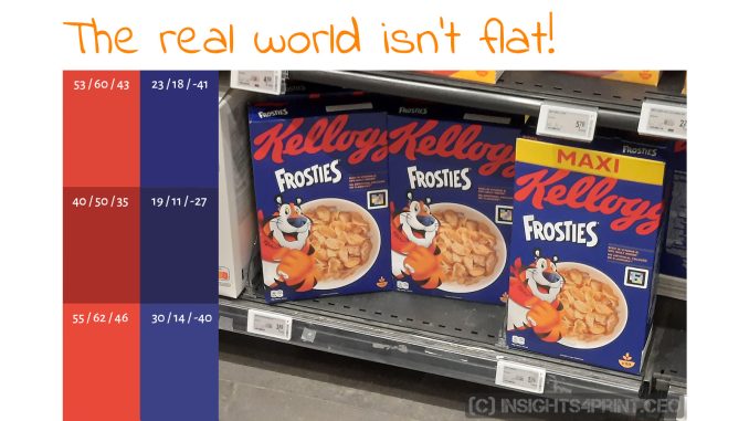
The world isn’t flat! I know, it may sound silly, but bear with me for a minute, and you will see it might not be that silly… The complete quality process in the printing industry is based on comparing flat samples, laid down on a flat table: inkjet proofs to the OK sheet, the OK sheet to other sheets in a print run. And this way, even the tiniest differences become visible, especially under the huge light at the press console (P1: 2000 lux). But that isn’t real life: on the shelves, these sheets have become boxes. And these are not necessarily in the same plane, as a consequence: the lighting conditions might be quite different. Which means: a different color perception. Let’s take a deeper look at this!
CONTENTS: What do you think? | The comments | The weird results… | Another example | Our brain is not a measurement device… | Only if they knew! | Some more examples… | Why is this important?
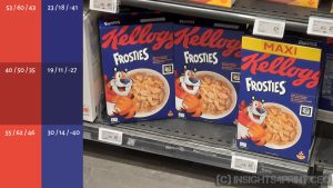
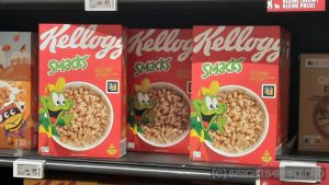
You may have seen the image below if you follow me on LinkedIn. It was taken a few weeks ago, in one of the supermarkets where I do my grocery shopping. Whenever I pass the cereals and Coca-Cola aisle, I activate the color-critical part of my brain. I will look if there is something interesting to see. And that day, there was. And I took a picture, put it on LinkedIn, with a question: “Two boxes of Kellogg’s cereals, what do you think?”
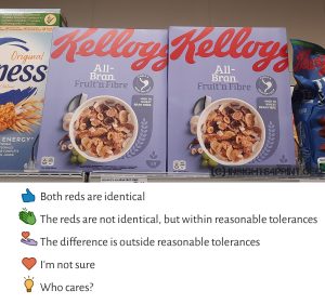

- Identical – 24%
- Within tolerances – 3%
- Outside tolerances – 50%
- I’m not sure – 5%
- Who cares? – 17%
When looking at the reactions, half of the people who responded said the difference was outside reasonable tolerances. Which is the answer I had hoped to get, but it is wrong. These two boxes are identical, or extremely close, but the left one is tilted back a little. Which changes the way the light falls onto it and, therefore, changes the color. As you know, color is the interaction of a light source, an object, and an observer. If one of these three changes, the (perceived) color will be different.
And this happens all the time in the world outside the (somewhat artificial) world of print quality checks. The press room, the press console, is a highly standardized situation. Which is needed, otherwise you would not be able to replicate quality control in different printing plants, at different times. Lighting is according to a specific standard (ISO 3664:2009; D50, 2000 lux, +/- 500 lux), and samples are on a flat table. That ISO standard even has requirements for the environment, which should be neutral grey and low-reflection. Here is more on ISO 3664:2009.
But that’s not how print products will be ‘consumed’. E.g., packaging will be viewed in a supermarket, on a shelf. Depending if the product is on the top or the bottom shelve, it will get a lot or only a little bit of light. Depending on the supermarket, the color temperature, and the CRI of the light sources, might be very different. Some supermarket chains have standardized their lighting, but that only accounts for their chain. Another chain might have another standardized lighting.
And even then, there might still be variables, as shown in the picture above: if a box is tilted or turned a little bit, the light will fall onto it in a different way, and this will influence the color perception by the observer: the third dimension enters the equation. And whether you like it or not, brands will never be able to control this. I repeat: they will NEVER control this. Which means they will never be able to fully control the color perception of their brand color. The real world has many more variables than the highly standardized print production and quality control, including that third dimension.
The comments
When looking at the comments, there are some interesting ones. Some people got it right and saw that the lighting was different (the first two shown below). But many didn’t. Here are some of the more interesting ones. I intentionally obscured the name and profile picture of some, but these are real comments.




The weird results…
The influence of positioning and, therefore, lighting was also revealed in the groundbreaking study on the perception of color differences. In that study, not only flat samples were judged, but also folded boxes. And where the flat samples showed a predictable growing curve, that wasn’t the case with the folded boxes…
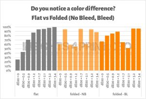
The gray bars are growing nicely with an increasing delta E between the reference and the samples. But that isn’t the case with ‘folded – NB’ (folded boxes, no bleed) and ‘folded – BL’ (folded boxes, bleed; the other side of the boxes). Given the fact that these were samples from the same production, with the only difference that they were folded, the only reasonable explanation I can come up with, is that they were placed (or folded) slightly differently, with slightly different lighting as a result.
BTW: do look at how many people claimed to see a difference between identical copies (dE00 = 0). With the flat samples, about 25%, but with the folded samples, about 2 out of 3!
Another example
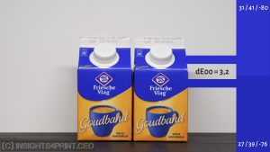
Here is another example, look at the blue of the packages in the middle of the picture. There are two varieties next to each other. Are these the same blue? It doesn’t look like it in the first picture. The left ones look darker, maybe more saturated.

Well, if I move the left package to the front, it’s quite close to the one next to it… At least much closer than the ones in the back. Again, it’s the lighting that made the difference. In the first picture, it was in the shadows. Again: the third dimension, with all its consequences.

There is something interesting about this type of package: the top is under a 45° angle compared to the rest of the package. The blue color is both on the vertical part and on the 45° top. Are these blues the same? From a shopper’s perspective? An interesting question, isn’t it…
At home, I took a picture of two packages and checked the colors in Adobe Photoshop: they are 3,2 dE00 apart. However, my brain keeps telling me that it’s the same color…
Our brain is not a measurement device…
So, why don’t my brain and Adobe Photoshop agree? Again because of the lighting being different. And our brain takes that into account, while my camera does not. And that’s what is often forgotten: our brain tricks us… Our brain is not a measurement device or a camera.
Let’s look at this picture: are these two yellows different, or the same color?

I bet your initial reaction will be that they are quite different, but they are the same. This is an excellent example of how our brain plays tricks on us. Since the lower one is in the shadow of the cylinder, it must be lighter, according to our brains. This relates to a phenomenon called color constancy, which is related to chromatic adaptation (a kind of automatic white balance that our brain applies to the visual input).
Now let’s turn this around: if there had been a darker yellow circle in the shadow, our brain would have said it is the same color as the yellow circle outside the shadow. And that’s what it’s doing with all the packages I’ve shown you: it takes the circumstances into account and ‘recalculates’ the colors, concluding the colors are the same. This is a ‘spatial’ effect of chromatic adaptation (it will recalculate a part of the scene), which leads to color constancy. This scientific paper elaborates on these concepts if you want to read much more about it.
Color perception is something weird, and a field of science that is still a work in progress (check out this article, which includes a link to an extensive scientific paper about the advances, and unknowns in color perception research). Below is another example of how our brain tricks us, how a surrounding color might influence the perception of a certain color.
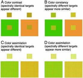
That’s something Kellogg’s probably didn’t know about when they redesigned their boxes a few years ago…
Only if they knew!
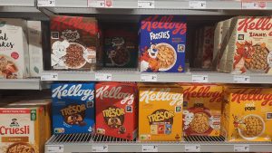
Around the same time I put the Kellogg’s picture at the top on LinkedIn, someone else posted a similar picture with the same packages, plus another variety of Kellogg’s breakfast cereals. He was complaining about the total lack of color consistency (in my opinion, the deviations were minor). But his pictures didn’t show the complete packages, so it wasn’t easy to get a good idea of the situation. However, based on what I could see, also in his case, boxes were twisted a bit, resulting in a different color perception… I commented on his post, stating that it might be due to a slightly twisted position, but no reply.
He did get a lot of responses to his post. And this reaction is one I have to share… The initial comment is from someone else, questioning whether it makes a difference for shoppers. Check out his reply…

Wow! That doesn’t seem the right justification to me: they would care if they knew how much money is invested in it! If that were the case, the Iridium satellite telephone network, that invested 5 billion US$ into its infrastructure, would not have failed… People would have used it! Five billion US$ can’t be wrong! This is the danger of a specialized echo room: given the amount of work you put into it, you might think something is very important. But the outside world might disagree, maybe even firmly.
Some more examples…
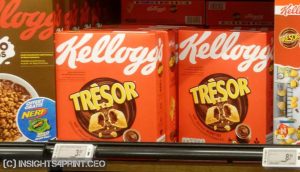
And here are some more pictures from boxes that were shifted a bit, resulting in a different lighting and, therefore, different color perception. If I put your attention to it, you will see it. Whether you will see this when doing shopping, that’s something different… And something I will address in my next article! Stay tuned!
Why is this important?
Assessing print quality is done in a very controlled environment, as it should be. But we should not forget that the world outside is different. E.g., on the shelves of a supermarket, boxes can be twisted, tilted, closer or farther away from the light source(s). All of these will influence the color appearance, and the color perception.
Brand owners and print buyers might think they need to control the appearance of the precious brand color in every detail, forcing printers to work within tiny tolerances. But they will never be able to control all parameters, especially not how our brain interprets the visual stimuli it gets… And for most, if not all of us, our brain will tell us that those red cans will always be Coca-Cola red. No matter the lighting and other factors influencing color perceptions. Not even deviations in print…
Print quality should be good, but tiny tolerances, like a maximum of 2 dE00, are not necessary. Let’s adhere to ISO standards and best practices like PSO/PSD and G7. These have decent tolerances and are attainable for every printer with skilled operators and decent equipment. And in that three-dimensional world, our color perception will also be influenced by many other factors, which are out of control of the brand owner. Fortunately for the brand, our brain will correct for those. Unless you put on your color-critical brain and specifically look for differences…




Such a great article. Especially for this sentence : “This is the danger of a specialized echo room: given the amount of work you put into it, you might think something is very important. But the outside world might disagree, maybe even firmly.”
I don’t even work in the print industry (altough I’m still an Industrial Designer), but it is an insight that works for oh so many things on any professional field.
Thanks Rafael! 🙂
Hello.
This is indeed a very good article like a John the math guy approach.
And I really liked it.
But let’s assume the comparison until the absurd.
If final color isn’t so crucial, why all the process (from the owner, the creative team, the prepress and the printer) would still occur?
After all, we could argue we are also facing to people with color visual impairment for example.
We also could consider why we spend so much time to deal with it.
In the meantime, I work in an industry where printer’s call of tender are prepared among other values with their ability to match low color tolerances for the branding bars.
What does this mean?
Is it more important for the customer or the owner?
That’s all the dilemma 🙂
Thx Robert! You made me blush with your John the Math guy comparison…
Suppose that, once upon a time, a color consultant read the headline of an article: “Color enhances brand recognition by 80%”. The perfect pitch for his/her services! And he/she started using that to convince customers to hire him/her. But without ever checking what the article, the study was really about.
Of course, everybody involved with printing and packaging loved the quote! It made them feel very important. All color consultants started using this quote. Vendors used it to sell their latest technology, which assured smaller tolerances. And print buyers used it to put pressure on their printers: the color has to be perfect, or sales will plummet! And some printers also used it, to differentiate.
But then there was a guy, who had a little bit too much time, who wanted to know how this was tested, and how the researchers came to that conclusion. He put a lot of time into it, days, even weeks searching and reading research papers. Only to find out that the research was on the use of color in newspaper ads, compared to black and white. Where, of course, the use of color enhances brand identity (compared to black and white). He wrote an article about it: https://www.insights4print.ceo/2019/02/color-increases-brand-recognition-by-80-the-real-contents-of-the-loyola-study-revealed/
And digging deeper into even more research, he found more and more studies that oppose the belief that minor color differences make a difference…
So, to answer your question: it’s much more about the owner, who wants to believe that tiny differences matter, than about the consumer.
There is one more thing, which I cover in this article: https://www.insights4print.ceo/2023/01/how-our-brain-perceives-evaluates-color-system-1-vs-system-2-dual-process-theory/