Earlier this year, I published an article with studies showing how long consumers interact with a package while shopping. On average, the ‘Total Fixation Duration’ was less than a second. Coca-Cola cans? One-tenth of a second. With that in mind, I decided to consult the wisdom of the crowd to find out how long a visual press check should take. Let’s look at the results!
CONTENTS: The wisdom of the crowd | As long as it takes… | Why is this important?
First, I posted the following question on LinkedIn, as a general post.

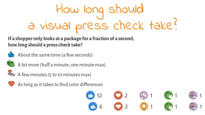
In toal, 17 people answered (including someone who was curious, which wasn’t an option I offered… 😊 ).
![]()
And most people said a visual press check should take about the same time as the time a consumer looks at a package during shopping. Wow! I didn’t expect this, but I’m pleased with this result! Please note that most of my contacts on LinkedIn, most people that voted, are from the printing industry.
The two answers ‘as long as it takes to find color differences’ deserve more attention. One is the CEO of a label printing company, the second is a consultant to the printing industry…
I also placed the same post in the LinkedIn Print Production Professionals group to get more responses, which delivered 11 more results. However, the ‘celebrate’ one is double with the original post. Here again, two people picked ‘as long as it takes’. One is the prepress operator of an agency, the other is from the aerospace industry, and based on his function description not involved in printing.
![]()
So, all together:
- About the same time (a few seconds): 18 (72%)
- A bit more (half a minute, one minute max): 1 (4%)
- A few minutes (5 to 10 minutes max): 2 (4%)
- As long as it takes to find color differences: 4 (16%)
As long as it takes…
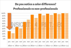
‘As long as it takes to find color differences’ has a few issues. First is a psychological one: stating it like that, you WANT to find differences… And if you want to find differences, I bet you WILL find them… (even if there are none) So, already the starting point is wrong. And this is BTW what happened in this study, where participants were shown a reference plus one of a set of 8 samples. They were asked if they saw a color difference between the reference and the sample. Almost one in three (!) print professionals claimed to see a color difference between identical flat samples… When you ask a color professional if he sees a color difference, he will try very hard, untill he does. When your goal for a visual press check is to find color differences, you will probably find them… It’s psychology.

But there is also another issue… a physical one: retinal fatigue… And you should not underestimate that one.
I tried to find studies showing a time frame after which retinal fatigue would show, but I didn’t succeed. But what surprised me: this topic was already covered in scientific papers a century ago!
Recently X-Rite published a blog post on visual color evaluation, including 10 tips. And this is tip #7: “Look fast. You may think that staring will help you focus, but our eyes actually become less sensitive after 5-10 seconds of looking at the same object. When judging color, look fast, then rest your eyes and before you judge again.”
This page contains several examples of what retinal fatigue can cause. Do try them!
Why is this important?
Evaluation of print quality is important, but it can come with flaws. Especially when one depends on visual evaluation of color. Retinal fatigue is a risk, people doing a press check should be aware of that. And take the rule into account that you should only look at a color for a few seconds. After that, you can’t trust what you see. Plus, as studies have shown: consumers, on average, only look at a package for less than a second…
That’s why assessing color quality must always be supported by or based on color measurements. That’s the only way to objectify color quality in print. There are many tools out there that can support brand owners in that. But even then, keep in mind that variables are possible. In case you didn’t know, check out my article on the ‘chain of tool tolerances’!
PS: a few weeks ago, a friend of mine, who is very knowledgeable on color and print, sent me a picture of three boxes of Kellogg’s he had just bought (at the same moment): “Look at these color differences!” And indeed, there was a difference visible. But when I asked him when he noticed the difference, the answer was interesting: “At home, when I put them in the closet.” He did not notice it while shopping… During shopping, his brain was probably fixed on getting the stuff he needed, not on evaluating color quality.


I would always say: As long as it takes. It depends on the job. We should indeed be looking for colour differences and I for one as a printer always LOOKED for errors and problems with every job I printed. I guess I always assume the worst and when evertyhing is perfect, that was always a bonus. But there was a LOT of jobs that stopped on my press, because it was not as it should be. Because I looked for the problems and never assumed everything was fine.
But back to the issue at hand: Checking brand colours should not take a long time today, since you should be able to measure them with a spectrophotometer on press. The days of comparing an old Pantone guide to the colour on press are gone. It’s the LAB value that you check and the difference in the LAB value of the printed copy and the target LAB value of each brand colour. Easy as pie.
Hi Eddy, about the PS: that’s obvious because we are not able to detect any colour difference without a reference.
Thx for your comment Rob, but he bought all three packages at the same time… But he didn’t notice the different untill he was at home.