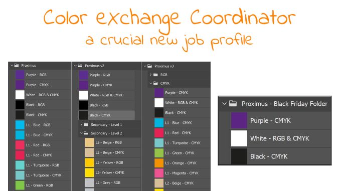
Initially, I had planned to write an article about two issues I spotted in Black Friday publicity folders I received last week. Two issues that could have easily been prevented with a little bit of education and using the tools we already have. But when I was almost ready, it became clear that one issue has a much broader scope, something we need to address in a novel way. And that’s where a new, crucial job profile comes in: the Color eXchange Coordinator (CxC)!
CONTENTS: Trapping | Not all black is designed equal… | A crucial new job profile: the CxC! | The Proximus Black Friday case | Why is this important?
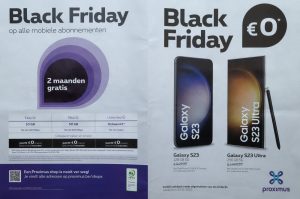
Black Friday is always a busy period for my mailbox, and in a few of the publicity folders I received, I spotted some errors that shouldn’t have happened. The first one was an issue with trapping, or better: the lack thereof. Which surprised me: didn’t we solve that, like ages ago? Why did this happen? Did someone forget to tick a box?

Not all black is designed equal…
The other was a more subtle error, most people probably wouldn’t notice it. But a color geek might. When I picked up that folder from my mailbox, I had the impression something was wrong. So, I took my loupe, and my gut feeling was confirmed: the different blacks in that folder were not the same colors! Even though they are part of the same design, probably made by the same designer, these were different colors. The text ‘Black Friday’ is in one occasion black (K) only, but in another composite black (CMYK)… I assume the designer must have used different definitions of ‘black’ for the different parts. Probably without knowing this would result in a slightly different black in print…
In case you’re unsure what I’m talking about, check out this article I wrote many years ago about not all blacks being designed equally.
A crucial new job profile: the CxC!
The big question now is how this could have been prevented. And it’s not that difficult: make the life of a designer easier. And that’s where a new, crucial job profile comes in: the Color eXchange Coordinator (CxC). This person, who should be a little tech savvy, could be a significant leap forward for design and brand color consistency in design. The person who now makes the technical briefing for design jobs, would probably be the best-placed person to become this CxC.
In the Project BBCG tutorial, I explain how you can easily exchange brand colors via ASE files (Adobe Swatch Exchange). This is a little gem in Adobe CC applications, which doesn’t get the attention and credit it deserves. Even other applications, like Affinity Designer, support this exchange format.
In the context of Project BBCG, it’s the complete set of brand colors that need to be exchanged. But you could also take a different approach: why not create project-based ASE files? So, with all – and only – the colors you need for a specific job, e.g., a Black Friday publicity folder… It doesn’t take that long to create such an ASE file. Uploading it into Adobe CC applications takes only a few seconds. And it will eliminate the need to search for specific colors in one or another library, or the need to define those colors over and over again.
Imagine what this could mean for designers! These creative minds don’t have to consider which color definitions to pick. It’s in that project swatch folder! There is no confusion possible anymore. And after having finished the job, they can delete it. When starting a new job, they import the next ASE file.
This would mean a significant increase in color consistency and probably significant time savings… Yes, you need to invest a little time creating and importing that ASE file, but designers don’t need to search for the right colors anymore. They are in that little swatchbook…
If a brand already has all its primary and secondary brand colors in a swatchbook, that could be the starting point: delete all the colors that are not necessary for that project and save the swatchbook under a different name, the name of that project. It’s probably just one minute of work…
The Proximus Black Friday case
The publicity folder I’m talking about is from Proximus, the largest telecommunication company in Belgium. And Proximus is an interesting case: their branding guidelines are publicly available.
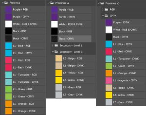
Proximus has 3 primary colors (Purple, White, and Black) plus 9 secondary colors grouped in 2 levels. All can used in 10% increments. Proximus has defined all these colors in different formats: HEX, RGB, CMYK, and, in some cases, RAL and Pantone. It would be complicated if you had all of these (without the tints) in one ASE file, one swatch library. The screenshots below show a few different possibilities to organize this, but in every case, it isn’t that easy…
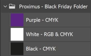
Let’s assume there is one ‘master’ ASE file, one ‘master’ swatch library, which includes all of these variations, as I showed in the example above. The CxC could create a project ASE file for the Black Friday folder, which would only contain the CMYK versions of the colors used: Purple, White, and Black. That would look like the screenshot below and would be extremely easy to use! The time needed to create such a project-based swatch library, when starting from a master ASE file, is less than a minute. And it will save time during design. It will prevent mistakes in design…
BTW: the CMYK version of Proximus black is 0 / 0 / 0 / 100. I assume that the designer used that CMYK definition for one part of the folder, but used the RGB definition (0 / 0 / 0) for other elements, which then got converted into composite black. The pictures below show the same text in different parts of the folder, left 100% K, right composite black.

When moving to project-based swatch folders, it will be essential to keep that swatches menu clean: project swatches should be deleted after a project has been finished, to eliminate confusion. Someone with scripting skills could easily create a script to delete all swatch libraries with one click (when a specific job has ended) and import an ASE file with another click. If you have created such scripts and shared them publicly, please notify me, and I will add them to this article and the Project BBCG website. UPDATE 04/12/2023: check out the first comment! This is the script I requested!
Why is this important?
Consistent brand color reproduction isn’t easy, and it starts with a consistent design. Having a Color eXchange Coordinator (CxC), who is responsible for providing everyone in the design phase with the appropriate color definitions, could prevent designers from picking a ‘wrong’ color. It’s not complicated, but we must be aware of this. Plus: it will save time in design.
As Project BBCG – A Better Brand Color Guide has shown, exchanging brand colors can be done in a rock-solid, straightforward way, with the tools you already have. The task of a CxC builds upon that, instead of exchanging all brand colors, colors are exchanged on a project base. It’s a little effort, with a big return.
PS: check out the discussion on LinkedIn!
PPS: my friend Henk Gianotten, who is not only a print expert, but also knows the design community very well, send me a message, emphasizing the importance of this topic. And he even created a logo to with the new CxC job profile!

Here is a video tutorial how you can create ASE files!
And another tutorial how to become the Color eXchange Coordinator!





Hello Eddy.
For your last request, I think you would find these links interesting:
The script : https://www.marspremedia.com/download?asset=adobe-script-tutorial-31.zip
The explanation on how it was built: https://www.youtube.com/watch?v=Nf7Tp10LsPs
All comes from the very prolific and clever William Campbell.
Thanks to him for such very useful scripts.
Best.
Wow! Great! Thx! 🙂