Brands are proud of their brand logo and their brand colors. They spend a lot of time and money to get that perfect logo. And a lot of time is spent on creating a brand guide. But then what? Do you share it publicly with the rest of the world? Or do you keep it close, only to those you think might need it? Let’s compare these options!
CONTENTS: One step ahead of counterfeiters! | Complete control is an illusion | If you don’t… | Why is this important?
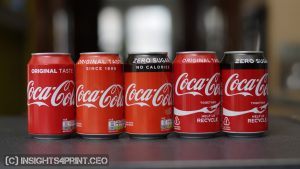
“There is no Pantone color for Coca-Cola red, but when you see it, you will recognize it”, that’s a famous quote from Coca-Cola. (here’s an archived version of that quote) It’s their second secret formula, that Coca-Cola red. But keeping that color a secret has a downside: over the years, I’ve seen very different variations of Coca-Cola red… Check out this article.
One step ahead of counterfeiters!
The main reason brands, like Coca-Cola, want to keep their brand color specification secret is to be one step ahead of counterfeiters. The reasoning is that consumers will recognize the ‘right’ red immediately, and counterfeiters will not be able to find the color definition of that right red.
Wrong, twice. Identifying a brand color is as easy as controlling the reproduction in print: use a spectrophotometer. Even if the original you want to measure is something round, there are special spectrophotometers to measure curved objects.
And identifying that ‘right’ red? Check the results of this test, where people were shown six variations of red and were asked to identify the right Coca-Cola red. The most popular one was NOT the ‘right’ one…
Complete control is an illusion
And then there is the illusion of complete control. As a brand owner, you may interact with the designers and printers where you order products. But that’s only a portion of occasions where your brand logo and colors are used. How many times is it also used in printed advertising where you are not the person ordering the ad? From high-quality glossy magazines, over newspapers, to the leaflet from a local event that a local distributor of your brand sponsors?
While the advertising in national magazines and newspapers might be in control of advertising agencies you work with directly, a lot of print will be designed and ordered without your knowledge. And that’s where making your logo, your brand color guide public, becomes essential: if you don’t publish it, you can get all kinds of wrong reproductions of your logo, your brand color.
If you don’t…
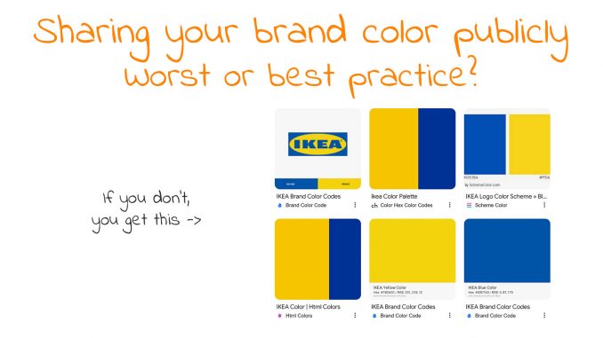
What happens if you don’t publish your brand color guide? People will look online and end up with websites claiming to have the codes of your precious brand color. Did you ever check these? Well, I did. Here are a few famous brand colors: Coca-Cola red, IKEA yellow, and blue. These are the first results when I search for ‘Coca-Cola red RGB’ and ‘IKEA brand colors RGB’.
Coca-Cola red
| Source | Pantone | RGB | CMYK |
| https://usbrandcolors.com/coca-cola-colors/ | Coke Red | 244 / 0 / 0 | 4 / 100 / 95 / 0 |
| https://encycolorpedia.com/fe001a | 254 / 0 /26 | ||
| https://www.schemecolor.com/coca-cola-red-color.php | 244 / 0 / 9 | 0 / 100 / 96,3 / 4,3 | |
| https://www.brandcolorcode.com/coke-zero | Custom mix | 244 / 0 / 0 | 4 / 100 / 95 /0 |
| https://brandpalettes.com/coca-cola-color-codes/ | 1788 C | 230 / 29 / 43 | 4 / 99 / 93 / 1 |
IKEA Yellow
| Source | Pantone | RGB | CMYK |
| https://www.designpieces.com/palette/ikea-color-palette-hex-and-rgb/ | 255 / 204 / 0 | ||
| https://www.brandcolorcode.com/ikea | 108 C | 251 / 218 / 12 | 0 / 13 / 95 / 2 |
| https://www.schemecolor.com/ikea.php | 255 / 218 / 26 | 0 / 14,5 / 89,8 / 0 | |
| https://brandpalettes.com/ikea-logo-color-codes/ | 107 C | 251 / 217 / 20 | 3 / 11 / 98 / 0 |
IKEA Blue
| Source | Pantone | RGB | CMYK |
| https://www.designpieces.com/palette/ikea-color-palette-hex-and-rgb/ | 0 / 51 / 153 | ||
| https://www.brandcolorcode.com/ikea | 2145 C | 0 / 87 / 173 | 100 / 50 / 0 / 32 |
| https://www.schemecolor.com/ikea.php | 0 / 81 / 186 | 100 / 56,4 / 0 / 27 | |
| https://brandpalettes.com/ikea-logo-color-codes/ | 7455 C | 0 / 88 / 171 | 95 / 71 / 0 / 0 |
And when you look at the images in the search results, that looks like this for IKEA… Not really consistent, isn’t it?
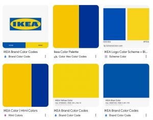
What do you think? Would you, as a brand owner be happy with this?
Why is this important?
If your brand color reproduction is essential to you, having different color codes online is something you definitely want to avoid. And that’s why you need to publish your brand color guide so that the correct color codes will be the first hit when someone looks for them. Your brand color guide will be the place to go when someone is looking for your brand color definition.
To make your brand color guide rock-solid and foolproof, check out Project BBCG – A Better Brand Color Guide!





Hi Eddie
Interesting as usually. Did any of the RGB and CMYK colour reference a ICC profile. They are meaning less without one.
Thx Paul!
And what do you guess… 😉
Rechecked every website that I mention in the article and no mention of an ICC profile (or profile). Not even the distinction between sRGB and AdobeRGB was mentioned….
Hello Eddy
In my opinion the CIELab values are the main source of information. The owner of the brand has to measure the values and publish them. As Paul mentioned it’s important how they obtained the CMYK values included the icc-profiles if based on sRGB. In a regular conversion with eci-profiles based on Fogra data a certain amount of GCR (Gray Component Replacement) is calculated. By increasing the GCR-amount and extending the amount of K a more stable color reproduction of brand colors is possible. It’s the responsability of the brand owner to mention why those tweaked CMYK values are different.
I agree with Henk.
A quick way to avoid confusion around reproduction of brand colours, while not making the instructions too technical is to simply issue their target LAB values.
If the brand colours are not media neutral, the target LAB values for each media must be released and made available.
CIE Lab is zeker een goed idee op voorwaarde dat de correcte viewing conditions ook vermeld worden. Als die niet bekend dan kan een verschil in viewing condition bij een wel bepaalde Lab nog steeds oorzaak zijn van een onbedoelde kleurverandering.
En zo staat het ook in Project BBCG (waar Henk aan meegewerkt heeft)!
Meer: https://www.projectbbcg.guide/
What a relatable blog post!
I was a graphic designer and switched to architectural color design. I was shocked to discover how antiquated color design workflows were – and still are.
For example, most believe colors have “undertones” and you have to “train your eye” to see them.
Just measure the color! The low cost hand-held instruments are a perfect fit for an architectural color design application.
No color math necessary. Just the basics are required – all you need to know is LCh. If you learn Munsell too, that’s a bonus that can prove helpful.
I tell people all the time that learning the basics of the CIELab color space and how to leverage the LCh notation takes a fraction of a fraction of the effort they expend trying to eyeball color – it’s unnecessary visual gymnastics.
Knowing how to measure color to understand its characteristics (among other things) is truly game-changing. And it’s fun to see the light bulb moment happen when someone does get it.
But my gosh, it can be a lot of work helping people see the light (pun intended). 🙂