
Earlier this week, I posted on LinkedIn why, according to me, designers might not be familiar with color spaces and document profiles. It generated a lot of discussion… Going from “designers should not be bothered with that” over “AI should solve this” to “this is mandatory basic knowledge”. What is clear is that we need a new, a different approach. So, here’s a proposal. What do you think?
CONTENTS: The basics | Current approach | Wizard-based approach | Why is this important?
Before diving into my proposal, let’s recap a few basics and the current approach.
Color spaces are needed, otherwise you are working blind. Check the example in this Project BBCG blog post. https://www.projectbbcg.guide/defining-brand-colors-in-rgb-is-meaningless/ Or do a little test: translate the word ‘MIST’ to English. To be able to do that, you need to know the language from which you need to translate. If you use a translation dictionary from Dutch (my native language) to English, it will state ‘FOG’. But if you use a translation dictionary from German to English, you will get something very different: ‘SHIT’, ‘DONG’, or ‘MANURE’. If you don’t believe me, check out the online Bing Translator (Google Translate seems to have censured itself on translating German to English). So, it is absolutely necessary to know what the RGB numbers of that color represent; otherwise, we are working blindly.
When doing color translations and starting with a limited color space (like sRGB, compared to AdobeRGB or DCI-P3, or an uncoated CMYK), you will lose color information, and getting the original color information back is difficult.
Current approach
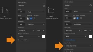
At this moment, when you start a new document in Adobe CC applications, that color space is hidden in the advanced options. That’s a bad idea. Yes, it might initially frighten designers when you show that color space, but it’s similar to a car rental company claiming the fuel type is an advanced option. And you don’t want that information hidden while going on a road trip…
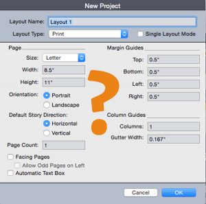
Based on the help information, in Quark Xpress, it seems you can’t even specify on a document level what the color spaces are. You need to go to the specific color management settings. But maybe I’m missing something, I’m not familiar with Quark Xpress anymore.
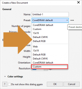
Corel Draw is similar to Adobe CC: it includes some presets, including ‘Default RGB’ and ‘Default CMYK’. Some designers might want to dive into what that ‘default’ is, but that’s probably only a tiny minority. We need to do better.
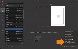
Affinity Designer and Publisher do a little better: their document setup screen does show the ICC profile used! But here, again, you need a basic knowledge of color management. And that has proven to be an issue.
A different, wizard-based approach
How can we tackle this, and at the same time also solve other issues with document setup?
Here’s my idea: a wizard-based document setup. I’ll walk you through it. Show you which questions should be asked, from my point of view. It’s a first proposal, kind of a 0.1 version. If I missed some things, please provide your input in the comment section! If you think it’s rubbish, please elaborate on your alternative to the current approach!
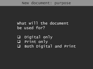
Step 1: What will the document be used for? Digital only / Print only / Both digital and print
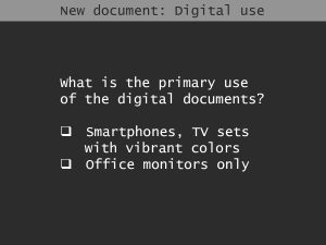
Step 2a (if ‘Digital only’ or ‘Both digital and print’ is selected): What is the primary use of the digital documents? Smartphones and TV sets (which can show very vivid colors)? Or only office monitors? These days, smartphones and TV sets have large gamuts, DCI-P3 seems to be the new standard for this kind of screen. When only office monitors, sRGB might be a better choice.
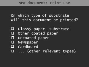
Step 2b (if ‘Print only’ or ‘Both digital and print’ is selected): On which type of substrate will this document be printed? A glossy paper or other kind of glossy substrate? Another type of coated paper? An uncoated paper? A newspaper? Based on this choice, the appropriate type of ICC profile could be selected in the background.
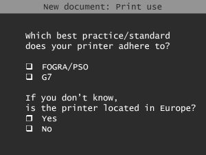
Step 3 (if ‘Print only’ or ‘Both digital and print’ is selected : Which best practice/standard does your printer adhere to? FOGRA or G7? If you don’t know, are you located in Europe? This is to distinguish between, e.g., PSO coated v3 and GRACoL CRPC6, based on geographical location. Maybe another question would be better to identiy whether the printer would use FOGRA-based or GRACoL-based profiles, but this was my first (an only) idea.
Step 4: The document size, orientation, … This is more or less the document setup information asked in current applications.
These questions are not only helpful for color settings. For example, when you know the document is (also) going to print, you know that it needs ‘bleed’. And if it has bleed, preflight or inline guidance, should check if that bleed is respected. So that wizard-based document setup could provide lots of information to correctly set up a document without the designer having deep technical knowledge… Wouldn’t that be great? And very helpful to prevent mistakes?
Why is this important?
The document setup is like the foundation of a building: if it’s not done correctly, the project will fail. At this moment, document setup is designed by people who know what is essential, and all the necessary options are in the document setup. But the average user does NOT have that knowledge, even though it is necessary. That’s why we need to change the document setup, to make decisions for the user, based on simple questions.
Dear Adobe, Quark, Corel, and Affinity, please check this. It should not be that hard to implement this kind of document setup. You would do the printing industry a HUGE favor.
PS: here is the discussion on LinkedIn for this article.




To complicate things a bit, regretfully several printers in Europe are printing to G7 standards and several printers in the USA are printing to Fogra standards – and other continents, say Asia have one or the other – the best have both (which in our global economy is of course the best idea – and no, it is not complicated at all with modern software and spectral measurement devices).
The best approach for designers imo is to ask their printshop to provide the settings they should use for each type of print job. Most printshops should be able to do this on a job-to-job basis. The designer then simply has to save the settings file/settings instructions in text format in the job folder to have everything under control and to avoid using the wrong settings for each job, even if he or she has to go back to that job a year or two later to do some edits. When there is a re-do of that type the designer should contact his contact person at the printshop and doublecheck if there have been any changes – a change of paper may trigger a change, so this is a good idea. This way the designer is able to softproof – and optionally hardproof on his or her end what the job should look like – and at the same time has put the responsibility of the outcome of the job on the shoulders of their printer and there is no guesswork. If the colours are visually incorrect, it will always be the fault of the printer and never the fault of the designer (unless he or she does not follow instructions – provided by the printshop – hmm yes or if they don’t have a properly calibrated display to preview the job).
Well, if designers would ask printers how to deal with things like settings or printing standards, we wouldn’t be having this discussion… They would set up new documents properly. But that’s not the case. That’s why we need a different approach, which does not depend on designers asking printers for their advice. BTW: I can imagine that when designers set up documents they have no clue yet where the documents will be printed.
And which profiles / printing standards, that’s not the topic of this article. First we have to agree on how we can get designers to set up documents properly, with the least effort from their side, which method would have the msot effect. Once we have that established, we can discuss on profiles / printing standards.
If the color settings file is correct for the work in hand and the blending space is set to Document CMYK then the document will be correctly colour managed for print.
If they are set correctly… But that seems to be the issue: designers, content creators are not familiar with that. Plus: Adobe CC applications hide the color in the advanced settings, Quark doesn’t even offer the option to specify it during document creation, it needs to be set in the color settings.
My opinion is close to yours. This is what I call the silo effect. Each side pretends it’s the other’s job. But we get in details, it often appears that nobody really knows because it assumes it should be to the others. It’s also, maybe unconsciously, a manner to not change anything. Blaming others than to understand why it fails. Whatever… It appears that the printing industry and the graphic design are more and more far way from each other. Who is to blame? Difficult to say. Printers? Graphic Designers? Consultants? “Experts”? Marketing matters?
What I mosts than ever agree however is that knowledge, training and sharing are more and more crucial rather than to be “AI”, “automation fir dummies” or “if”.
My two cents.
Great insights! Your proposal for a wizard-based document setup is a game-changer. Making color management more intuitive will bridge the gap between technical accuracy and user-friendliness. Excited to see how this evolves!
This is a brilliant and much-needed perspective! Simplifying document setup through a wizard-based approach would be a game-changer, ensuring designers make informed choices without getting lost in technicalities. Your proposal is insightful and well-structured—kudos for pushing the industry towards a smarter, more intuitive workflow.