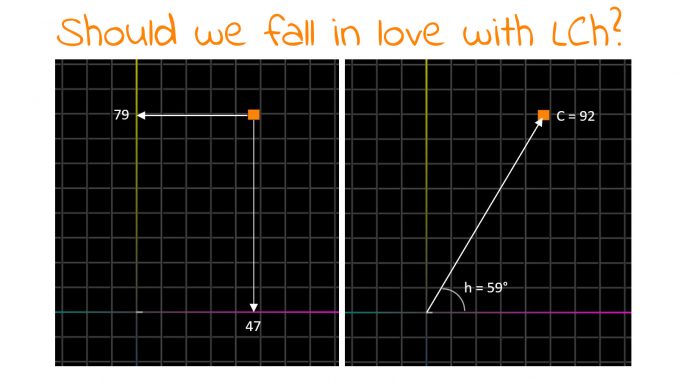
For as long as I can remember, the primary unambiguous, device-independent way to describe, define colors is in Lab (CIELAB, L*a*b*). But even after so many decades, I still struggle to ‘feel’ the a- and b-values… They are not intuitive to me. So, I wondered why we are using Lab, not its sibling LCh (CIELCh, L*C*h°). That one is much easier to interpret. Or maybe it’s too easy? Let’s dive in and check out why we should fall in love with LCh!
CONTENTS: Color science evolves | Hue-based color management: simple and solid | But… (the icky part) | Why is this important?
Color science is a science, which means it evolves over time, based on observations, experiments, and new theories. Which is why the way to describe, define colors has also changed over the ages. An old system that got renewed attention, due to a reprint), is ‘Traité des couleurs servant a la peinture a l’eau’ by A. Boogert (17th century). But there are also others like ‘Werner’s Nomenclature of Colours’ (1821).
But let’s jump to more scientific approaches. In 1931 the CIE (‘Comission International de l’Eclairage’, International Commission on Illumination) created the CIE 1931 XYZ color space. In 1976, CIELUV, a ‘simple-to-compute’ transformation of the CIEXYZ color space, was adopted by the CIE. Also in 1976, the CIELAB color space was defined, again based on CIEXYZ. And CIELCh is based on that CIELAB; it just uses different coordinates. (more on Wikipedia)
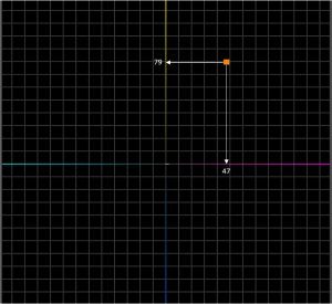
The three coordinates in CIELAB (for the rest of the article: Lab, to improve my typing speed) are L for lightness, which ranges from 0 (black) to 100 (white), ‘a’ for the green/magenta axis, and ‘b’ for the blue/yellow axis. On both the a- and b-axis, you can have values between -128 (green and blue) and 127 (magenta and yellow). (*) And that’s what’s difficult for me, and probably I’m not the only one: what kind of color is Lab 70 / 47 / 79? It’s rather light (the 70), but that 47 / 79, I really have to think hard, I don’t ‘feel’ it. Especially if I want to know whether it’s saturated or not.
(*) see the comment below from John Seymour: “You state that the range for a* and b* is -128 to +127. This is a good limit for practical purposes, but (under D50/2) a* can go as low as -16, and as high as about 120. For b*, the range is -130 to + 145.”
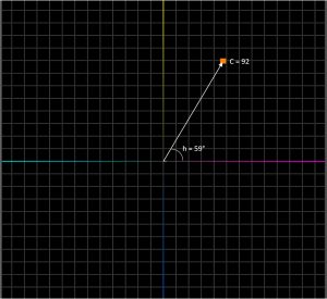
So, enter CIELCh… The L is the same: the lightness, ranging from 0 (black) to white (100). And then there is C, the Chroma: how ‘chromatic’ is the color? How ‘vibrant’, ‘saturated’ is that color? That ranges from 0 (grey) to 100 (very saturated). The h represents the hue angle on the color circle: red magenta = 0°, yellow = 90°, green = 180°, blue = 270°. And here is the difference with the H (capital letter) from HSL color space (which you can see in, e.g., Adobe Photoshop): that one is based on the additive primary colors: red = 0°, green = 120°, and blue = 240°.
Now, let’s take a second look at the color I used as an example. When converting Lab 70 / 47 / 79 to LCh, I get: 70 / 92 / 59. With a C of 92, that’s quite a saturated color! And with a hue angle of 59°, that’s between red magenta (0°) and yellow (90°), but closer to yellow, so that’s a nice orange. Woohoo! I couldn’t have figured this out that easily in Lab…
(corrections / strikethroughs: see comment from John Seymour below)
Hue-based color management: simple and solid
My lack of ‘getting’ Lab intuitively isn’t the only reason why I want to start this discussion. There might be a much more important one: color conversions. When converting from a larger (Adobe RGB) to a smaller color gamut (uncoated paper, or newsprint), you need to do something with the original colors, you need to adjust the colors to fit into that smaller gamut. Whether it is only the color outside the target gamut, or all colors (perceptual rendering intent), you need to do calculations on these. And in the past, I’ve seen things go wrong with these conversions – the most infamous: deep blues turning purple (see this article, and this one). Over the years, this has improved, but a different approach, based on LCh, might be much easier and more robust. Let me explain.
Which color deviations are the most visible? Changes in hue… So here’s an idea: do the color transformations not in Lab, but in LCh, and always keep the hue angle constant. Only work with the Chroma and, to a lesser extent, with the lightness. Simple, isn’t it?
But… (the icky part)
However, it’s not that simple… Lab and LCh have an issue. To quote John – The Math Guy – Seymour: they are icky. And this goes back a very long time. The problem is that XYZ, Lab, and LCh are based on color matching, not color perception. That might confuse you, but the essential part is that these color models don’t reflect how our eyes see colors or how the cones in our eyes work. John recently gave an excellent webinar for FTA (Flexographic Technical Association) on this topic. Do watch it! As you can expect from John, it’s a comprehensive but accessible history of these color models.
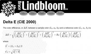
A practical consequence of the decision to make it based on color matching and not on color perception, is that if you keep the hue angle consistent but change the Chroma, you will perceive a shift in hue… Look at the ‘spiders graphs’ that John is showing in his presentation, you can see it in the preview above, the left image. In an ideal world, the same hue would be a straight line in Lab or LCh, but that’s not the case: they are curved. And that’s why you can get these bad blue-to-purple conversions. And also: that’s why the formula for delta E 2000 is such a monster. It’s pretty complicated, because it needs to adjust for the fact that Lab and LCH are not perception-based…
And all of this is not good. When you have a science-based color model, that should reflect how we see color (well, that’s my opinion). If you change a color but keep the hue angle stable, you should perceive this as a similar color (maybe a bit lighter, darker, or less saturated, but still the same family). When we would use LCh to define colors, try to explain to a non-specialist that you need to change the hue angle to keep variations of a brand color similar. Their head might explode. So, maybe it’s not that bad to use a less intuitive Lab…
Why is this important?
Color is extremely important in printing, it is probably the number 1 reason why jobs get rejected. So we must deal with it in a rock-solid, easy-to-understand way. And that’s where Lab and LCh are ‘icky’…
So, we must ask ourselves, isn’t it time to start from scratch and establish a ‘perfect’ Lab and a ‘perfect’ LCh, that conform to how we perceive colors? Much research has already been done on color and color perception, also outside the printing industry. Just check ‘color perception’ in Google Scholar, even in the last few days, several papers were added. John also mentions newer Lab color models in his webinar, although still not perfect.
We now have the tools and methodologies to do it right this time. And when we have that perfect Lab and LCh, I’m sure you will instantly fall in love with LCh. It’ll be the love of your life.
BTW: in preparation of this article, I asked a number of knowledgeable people, with a long history on color, why we are using Lab instead of LCh. Guess what: nobody seems to know…
PS: you can also join the conversation on LinkedIn!




And just as I have got used to thinking in Lab🤫
I’m sorry Paul! But: LCh is easier! 🙂
The change would cause a lot of work for the standards area. Would the advantages be worth the effort?
Moving from Lab to LCh is just a mathemetical conversion. Plus: in some ISO standards you already have tolerance for changes in hue. It wouldn’t be such a big update in my opinion.
Creating a ‘perfect Lab’ or ‘perfect LCh’, that will be a lot of work… But my gut feeling is that it would be worth the effort. It would make a lot of things easier and more intuitive. But again: that’s my opinion. Maybe I’m overlooking something.
BTW: if you don’t know it yet, here’s a plugin for Microsoft Excel that does all kinds of color conversions and color calculations (including conversion from Lab to LCh): https://rgbcmyk.com.ar/en/colortools-home/ It’s free, I’ve been using it now for some time.
I love the post, but there are a few corrections….
You state that the range for a* and b* is -128 to +127. This is a good limit for practical purposes, but (under D50/2) a* can go as low as -16, and as high as about 120. For b*, the range is -130 to + 145.
You also said that the positive a* axis (0 degrees in hue) is red. This is the lie that has been repeated until it has been accepted as true. Zero degrees of hue is magenta. True red is at around 30 degrees.
Thanks for pointing out the mistakes John! I’ll correct these.
And I should have known about that positive a*, I watched your webinar yesterday!