In the past few weeks, I’ve seen several ‘color games’ on LinkedIn. Although they are intended as a game, as fun, you might want to take a serious look at these. And dear printers, you might even want to integrate these into your daily production. Hear me out!
CONTENTS: The illustrious delta E | The first game: your color vision | The second game: delta E… | We need to talk… | Why is this important?
I have always wondered whether print buyers, designers, and brand owners know what delta E really is, how they should interpret a specific delta E.
Officially, a delta E of 1 is the smallest perceivable color difference. Clear, isn’t it? Well… not so fast… Obviously, this depends on your color vision and color discrimination, meaning it defers per person. But there are also other factors in play. The main one is the amount of light (lux)… If you have a lot of light, it’s easier to see minor differences than with a more limited amount of light. That’s why the ISO standard for viewing conditions (ISO 3664) has two conditions: P1 (2000 lux) and P2 (500 lux). The first one is used next to the printing press, where it is crucial to spot minor differences. P2 is a lighting condition that is more like everyday indoor light. Why this influence the abbility to see small color differences is due to the construction of our eyes: the rod and cones. The rods are much more light sensitive, but only see ‘grey’. To see color, the cones need to be activated. And being less sensitive, you will need a certain amount of light.
Remember that a property of light is that it decreases quadratically with increasing distance. So, for example, if a light has an intensity of 2000 lux at 1 meter, it will have an intensity of 500 lux at 2 meters (2000 / (2×2)) and only 222 lux at 3 meters (2000 / (3×3)). To bring that to day-to-day life, the top of the shelves in a supermarket will have a lot more light than the bottom shelves. Ergo, spotting color differences will be much more challenging at the lower shelves…
Oh, BTW, as a person, your color vision is not ‘fixed’, it deviates, and not only by aging. I saw one person perform the Techkon Color Game twice. The first time, he scored just over 60, the second time, it was around 30. And you can train your color vision. Plus, psychology is also at play, as shown in this study. If you want to have a repeatable evaluation of color, you need an instrument, a spectrophotometer. And you need to calibrate that spectrophotometer on a regular basis.
Also, how you place colors next to each other makes a difference. If two color patches touch, it will be easy to spot a difference. Adding a small space between them, will make it much more difficult. E.g., the X-Rite Hue Test had no border around the colors in the first version, piece of cake! I had a perfect score, in no time. But shortly after, they made a small change: they added a small black border. And then it became much more difficult…
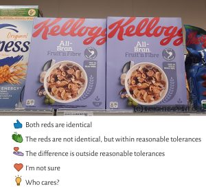
And something that most people tend to forget: the real world isn’t flat. In real life, e.g., packages on a shelf are not in the same plane. They can be twisted, tilted a little bit, making the light fall on them slightly differently, resulting in a different color perception. Check out the picture below. These packages are identical, but the left is tilted backward. When I consulted the wisdom of the crowd (a test on LinkedIn), half of the people said the difference was out of tolerance! This blew my mind…
The first game: your color vision
The reason why I like this first test is that you can evaluate your color vision in a fast and easy way. Please note that this test also has two important messages at the start screen: calibrate your monitor and check for color blindness. Especially the calibration is crucial.
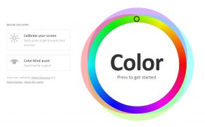
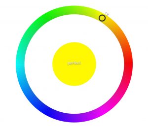
The test is relatively simple: you see a color in the center, and you need to go around the color circle to find the exact match. You will also see the color from the circle in the middle while the clock is counting down. In this test, the colors are touching, making it a bit easier. In the second game, that is not the case.
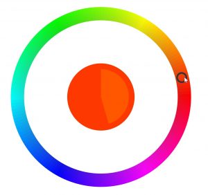
Once you select your pick, you will get a score. And this is where it become relevant: if this isn’t ‘perfect’ or ‘very good’, you should not do a visual evaluation of print jobs. And that’s why I like this test: if you only focus on the Hue part, it’s a very short, very effective test to check someone’s color vision. E.g., those print buyers, designers, brand owners that still wants to do visual press checks, because they know better… Let them do this test first! They should not be allowed to do a visual press check if they don’t have a perfect or very good score.
Oh, in case you feel stressed while performing this test because there is a timer and the time is limited, please keep in mind how much time we are looking at a package in a supermarket… Test with eye-tracking devices have shown this is very limited: usually less than 2 seconds, Coca-Cola red only one-tenth of a second! More about that in this article.
The second game: delta E…
Shortly after that first game, Techkon USA launched their own version. What is interesting about their version is that it calculates the color deviation between the color you picked and the reference. And that’s great: this will give you a feeling of what that illustrious delta E really means. For the record, there are also different formulas to calculate a delta E, so you should specify which delta E is used. In print, we use delta E 2000 or dE00 in short. That’s the one Techkon is using in its color game.
Also interesting about the Techkon Color Game is that it isn’t about abstract colors: they are using ‘real life’ examples, being: famous brands and products. That way, you really get a feeling of what color reproduction is.
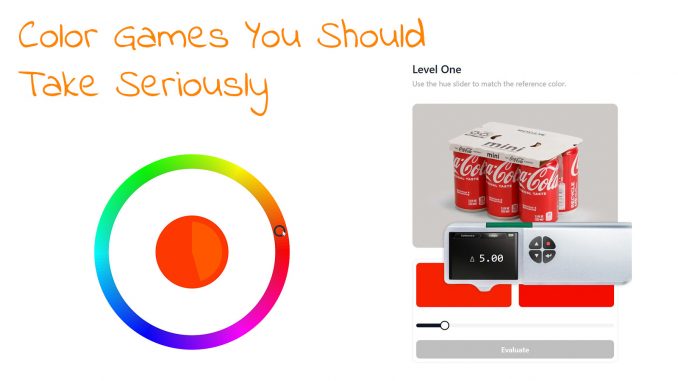
The test works with different levels. In Level One, you have only one variable (slider) to pick your color (Hue). As you can see in the picture below, my choice of Coca-Cola red wasn’t quite correct…
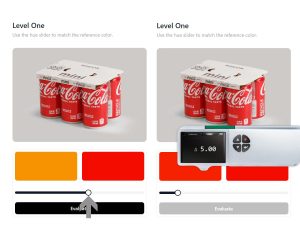
There is no time limitation, it’s when you hit the Evaluate button that you will get your score.
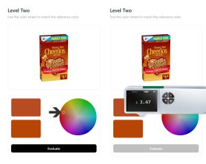
In Level Two, you will have two variables (Hue and Saturation), and you must pick the combination of both via a color circle. The saturation increases the further you are away from the center. Having to pick the right color in that circle is already much more challenging than just using that hue slider in Level One.
In Level Three, you will have all three variables: Hue, Saturation, and Lightness. When you do the test, you will notice that it becomes more and more complex every time a variable is added…
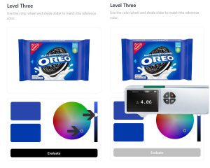
The first time I did the test, in the first stage, I always had a score below 2 dE00 (the screenshots above are from a second try). But when adding the extra variables, it became much more complex, often picking a color that was around 4 dE00, or even higher… And I was convinced I had picked an identical or very close to identical color every time!
This test really shows the value of these delta E numbers. And why tiny differences won’t matter. And, dear printer, that’s why you should consider integrating this in the ‘press check workflow’: let customers that demand press checks or who are very picky about do these two tests. First, check whether their color vision is sufficient (the first test) and then let them experience the value of a certain dE number (the Techkon test). At least some print buyers should get a better understanding of color deviations and become more realistic. That’s why I’m sharing this. But maybe I’m a bit too optimistic…
For the record, in my first test, I scored just below 40 (39,53 to be precise, and smaller is better). With some 150 people that had participated then, I was – as usual – average. Now, please note that the people who participated are probably print or color-focused people, not the average person, the average shopper. People who don’t focus on color might have more difficulties performing this test: the ‘highest’ score at the moment of writing is 1103,74. The 50 worst results are all above 500. The lowest score, with over 1000 people listed in the ‘leaderboard’ (which is optional), is an amazing 3,69. Wow!

In case you wonder what that score represents, it’s the sum of the delta E in each test. So, with 5 tests at every level, my average was 2,6 dE00.
As I mentioned before, you can train your color vision. That’s why people in the printing industry, especially those controlling a printing press, probably have better color vision than the average supermarket visitor.
Even then, it is not constant; it can still vary. I saw one person doing the test twice. He had over 60 the first time, and the second time, he was just below 30.
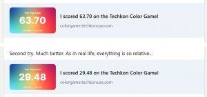
I also performed the test several times, my score was always between 35 and 40.
We need to talk…
Dear printer, brand owner, print buyer, designer, we need to talk. Seriously.
With over 1000 participants who decided to add their results to the ‘leaderboard‘, probably the majority of them having a color-related job like in printing or print buying, the median is somewhere around 30 (my 39,53 is just below the middle position). A 30 score corresponds to a 2 dE00 on average on each test. Please think about that for a moment…
And now consider that:
- someone involved in printing
- who is used to looking at, and evaluating color
- who took the time to take the test (there is no time limitation in this test)
- with a reference shown close to the color that the participant was mixing
thought that a color that is 2 dE00 from the target was a perfect match (the goal of the Techkon Color Game)
And please now explain to me why someone:
- who is not trained in (critical) color evaluation,
- who probably has never heard about the claimed importance of exact brand color reproduction,
- on a time constraint (eye-tracking tests have shown the ‘Total Fixation Duration’ while shopping is below 2 seconds, sometimes only 1/10th),
- in a case where the ‘exact’ brand color has to be recalled from memory (no visual reference next to it, and people can’t even recall the most iconic color in the world from memory),
- and in a real-world situation where the light might fall slightly differently on adjacent packages (resulting in a different color perception),
would let a tiny color difference like 2 dE00 influence their perception of a brand, leave the package on the shelf, and quit the brand as the preferred brand.
Can you explain this to me, please?
Oh, BTW, noticing a color difference is just that: you notice a color difference. And that does not mean this color difference is disturbing, and even more: it does not mean this will influence buying behaviour, as shown in a part of this test.
The ‘tiny color deviations will damage brand image’ myth was introduced decades ago by color consultants wanting to make money, and further promoted by companies that sell tools and services for color control. It’s based on the false interpretation of studies that showed that the use of color – compared to black and white only – improves brand recognition. That study, nor any other, has shown that tiny deviations in brand color reproduction influence buying behavior. On the contrary: there are studies showing consumers are quite tolerant towards deviations in brand color reproduction.
So, isn’t it time we end the 1 or 2 dE00 madness for packaging/labels and general/commercial printing and just all adhere to the ISO standards? These have reasonable tolerances: within reach of every printer with proper equipment and skilled people, and probably not even visible to most consumers. And certainly not damaging business. And let’s just use the color tools that are available to have a decent brand color specification – not one that looks different every year, but a rock-solid way like Project BBCG promotes – and use the measurement and control tools to measure and control print production. But not for a race to the bottom: a zero dE.
(added 01/09/2024: here’s a list of all the published ISO standards that were developed by TC 130 – Graphic technology)
BTW: yesterday, one of my LinkedIn friends told the anecdote of a customer of a friend of a colleague (so, yes, third degree information), who was complaining about a 0,5 dE00! That’s completely nuts. There is absolutely no justification for such silly complaints. It’s just a power game, someone wanting to feel important.
Why is this important?
Color is THE most critical quality parameter in print. With print buyers and brand owners demanding tighter and tighter tolerances, a 2 dE00 tolerance is often mentioned. But what does that 2 dE00 mean? The Techkon Color Game makes it tangible. It may be intended as a game, but it does have a practical purpose: giving people an idea of what those numbers represent AND showing how difficult it can be to get two colors within a tight tolerance.
And the first test checks the most critical parameter when evaluating the visual color: can you see color differences correctly? People who don’t succeed in that one, should not be allowed to do visual color evaluations. Period.
PS: someone questioned the Techkon Color Game on LinkedIn. When he checked the reference and the color he mixed with a color picker, it showed two identical RGB values, but the game still showed a dE00 that was above zero. Techkon explained in a comment how the color game actually works and what happened.
And in case you didn’t know: you can have two different Lab values that, when transforming them into sRGB will get the same RGB values. E.g., the following Lab values, which are nearly 0,6 dE00 apart, will become identical when converted to sRGB: 75 / 1,5 / 50 and 75 / 1 / 50,3. Both result in 208 / 182 / 89… It took me a less than a minute to find these combinations.



Hey Eddy
I ended up with a score of 33 – which means my average dE00 is about 2, – which happens to be the MAX dE00 allowed by many brands for colour production, – since a dE00 of 2 basically means that most people will not notice the colour difference.
What does “adhere to ISO standards” mean? I think this would just make it more complicated for everyone in the production cycle to understand what is expected.
There is no ISO brand colour palette available and you cannot print PMS 185 to ISO standards for instance, – since PMS 185 is made up from proprietary Pantone inks, – and it changes radically depending on the substrate (compare PMS 185 C to PMS 185 U) – which is not useful for any brand really.
However, there is one brand colour palette that DOES adhere to ISO standards, ISO 12647 to be exact, where the colours remain completely correct if you just follow instructions and use the universal standards sRGB for online viewing and the PSO or G7 icc profiles for CMYK printing on any substrate.
In this case it would make more sense to say “adhere to SMS standards”, since this brand colour palette is called the Spot Matching System and the colours are referred to as SMS colours for short. Adhering to SMS standards does not require anyone to adhere to ISO standards and in fact ISO standards do not cover colour production in all industries.
The SMS system contains over 5.200 brand colours and each individual colour has it’s own CIELAB value that remains the same, no matter for what purpose you use the colour – for the web (sRGB – which is the format in which the colour palettes are delivered to designers and users), for Television (Rec. 709) or for Fogra 39, Fogra 51, Fogra 47, Fogra 52, CRPC3, CRPC6 or even for newspaper printing (ECO palette only – consisting of 1.738 colours) or for product design of any kind.
SMS standards are slightly different, depending on what you are doing but in general you can get your SMS READY certification if you are able to print or simply reproduce SMS colours within a dE00 of 3 or less, regardless of your industry. Each printer or manufacturer simply does his best, prints our test colours and then reports his outcome and what dE00 they achieved and what MAX dE00 they are willing to commit to.
If they are way off – and say that this is a printshop, the best advise I can give them is to contact either a Fogra or G7 Expert and to have their process certified.
That will put them in the ballpark of an SMS READY certification and their colours will at least no longer be all over the place. However it is important to understand that even if a Fogra, Ugra or G7 ISO 12647 certification means that you can print to those standards, the primary focus in this case is on consistent printing of photographs. But if you are printing SMS brand colours in CMYK along with the photographs, that is a totally different thing and the printer must keep his densities and his TVI considerably closer to their targets than the ISO 12647 standard dictates/recommends.
For instance allowing a difference of 8% (+/-4) for the 50% fulcrum might be ok if you are just printing photos, – BUT if you are printing solid colours – and this solid colour just happens to be what the customer is focused on – say if this is his SMS brand colour, then you are out of luck, since the dE00 of the colour could be as much as 6 or 7 (just guessing here) if the dotgain of the press units is all over the place. Fortunately these days there are systems such as the Rutherford, InkZone and MeasureColor “closed-loop) systems that enable printers to keep their densities and dotgains in check from job to job.
In conclusion. In my opinion the best and the easiest way for brands to tell their manufacturers and their printers what they want is to use the dE00. Each brand manager can then simply check the brand colours with a spectro and compare the colour to the reference SMS brand colour – or whatever colour they are using.
A dE00 or 3 or less is ok for most brands, a dE00 of 2 or less is very good and a dE of 1 or less is perfect – regardless of the process.
Ingi, there are multiple ISO standards than can be relevant. It’s not just ISO 12647, which is a set of multiple standards (9 to be precise), there is also ISO 15339-2. Plus a whole bunch of ISO standards for different parts of the complete process, that’s why I use ‘ISO standards’ in general.
Adhering to ISO standards would make life much easier, that’s why all kinds of units and measurements are standardized. BTW: these ISO standards are developed by a large group of industry professionals, who take the time to discuss what it should look like. There are very good reasons why the standards are what they are, that’s why we should adhere to these standards. Including the color deviations that are part of the different parts of ISO 12647 e.g.
The 2 dE00, I’m sorry, but there is absolutely no justification why that should be the tolerance for print. You can only notice this if you are a trained color professional, under sufficient light, with enough time to judge, with the reference and sample in the same plane and within a close distance, preferably even touching. In other conditions (no trained eye, in a supermarket, with packages not touching, not in the same plane, under light conditions that are not optimal and with a limited time to look at it: less than 2 seconds), so: real life, people won’t notice. And if they would notice: it’s due to the lighting conditions: see my example of the Kelloggs boxes in the article.
The 2 dE00 tolerance was invented by people who wanted to make a living selling color consulting. Brand owners were eager to pick it up to put pressure on their printers. I would love to see picky brand owners do the color game!
BTW: your SMS system limites brand owners in their choices: the gamut of sRGB is in the cyan/green region smaller than CMYK (PSO coated v3). And most TV sets, even most monitors these days also have a gamut larger than sRGB. When using a brand color specified by SMS on a new OLED tv set, that brand color might look dull. Is that what brand owners want, a color that looks dull on a screen?
All colour ordering systems in the world have a limited number of colours. Some are more subtle/natural while others are more vibrant.
It should not be the goal of professional designers to always pick the most vibrant colour for any brand, though I don’t blame children for picking only the most vibrant colours.
The advantage of using SMS colours rather than other colour ordering systems – Pantone, NCS, HKS, RAL or whatever is that if you decide to use SMS colours for your brand, you can rest assured that your brand colours should always look the same – regardless of where you see them – regardless of media, substrate or industry.
The reason is that they are restricted by the colour gamuts we use for our media. I personally see this as an advantage if you happen to be a professional designer picking out colours for any industrial application.
It is a bit odd that you are criticizing the Spot Matching System for its limited gamut while at the same time you are advocating for ISO standards.
What limits the size of the SMS colour gamuts are in fact colour gamuts that are based on current ISO standards.
This is why you can for instance proof all SMS colours on a certified proof according to ISO 12647-7, which you cannot do with colours from other colour ordering systems or random colours that you measure with your spectro.
Ingi, ISO standards permit the use of spot colors, which can be very vibrant. You eliminate that possiblity, you only think in CMYK, which is only a part of printing. Packaging and labels is still largely spot colors.
That’s why Project BBCG has a better approach: measure the color you picked, from a color guide, from a print job, from an object, and use that measurement as primary brand color specification and work from there for specific applications.
BTW, just checked, there are 118 published ISO standards from TC 130, the technical comittee for the printing industry: https://www.iso.org/committee/52214/x/catalogue/p/1/u/0/w/0/d/0
Hey Eddy
I admit that when I developed the Spot Matching System, I did not have in mind to take over the packaging and label industry. Between you and me, I honestly don’t care if Cocoa Puffs packaging is printed with SMS colours or something else – but since I regularly have Cheerios, it looks like their packaging is printed in CMYK
My primary focus was – and still is, to offer a colour palette suited for logo design and corporate identities of companies and institutions. What is additionally super cool is the fact that if you use SMS colours for – say clothes, you can market those clothes in their correct colours – online and in standard CMYK. I am sure you understand how practical that is – compared to using colours that canNOT be marketed in their actual colours. But anyway..
I am not saying that ISO is against colours that are especially vibrant. Neither am I. I love vibrant colours and printed a lot of vibrant Pantone Neons etc. back in the day.
I am just saying that they are not very practical if you are picking out a colour for your a serious brand, because you will almost never see them if you do (because they cannot be correctly reproduced, except when you mix them and print them on coated paper as a spot colour).
Sure, you can measure a random colour you like from a flat surface with you spectro and then cross check it against existing colour matching systems for the various purposes as you propose with your Project BBCG.
This is actually what I also recommend and what is taught in our step-by-step training – https://www.spot-nordic.com/sms/gettingstarted/SMS_Do_It_Yourself_05.2024.pdf – at the end where the user can locate the closest Pantone colours, if Pantone spot colours are required.
However, I recommend people do both – invest in a copy of the SMS colour palettes (EUR 90 each) and then use their spectro to locate the closest SMS colour, which covers both print (CMYK for both coated and uncoated paper), web and TV, – rather than wasting time trying to define their brand with colours from various systems and CMYK values for each individual papertype and print standard (where the SMS sRGB colours can be converted to any print standard you need at any time).
The SMS Standard v6 library is even built into the TECHKON SpectroDens and our SMS READY Expert training instrument – ColorMeter Exact to make it as easy as pie to locate the closest SMS Standard colour.
The Spot Matching System is an attempt to simplify and streamline things for designers Eddy and having over 5.000 colours at your fingertip that remain absolutely the same for all media is about as simple as it gets.
But if designers prefer to use Pantone colours or random colours that they measure to then look for the closest Pantone colour for coated paper and then the closest Pantone colour for uncoated paper, and then the closest web colour and TV colour) etc… – no problem. To each his own.
Best regards
Ingi
The MAX dE00 is simply an easy way for even amateurs in colour management to tell their printers and manufacturers to keep their colours correct – no matter what.
A printshop that prints to ISO standards can still print brand colours with a dE00 of 5 or more – which is of course not acceptable for demanding brands that care about their brand colours.
Ingi, ISO standards do use maximum dE00 tolerances, for specific processes, for process colors, for spot colors. You should be aware of that. ISO 15339 even has even multiple levels, depending on the type of work, the customer demands.
That is good.
The way I see it, printing to ISO standards is (should be) the basic requirement.
It is like that the primary condition, if you want to compete in the English Premier League, you need to have at least 11 players and all 11 must know how to play football.
But then when the players are up against other teams and all those teams will have players that may be better and may be worse at playing football than they are and usually the better team will win the game – like for instance- my team Liverpool will most likely win the game today against Man Utd.
The dE that a printshop is willing to commit to, tells you how GOOD they are at printing.
For a brand owner to set his own dE00 for his brand colours, simply seeds out the printers and manufacturers that are not up to the task. That is anyway how I see it Eddy.
And never forget – You will never walk alone.
Best regards
Ingi