

While walking through the aisles in a supermarket recently, I noticed these nice Bahlsen packages, four different types of products/designs nicely aligned in a row. And I wondered how close the Bahlsen blue would be, especially given the different background in one of them. So, just for testing purposes, I bought two packages: the milk and dark chocolate cookies. And I used them for a test on LinkedIn, to consult the wisdom of the crowd. With some unexpected results… The cookie monsters have spoken!
CONTENTS: Perfect print quality | The results | But that 2%! | That other number… | But all those studies! | Some interesting studies | For the record | Why is this important?
A few weeks ago, I had again a heavy discussion on tolerances for brand color reproduction. With someone claiming brand colors must be within a 2 dE00 tolerance, otherwise, it will hurt the brand image, and it will impact sales. He admitted he couldn’t prove that larger deviations would have a negative impact, it just has to be like that. I disagree, strongly, based on multiple studies, tests and observations.
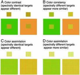
So, I was happy to run into those Bahlsen packages a few days later. They are a fascinating case: they have a more premium-looking design and perfect print quality. However, the design is different: the milk chocolate has a light blue background, and the dark chocolate has no background. In the shop, I had the impression that the blue of the logo was different, but I was aware that the light blue background might be messing with my color vision and my brain. Color contrast/color constancy is something many people are not familiar with, although the effects are significant. A perfect spectral match might look different, while different colors might look identical, as shown in the examples below.
Back home, I immediately took my Nix Spectro 2 to measure it. And I was amazed by the result… I measured two different spots in both packages, in the letters B and N, and compared the blues in those spots. Guess what: both comparisons were below 1 dE00! I had not expected that: they looked different to me! My brain ‘sees’ color differences. But spectrophotometer says ‘no’ — no noticeable color differences.

So, I had to put this online and consult the ‘wisdom of the crowd’, the cookie monsters on LinkedIn.
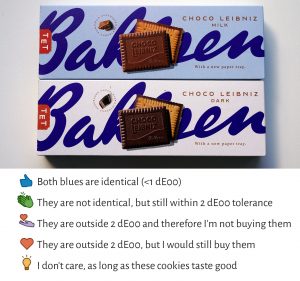
The poll on LinkedIn had the following options:
- Both blues are identical (< 1dE00)
- They are not identical, but still within 2 dE00 tolerance
- They are outside 2 dE00 and therefore I’m not buying them
- They are outside 2 dE00, but I would still buy them
- I don’t care, as long as these cookies taste good
About an hour after posting the poll, I already had a completely unexpected result: that person I had that fierce discussion with about the necessity of tiny tolerances when reproducing brand colors had picked the last option: “I don’t care, as long as these cookies taste good.” I was flabbergasted! Think about it: someone who, on other occasions, is a firm proponent of tiny tolerances for brand color reproduction (2 dE00 max) now said he didn’t care about it. Wow! This is almost unreal… It was probably his relaxed ‘Saturday morning brain’, that reacted, not his busy ‘weekday brain’.
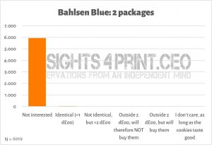
The results
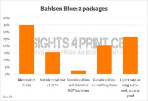
But let’s look at the complete results, not just that anecdote. Just over 34% said the two are ‘identical’, which was the right option. 15% claimed it’s between 1 and 2 dE00 (close, but incorrect). 20% detected a color difference above 2 dE00, but they will still buy the cookies. And 26% said they don’t care about the color as long as the cookies taste good. That’s significant: when combining the last two options, almost half of the respondents (46%) said that they would buy the cookies, even if they saw a color difference over 2 dE00, or they didn’t care at all about the color of the package.

Eventually, a few people picked “They are outside 2 dE00 and therefore I’m not buying them”. It took 4 days and over 75 votes before someone selected this answer. Please note: their assessment was wrong, the colors were NOT outside 2 dE00. Please remember this, I will get back to it later.
There was also one person that hit ‘Funny’, which wasn’t an option, but he wanted to express his feelings about the test. He is an expert in ‘imaging technology from the color and spectral point of view’. So: someone who knows all the details about color. And he finds this topic funny. Think about that.
But that 2%!
I can hear you: those 2,4% that claimed they would not buy it, that’s a significant number when you look at the total sales of a product! If you have 1 million euro in sales, that’s 24.000 euro you are losing!
Yes, but there is a flaw in that reasoning: these packages were perfect, with less than 1 dE00 color difference. And still they claimed they would not buy them.
So, if the myth that (the perception of) differences in brand color reproduction would hurt sales is true, these two respondents show that even with a perfect brand color reproduction – like this Bahlsen blue – you will still lose sales. Because our eyes are not a spectrophotometer… These two respondents claimed to see a larger than 2 dE00 color difference, they consciously picked the option. If they act the same in real life, you just can’t get the situation right. What are you supposed to do if people reject a perfect package? Please, enlighten me!
And why did they pick that option? Either because the background messed with their color vision/brain, or because they were triggered to select that option. Because they are professionals, or because they wanted to have ‘a good score’ on the test. And guess what? One of them is a packaging business developer. He probably tells his (potential) customers the story that ‘bad’ brand color reproduction will hurt sales and that his company can deliver perfect quality. He just had to pick that one…
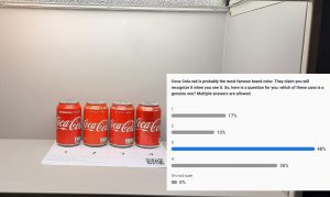
And that’s what is difficult, or even wrong, with this kind of study: it is very easy to get biased results. ‘Priming’ and ‘framing’, both concepts from ‘behavioral economics’, are very real. I showed that some time ago with regular cans of Coca-Cola at an AGFA / ECO3 event… Many said only one can was legit, the rest not. They were overthinking my question, the setting. They were using System 2 of their brain, not System 1 (the one you use while shopping). (LinkedIn post which includes description of the test)
The same is true in this test with the Bahlsen cookies: just the fact that I showed the picture of the two packages and asked to look at that blue made respondents more critical than they are during shopping. While shopping, System 1 of our brain, the fast one, is active, and it acts like this: blue = Bahlsen = buy it!
And that’s why you need to observe shopping behavior. Guess what: I’ve done that on several occasions. There are a lot of articles on ‘Brand Colors IRL’ (in real life) on my blog. The first was on Kellogg’s (part 1, part 2, part 3), which triggered someone I know to state that Milka would never tolerate the differences I showed in Kellogg’s packages. Which made me buy Milka products. Guess what: rather large deviations. My contact, who used to be involved in the production of the artwork for those Milka packages, couldn’t believe his eyes. And there is, of course, my collection of Coca-Cola cans. With these examples as the most prominent ones. The extremes were bought in a time frame of only a few months. Did it impact sales? Probably not, there was no recall action or mention on the news or FAQ page of Coca-Cola Belgium…
That other number…
Now, you could argue that the ones that picked the option that they were identical (the correct answer), might not buy it when it deviates. Fair point, that’s maybe a flaw in this test. But there is still another number we have to look at, a very important one… A number to put everything into the full perspective.
And that number is the total of LinkedIn members I have reached. It should be considered part of this test: these people saw my post in their feed, and they saw the image and the question. And guess what: most decided not to participate, because it’s something they are not familiar with or are not interested in. But beware: all those LinkedIn members are consumers, 100% of them, that’s why we should include that number. The fact that the large majority was not interested in participating shows this discussion isn’t relevant to them and isn’t a part of their life. It’s a ‘printing industry bubble’ topic. The 2 dE00 myth does not live outside that bubble.
One week after posting the poll, the total number of members I reached with this post past the 6000 mark… Only 1,4% considered this topic important enough to participate by hitting a button, the rest didn’t care about this topic. That’s 98,6% of the potential respondents that said: this is not for me, this isn’t part of my life.

And if we include that number in test results, it becomes overwhelming: people don’t care about this kind of topic, or discussion. You can’t even see the results of the other options in that graph…
But all those studies!
Yes, once again, somebody stated that a package that looks different will not be sold. He was firm about that claim. But when I asked to show a study confirming this, he stayed silent. Like every other discussion I had over the past decade on this topic. Many claim there are all those studies confirming the necessity of small tolerances, but they always fail to show me even one study that comes even close to this claim.
If they have one, it’s always on the use of color versus the use of no color (so: black & white). Yes, the use of color versus no color is important, that might impact sales. But that’s on color versus no color. It’s not on tiny deviations like 2 dE00.
There are studies showing that picking the ‘right’ color is important, brown will not be a good color for cleaning products, but it is for chocolate brands. But again, these studies are not on tiny tolerances. E.g., look at this research paper on ‘The Value of Color Research in Brand Strategy‘. It shows that color (versus no color) is used for product identification and carry a meaning. But you will not find any information about printing, tolerances in print, color deviations from the ‘ideal’ color, nor delta E.
Even more important, the studies out there show exactly the opposite, or that our color memory fails.
Some interesting studies
A survey with consumers showed the conditions when people are disloyal to their favorite brand: when it’s out of stock or when another brand has promotions. Not when ‘it looks a bit different’. It’s about product quality and price for FMCG products, not about a tiny tolerance in print.
Fun fact: I repeated that question last year, during a FOGRA Colour Management Café. Not one of the few dozen participants, which included people from X-Rite/Pantone, picked that option! By focusing on brand loyalty and rephrasing the color deviations issue – “It looks a bit different” instead of “The brand color is outside 2 dE00” – they were caught off guard, and their true feelings were revealed: it doesn’t matter.
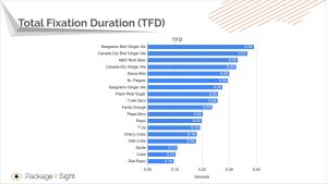
Tests with eye tracking devices have shown that in a supermarket setting, people only have a very short interaction time with packages: less than 2 seconds ‘total fixation duration’. You can’t judge color properly in this time frame. Plus, given this limited time, another part of our brain is active (System 1), compared to doing a press check (System 2). BTW: the total fixation duration of Coca-Cola cans was one-tenth of a second. Only the blink of an eye…
Our color memory is bad, multiple studies have shown this (study 1 and study 2). Even the most iconic color – Coca-Cola red – can’t be remembered correctly. The most popular color in this test was not the right one…
And then there is the fact that the real world isn’t flat, like the table of a press console. A slightly different placement will influence lighting and therefore color.
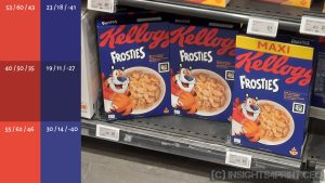
By the way, talking about the print bubble, here’s an interesting one: almost 1 out of 3 ‘print professionals’ claimed to see a color difference between two identical flat copies. Why? Psychology. They were asked if they noticed a color difference, and being professionals, they had to see a difference. Even if there was none. And that’s also one of the issues with many surveys and tests: questions creating a bias. If you ask people if they think color is important, they will probably say it is. Why would you otherwise ask it? By the way, when looking at the second part of that test, with folded boxes, it was about 2 out of 3 that claimed to see color differences between the identical copies. As I already mentioned: the real world, the one outside the press room, isn’t flat… But our brain will compensate for color differences like in the image below. Our brain says: Kellogg’s = red.
For the record
And as I stated many times before, I’m not advocating bad print quality. Print quality should be good and consistent. And printers should take pride in their work and use the tools that are available to produce good print quality. However, print quality is not only about (tiny) color deviations, there are also other aspects. For example, look at the package below; this should have never been used. I hesitated a long time before buying this one: it looks like someone spoiled a chemical on it. And even knowing that the bars are also individually packed (and therefore protected), I still hesitated to buy them. In the end, I bought them to use as an example of print issues.
When talking about tolerances, the applicable ISO standards (like the ISO 12647 series and ISO 15339), have good tolerances. Within reach for every skilled printer with decent equipment. And deviations that are probably not even visible for a consumer while shopping: remember: the total fixation duration is less than 2 seconds!
By the way, getting back to the less than 1 dE00 deviation in the Bahlsen packages, there is a good reason for this quality: the blue is printed as a spot color. Which is more expensive, but easier to get within tiny tolerances. Another interesting observation is the chocolate’s color, which is very good. Why? The black ink was switched to brown ink… Again, a more expensive, but safe choice. In case you didn’t know, printing chocolate with regular CMYK is challenging. Even small changes in one of the colors (CMY) could result in a brown that doesn’t look very tasteful… That’s why the black is often replaced by brown ink.
Why is this important?
There is no evidence at all for the claim that a small deviation (< 2 dE00) would hurt brand image and impact sales. What I showed with this test on LinkedIn is that the large majority doesn’t even care to look at this ‘issue’, and from that 1,4 % that did care enough to share an opinion, only 2 picked the option that the deviation was above 2 dE00 and therefore they would not buy it (even though the packages were identical!). Even better: nearly half of them said they either noticed a 2 dE00 difference but would still buy it, or didn’t even care at all about it, as long as the cookies taste great. It’s about product quality and price, not about a tiny tolerance in package printing.
The myth that tiny color deviations would hurt brands was invented by color consultants who wanted to make money. And it’s based on a wrong interpretation of studies from the newspaper industry, showing that the use of color – compared to not using color at all – enhances brand recognition. Even after a decade of asking people who defend the tiny tolerances to show me the proof, I still didn’t see ANY study that would confirm this. But I do have studies showing the opposite… And not just tests I designed myself. Also tests by others. So, it’s time to call the myth busted and end the 2 dE00 madness.
And dear FMCG brand owners, if you still think your brand is so special that it does need tiny tolerances in print, accept the conditions and pay a premium price for it. A 2 dE00 tolerance is NOT the default for packaging & labels and commercial printing. It’s a premium. You have to put your money where your mouth is.
PS: Three decades ago, tolerances were broader because of the limitations of the technology used. So, if a 3 or 4 dE00 didn’t hurt sales then, why would it hurt sales now? Please, enlighten me…
UPDATE 19/10/2024: something interesting has happened! There is currently a real-life experiment which will show the real influence of color difference in sales. Oreo is in the process of updating its logo AND brand color! Although the new brand color is still in the same color category (vibrant blue), the difference is just over 10 dE00… Will Oreo sales plummet? Read all about it in this article, which includes many images to assess the change in brand color.


Be the first to comment