

It’s probably – or even better: certainly – not intentional, but Oreo is running the most extensive real-life study on print quality. Why, you might ask. Well: they changed their logo, including the logo color, the brand color. It might look like a subtle change, but the new brand color is about 10 dE00 off the previous one. So, if the old ‘truth’ that color differences in packages will impact sales, Oreo sales should be plummeting right now. Old and new versions are being used jointly in several supermarkets I visited. Some products have the old logo and color, some the new… Let’s check it out!
CONTENTS: Chinese Oreo | The other little experiment | The ‘icky’ part, again… | Why is this important? | Updates
A few weeks ago, I went to the Chinese supermarket, a short bike ride from home. To shop for some Chinese specialties. But when I was in the shop, I noticed they also had Chinese varieties of Oreo… And those packages didn’t look like the Oreo packages I remembered from my ‘regular’ shops. So, I bought one, obviously. To put it next to a Belgian one and write a nice article about it.
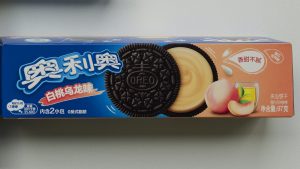
But when I put it next to the regular Oreo I bought in a Belgian shop (Delhaize) a few days later, I was in for a surprise! These blues were not that different… My color memory had failed on me, once again. (as an excuse: I’m not an Oreo addict, I otherwise never buy it) Now, that’s not something special: several academic studies have already come to the same conclusion. I’ve covered a few in two articles before (article one, article two).
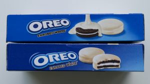
When looking a bit closer, I was in for a second surprise: I had bought two varieties of Oreo in the Belgian shop. Next to the regular one also the ‘Enrobed White’. And guess what: not only did these have a different ‘brand color’, also the logo had changed! I didn’t notice that while shopping! I did take some time – at least half a minute – before I noticed it, it’s a subtle change.
In case you haven’t read this article yet, during shopping, ‘System 1’ of our brain is active. It’s fast but inaccurate: blue = Oreo = buy! But when at home, ‘System 2’ was activated, the one that is slow but accurate. The one you are using when judging color in a printing company, when comparing proofs with print jobs… Next to that System 1 and System 2, there is also a newer theory called ‘predictive processing’. This explains that the brain and our senses are not bottom up (senses feeding the brain), but more a top down approach, where the brain makes a ‘prediction’ of what you will see / sense, and uses as little sensory data as possible to confirm (or reject) the prediction. This approach will save energy, by not usnig the full set of data, but only just enough to confirm it’s Oreo. More about that theory in this article.
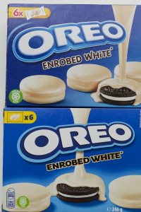
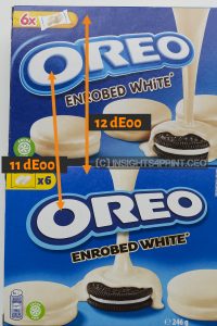
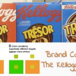
After finally noticing that the logo had changed, I went to another supermarket close to my home (Jumbo) and bought multiple other Oreo packages. And there I noticed that the ‘Enrobed white’ logo differed from the package in the first supermarket! Plus the fact that the different versions of the logo were used next to each other. And it’s not just the logo that went from a ‘3D’ version to a ‘flat’ version. Also, the signature color in the logo went from a medium blue to a dark blue. When I returned home I checked the color difference with my Nix Spectro 2: over 10 dE00. That’s a lot more than the maximum tolerances many brand owners demand because they believe they would lose sales with higher deviations.
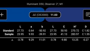
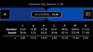
So, here we have two versions of the Oreo logo AND Oreo brand colors in the same supermarket, on the same shelves. With a rather different color, over 10 dE00, that’s something no brand owner or print buyer would accept. My brain immediately said: this is an exciting experiment! Will this 10 dE00 difference impact sales, as some color consultants and vendors offering color tools tell us all the time? I can’t wait to see the Oreo sales numbers from 2024 and compare them to 2023!
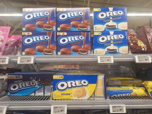
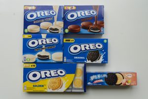
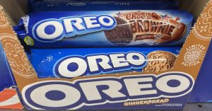
Here’s an overview of all the packages I bought.
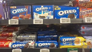
And here are some details from the ‘new’ (flat logo) and ‘old’ packages.
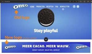
Interesting side note: when I was looking for information on the change in logo, I noticed that the EU website has the two different logos on the same page! In the header, it’s the old one; in the lower part, the new one…
The other little experiment
I recently also ran a smaller, but related experiment on LinkedIn. One about AB InBev that had launched a new pilsner beer – or to be correct: the reincarnation of an old one – but didn’t spend any money on publicity and marketing, except a press release. I asked LinkedIn whether this could work, launching a product without marketing and publicity. To show what I was talking about, I added a picture of two six-packs, plus a can from one of them. I happened to have bought the six-packs in two different stores with a few days difference, and when I put the second in the refrigerator, I not only noticed that I already had a six-pack in there (forgot about that…) but also that the blue brand color was quite different! Plus, the color of the cans also differed from the foil, keeping the six-pack together.
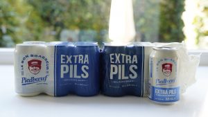
Although almost 300 LinkedIn members viewed my post, only one person was commenting on those different colors (the usual suspect 😉 ). Also one other person – with a packaging background – commented, but that was about the marketing strategy, not about the colors. And that was what I wanted to find out: since I only talked about a successful product launch and marketing and publicity, NOT about color, I wondered how many people would notice and comment on those color differences. Well, just one…
BTW: a few days later, I noticed in one of the supermarkets (Delhaize) that there is also a difference between the 33 cl and 50 cl packs…

The ‘icky’ part, again…
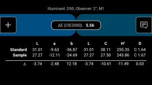
For the record: I also measured the color difference in the Piedboeuf foils, and I was surprised it was only just above 5 dE00, while it looks very different to me. And this brings us back again to the ‘icky’ part of our current color models. I have seen color differences around 5 dE00 that looked much ‘closer’, but this is in my perception a huge difference, but when measured, it’s also only 5 dE00… That’s half of the color difference in the Oreo examples above! Is that your preception, that the difference between these blues is half of the one in the Oreo samples? It’s certainly not my perception… it’s much bigger.
The clever color scientist should address this. Having an ‘icky’ model on which we base everything is not a good idea. If you build a house, you want the foundation to be rock-solid.
If you have no idea what this ‘icky’ is I’m talking about, please check out this video by John – the Math Guy – Seymour. Very enlightening!
Why is this important?
For decades some people in the industry have been telling us that brand color reproduction should be very consistent and within tiny margins. Because larger color differences would impact sales. And that’s obviously something no brand owner wants!
With this change in the Oreo logo and brand color, we now have a real-life experiment that will show whether this is true. Or that it’s just baseless fear-mongering, intended to sell color-related services and tools…
If there is no significant impact in Oreo sales in a year, despite the 10 dE00 change in brand color, we can bury that claim – or should I say: an urban legend?– once and for all. Why? Because it is hurting printing companies. If brand owners want premium quality, they should be willing to pay a premium price. Not come up with an unfounded claim that ‘it needs to be like that’ because it would otherwise hurt their sales.
BTW: over the years the Oreo logo has changed significant. Did you know it used to be red? And cyan?
PS 1: I visit one of the shops (Jumbo) a few times a week, and the rotation of Oreo packages is quite high. There are no Oreo’s left behind, not even with this 10 dE00 color difference…
PS2: For the record, as I explained many times before: I’m not promoting bad print quality, absolutely not! But there is no basis for tiny tolerances,. The tolerances specified in the applicable ISO standards and ‘best practices’ like PSO/PSD and G7 have decent tolerances and are within reach for every printing company with decent equipment and skilled operators. Let’s stick to those and not engage in a race to the bottom: demanding ever smaller delta E’s.
UPDATE 20/10/2024: Also in Finland Oreo is rolling out the new logo design. Check out the picture below by dr. Kai Lankinen (the packaging and ECG specialist)! For the record: the two different versions were not in the same display, one of them was on the shelves, Kai put them together in the display to be able to compare them.

I have been in the print packaging business for three decades and print quality is a very important process that helps many businesses make good decisions on there brands. Printing can very for many reasons and standards help control not only the color, but the printing processes. Presses can very for many reasons, age, type, ink, water and many other consumable used in the process. Quality is Paramount! I have a solution for OREO if there interested.
Thx for your comment Cline, but I think you misread the article: it was Oreo themselves who decided to change their brand color, this 10 dE00 color difference is NOT a printing problem. It is a DELIBERATE choice by Oreo. And if they make such a choice deliberately, it means that small deviations would not impact sales, otherwise they would not have made such a change.
I started in the printing industry in 1988 and I’ve seen many examples in FMCG that clearly show tiny tolerances don’t make a difference. It’s a print bubble thing. But that being said: I’m not promoting bad print quality, we should adhere to the tolerances specified in the applicable ISO standards and best practices like FOGRA PSO/PSD and IDEAlliance G7. These are within reach for every printing company with decent equipment and skilled operators.
hey Eddy,
thank you for writing this up. I think, you mix a few things up here. Of course, the brand owners always want their colors to be as exactly, as possible. But usually they accept a dE of < 3. At least it's like that in Europe. The definition of dE is solely for contract fulfillment.
Then it depends on the printing method the packaging is produced with. It's not a very big problem for Gravure and Planographic Printing (Offset) to reproduce dE < 3, if the house standard is well thought. It's different with Flexo, which is the biggest packaging printing method in the western world. In Asia it's Gravure.. Even having a well thought house standard, there's quite a lot can go wrong with Flexo in the print.
As I experienced, from the view of flexography, the US market is all about product and less about quality of the packaging (f.e. the flexographic plates sold by the plate makers DuPont/Kodak/ Flint in the US are "cheapier" than their european counterparts. Also, the US press operators aren't that much educated in flexo like f.e. the germans. Which makes me wonder, as FIRST is really well defined and thoughtful on this giving hints on what to keep an eye onto for press operators. ). The Europe is keen to see good packing quality and good product quality. The Asian are more about the quality of packaging and less the product (to certain extent, of course).
You're right. that customers won't accept bad printing qualities and this will impact the numbers. But for this, the (printing) quality must be really bad for a lot of packages. Actually, for a LOT and this consistently.
With bad quality I mean bad register and other printing faults (but not dot gain or color deviation).
Deviation in colors won't even be noticed, if there's nothing to compare with put side-by-side 🙂
Our color brain just remember the color, but not the exact one. One experiment I witnessed, helped and constructed, was with the coca cola red. The students have produced a variety of coca cola red.. more yellowish, more cyan or more magenta, etc . they produced 16 different labels (white OPP) , placed them side by side with an original label and let the audience of a few hundreds choose what it thinks the coca cola red is. No one has chosen the proper (original) label with the proper coca cola red. It was a kind of an eye opener for me, leading to conclusion: we can't remember the exact color, so it's not a problem having high dE – as long all products in the display shelf are off the same batch. Instead, we're exactly remember the shape of the logo or "the structure".
So, having a redesign of the layout and of the logo rather point the consumer into the direction "it's a new alternation/product" and not into thinking "it's a bad quality, because color is different".
Then, among 20 bottles of coke with plastic label out of the shelf, we measured dE of 7-10 (depending on reference). The dE of plastic vs. paper label was about 16 measured with polfilter set. Also, the same results are measured with a sphere spectrometer with/without catch hole.
Out of curiosity, how did you do the measurements/which settings or, may be, what device?
Last but not least:
If it's me, I choose dE(76) for such tasks, because it calculates the pure mathematical distance in the gamut. All the other dE methods are invented by the press operators, who can't or are not willing to reproduce the colors and so need some explanation like "you can't perceive the difference in yellow, so we don't need to reproduce it exactly anyway " 🙂
always go for the unmasked truth hahah
Have a nice day!
Thanks for your thoughts Anton!
But I think you misread some of my points. I think color differences will NOT impact sales, contrary to popular believe (pushed by people making money in the industry by selling products and services related to color consistency). I’ve seen and published many cases that show real life is different from a press room, e.g. the fact that packages are placed in a 3-dimensional environment, not in a 2-dimensional as the control table of a printing press.
Yes, there can be differences between processes, that’s why I always refer to the applicable ISO standards, not just a ‘general’ color consistency claim.
It’s been a while since I travelled to the USA, but I can remember the first time (when I visited RIT, in 1999), when I was astonished how bad print quality sometimes was, e.g. the magazines and flyers in the hotel. That quality was not acceptable in Belgium. But I did see it improve over the years (last visit was in 2014).
Interesting experiment with that Coca-Cola red! And it is similar to my test: https://www.insights4print.ceo/2022/07/399-iconic-color-memory-tests-some-interesting-conclusions/
On delta E: dE 76 is a more ‘straightforward’ (or: easier) formula, but the ‘update’ to dE 2000 has a very good reason (and it has nothing to do with printers making up some kind of excuses): the CIELab color space is perceptually not evenly distributed. Meaning: the same dE76 number can perceptually be much larger in one color region than in another. That’s why the industry moved to dE 2000 (dE00 in short). But even that one is not perfect. Check out the video by John ‘The Math Guy’ Seymour I included in the article. The ‘tolera&nce ellipses’ clearly show the issue.
The measurements: I did include the device (Nix Spectro 2), the screenshots show the settings D50, 2°, M1. What isn’t mentioned: these were always 3 measurments and these were averaged.