

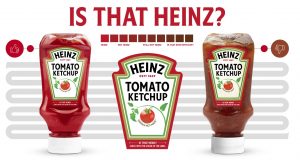
The ‘Label of Truth’ from Heinz and Pantone is going around on LinkedIn again. With raving reviews. Everybody loves it! Genius! Except that it’s seriously flawed and, therefore, a big fail. Pantone should have known this. And, by the way, there are no ‘easy’ solutions to combat counterfeiting.
CONTENTS: A 5-second reality check… | Counterfeiters are not stupid | Metamerism… | Why is this important?
To be honest, I have no idea how big the ‘issue’ of counterfeit ketchup is. But if we can believe the reasoning behind the Label of Truth, Heinz ketchup is ‘often’ replaced by cheaper ketchup in restaurants. When the ‘real’ bottle is empty, it’s being refilled with a cheap ‘rip-off’. And that’s something you want to avoid as a brand. You’re losing money, AND you might be losing customers: that rip-off ketchup probably does not have the excellent Heinz taste, but since it comes in a Heinz bottle, people might stop buying Heinz for themselves and switch to another premium brand. So far, I agree.
So, how do you prevent restaurant owners from putting another ketchup in that bottle and pretending it’s Heinz? That’s where a marketing agency came in. They had a simple, but genial idea! The cheap rip-off ketchup often has a darker, more brownish color, so let’s put a color checker on the label! If the color of the ketchup is the same as the color of the label, it’s Heinz. Simple, but genial, isn’t it?
You can see the full commercial here.
A 5-second reality check…
It might seem a bright idea, but let me take you to the supermarket I visit often. Look at the picture below: there is regular Heinz ketchup, Heinz Zero, and some smaller bottles of regular Heinz. All genuine Heinz bottles. I immediately noticed that the color of the Heinz Zero is much lighter than the regular one. And from experience, I know the Heinz Bio is darker (and the taste is also so much more intense, I will never buy regular again, highly recommended the Bio Heinz!). Look at those smaller bottles; the ketchup in those also looks a bit darker than the larger bottle.
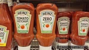
Conclusion: the color of the different Heinz varieties is not the same kind of red. Maybe due to the recipe, although I learned last year that they also add colorants to the ketchup to keep the color consistent (which is something I preferred not to know).
So here is an important question: how will the Label of Truth deal with that? With different varieties having different colors?
They could create different labels for the different varieties, which could confuse consumers: the color of Truth being different??? I can imagine people losing trust over that…
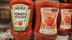
And, let’s be honest: check out the color of (cheaper) house-brand ketchup, it’s not that different from the real Heinz. Below is a picture from last year, when I first saw the Label of Truth. The Jumbo house brand is very close to the Heinz ketchup, much closer than the Heinz Bio ketchup…
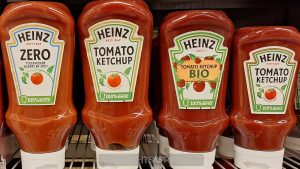
During another visit to the same supermarket, I put the Zero, Regular, Bio plus a smaller bottle of Regular Heinz next to each other, perfectly aligned.
Counterfeiters are not stupid
When companies, especially FMCG, are confronted with counterfeiting, they are often looking for easy solutions. Some people claim that the exact reproduction of that unique brand color will combat counterfeiting. But, sorry I have to say, that’s just silly.
Counterfeiters do dumb things, but they are not stupid. They are clever – in a bad way – and competent. They can buy the same equipment and materials any other company can buy. And that ‘special’ brand color? It only takes a spectrophotometer to measure it and get the ‘recipe’, making it easy to reproduce within tight tolerances. These days, you can get a decent, reliable spectrophotometer for less than 1000 euros. That’s an investment counterfeiters certainly want to make.
Only if you go to very specialized inks, foils, or substrates, it will get more challenging to counterfeit. But that comes at a price… Probably not something you want to use for FMCG packaging… But you might want to use it for more expensive or very important stuff.
Security printing is a very different game. A part of the industry with a lot of secrecy and strict rules. If you look at a banknote – the best-known security printing product – you will detect several security features. But those are only the ‘overt’ ones… There are also ‘covert’ ones. And most, if not all, of these covert features are not known by the general public, you need to be involved in the security printing world to know what to look for to detect these features.
And that’s one of the issues with introducing security features that need to gain the general public’s trust: they need to know what those features are and how to check them. But if the general public knows this, can check this, the counterfeiters can also do this. And they might be able to reverse-engineer it and copy it…
Metamerism…
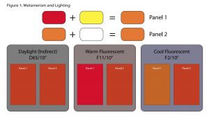
Back to the Label of Truth! Why I called it a big fail, is due to a very annoying aspect of color: metamerism. In case you don’t know what this is, a metameric pair are two colors that look identical under one lighting condition but different under another. Which might surprise you, but it is real.
And it’s something that happened quite often in the early days of inkjet proofing: the proof and printed sheet looked identical under D50 lighting (the one you can see next to the printing press), but looked different in, e.g., office light… Spooky… And a challenge to avoid this.
Metamerism is the Achilles heel of the Heinz Label of Truth: since the ketchup and the ink on the label are made from very different materials, they might act differently under different light conditions. In the press room, they might look identical, but not in the candlelight of a restaurant. Or in your fridge.
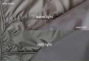
If this is still too abstract, take a look at the picture below. This shows two parts of a winter coat I once had. While in the shop (with a ‘warmer’ light), the colors of both fabrics look similar (brown), but that wasn’t the case anymore when I looked at them in a ‘colder’ light source… the inner coat turned green…
And this can happen with all kinds of colors, here is an interesting example from paint manufacturar Coloraid, showing two paints which look identical under one light source, but different under another.

And in a technical bulletin, ‘architectural coatings’ company Diamond Vogel shows what can happen to the color red, depending on the composition.
Metamerism is something most people in the printing industry know, certainly the real color experts. But it seems that the team that invented the Label of Truth didn’t include anybody with that knowledge. Or the rest of the team chose to ignore that voice, since it was too critical on that fantastic idea and therefore limiting creativity. Which results in a very flawed concept. I bet the Heinz bottles with a Label of Truth will experience metamerism in some lighting and that this will impact consumer confidence in Heinz
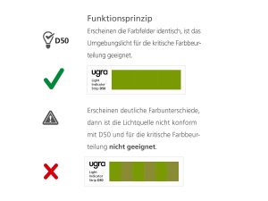
BTW: that metamerism can also be used as a feature to check whether you are checking colors under the ‘right’ light source (D50 for the printing industry). Here are two examples that you can buy, which only show one color when the right lighting condition is used, but will show different blocks when another light soures is used.

Why is this important?
It might look like a genial idea, just look at the raving LinkedIn posts, but the Label of Truth is fundamentally flawed. Metamerism will happen in some lighting conditions, leading to discussions about counterfeiting over perfect ketchup. Resulting in a loss of trust. Resulting in a loss of sales.
And pointing customers to the color of the ketchup and inviting them to judge it, with the label as the reference, could also lead to overcritical responses and rejection of perfect ketchup. Just ask any printer who has customers with no prior printing education doing press checks. They are also overcritical and sometimes reject decent print jobs.
The Label of Truth was only used in Türkiye, and only for a limited time. And there is probably a good reason for that: it doesn’t work. I wouldn’t be surprised if it even had a negative impact on sales instead of a positive.
UPDATE 24/10/2024: To have an idea about the size of counterfeiting, these are the latest numbers from Interpol: 91 million euro seized in the past year. And please note: this includes EXPIRED food.

Recently I pondered the color of ketchup, and other bright red tomato products, because I saw it as an impossible color to achieve naturally and using tomatoes at home would create sauces with an orange color. I don’t know why coloring isn’t in the ingredients and I guess they are barely willing to admit they use coloring, I don’t know how you found out but rarely is it discussed and some people adamantly defend that they don’t use coloring. Otherwise I don’t really care about ketchup brands, it is not my favorite sauce, but apparently even people who think Heinz is best don’t really know the difference either if it is so easily replaced in a bottle.