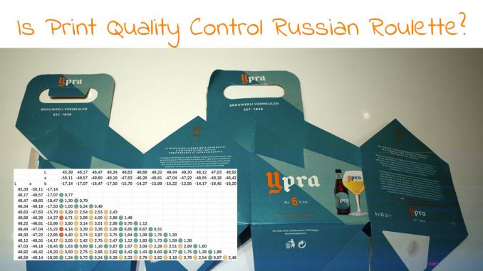
There are certainly people who are inclined to say that I need to get a life: as a kind of distraction, I recently put my spectrophotometer on different spots of one single package. Who would do that??? And why??? Well, I have to admit that I was a bit bored when I did that, but it turned into a surprise. I did expect some deviations within that package, but some spots were even >4dE00 from others! Wow! And, in case you wonder, that is my life: trying to understand print quality in all its aspects. Not just parroting the ‘obvious truths’ that some experts repeat over and over again, without providing any proof for those claims.
CONTENTS: An abundance of variables… | Russian roulette | Why these deviations? | The difference | My digital stamps | Why is this important?
It might look straightforward: color. But it isn’t, absolutely not. E.g., let’s look at the reproduction of color in print. You have the ink, a mixture of multiple chemical elements. The substrate, composed of layers of different materials, might look like a smooth surface, but when closely looking at paper and cardboard, that’s certainly not the case. You have the printing machines, those beasts have variables. In the press room even temperature and relative humidity can play a role. And when talking about offset printing, there’s also the fountain solution which has variables, with the water as one of the important and maybe even most underestimated ones – don’t get me started on water quality!
If you think reproduction on a screen is that much easier, it isn’t. What’s the gamut (meaning: color capabilities) of the screen you are using to read these words? When was the last time you calibrated it?
And if you look at print, do the conditions always conform to ISO 3664? Probably not. The color temperature of light sources varies, even the color temperature of sunlight! It depends on your location, day of the year, hour of the day. And the weather: sunny versus cloudy does make a difference. And no brand owner will ever control the sunlight, nor the light in my fridge! Never, I assure you!
Even you, as a human being, have variables: the lens in our eyes tends to turn more yellow over the years. And a certain percent of humans have cone deficiencies: they are ‘color blind’.
A last variable: color itself isn’t straightforward… Recent research shows that a color isn’t a finite point in a 3-dimensional color space. It’s more like a cloud, like an atom, which doesn’t have clear boundaries. Check out this LinkedIn post by Jan Morovic, one of the top color scientists on Earth, probably in the universe.

And even with all these variables and uncertainties, there are still people who are advocating, demanding tiny tolerances in print. “Because small deviations will hurt sales.” Still, after years of searching and asking, I still haven’t seen ANY proof that this is true. Au contraire, my friends! My blog is full of examples of color deviations that didn’t impact sales. And to show an example, the last study I was shown as ‘proof’, is this one.
The following quote from that manuscript was used as proof that small tolerances are needed: “Colour is perhaps the single most important element (or feature) as far as the design of multisensory product packaging is concerned. […] Indeed, colour can be an important, controllable marketing variable for managing image standardization because a product’s colour can function not only as an immediate identifier of its brand but also its quality and price.” But this only states that color in general is important, it DOES NOT state that color reproduction should be within tiny tolerances. That’s the interpretation of someone involved in printing, and probably selling color-related services and products. I checked the entire manuscript, and deviations in color reproduction were NOT part of it. I even contacted the author of the study. He replied that ‘color’ in his research should be interpreted in a broad way, like color categories. And he concluded: “I haven’t come across anything focusing on exactness of shade mattering.” So: any claim that this study shows that color reproduction should be within tiny tolerances is UNFOUNDED.
But let’s get back to the topic of this blog post: is quality control Russian roulette?
Russian roulette
So, my boring measurements involved a greenish 4-pack of a nice Belgian beer. I measured 13 different spots with my Nix Spectro 2, 3 measurements per spot averaged, D50, 2°, M1. When comparing all these values, the largest deviations are above 4 dE00! But visually I hadn’t notices any issues with the color!
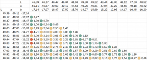
BTW: I compared the measurements in Excel, with the excellent ColorTools add-in, which is free… The color encoding used is green for values below 2 dE00, orange between 2 and 4 dE00, and red above 4 dE00
To be sure, I bought a second 4-pack of that beer. (notice how devoted I am… 😉) And I checked 15 different spots. Guess what: it’s consistent, again deviations over 4 dE00…
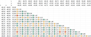
So, here we have two packages that look nice. But when using a 2 dE00 tolerance, it would depend on WHERE I measure whether it would be within or outside that 2 dE00 tolerance… And guess what: in most cases, only the control strip is measured… Only those few spots on that large sheet, or wide web…
When I posted this on LinkedIn, someone from a press manufacturer said they now have inline, in-sheet control options. It might look nice at first sight, but there is a big danger with that… And that’s the topic for my next post.
Why these deviations?
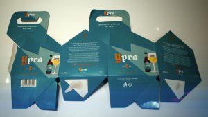
You probably want to know where these deviations came from. A brief look with a loupe (left part of the image below) and a USB microscope (3 images on the right) immediately shows the issue…
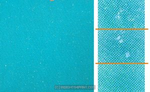
I asked my friends dr. Kai Lankinen and Henk Gianotten to take a look at these and tell me what went wrong. Mottling, they both said. I’m only a bit familiar with mottling, I wasn’t aware of the fact that it could, on a very local scale, be responsible for dots entirely disappearing.
Mottling can occur in offset, gravure, and digital printing. In offset, it can have many causes. One of them is the surface structure of the substrate, which can – on a microscopical scale – be quite roughin the case of paper, cardboard, and similar substrates. And since it’s that rough surface of the substrate that is the root cause, here’s something important: you can’t influence that surface during printing. It’s the result of the paper production process.
You might want to check my LinkedIn post and the feedback from specialists to know more about the possible causes of this mottling or other problems that might lead to this kind of image.
And dr. Kai Lankinen also consulted ChatGPT, this is the feedback from that AI engine:
“From the image of the offset-printed paperboard you provided, the printing appears uneven, which could be attributed to several common issues in offset printing. Here’s an analysis and possible fixes:
1) Ink Transfer Issues: Uneven ink distribution may result from improper transfer between rollers, blanket, and substrate, causing patchy printing.
2) Substrate Surface: Uneven or coated substrate surfaces can lead to inconsistent ink absorption. Paper dust or debris may also interfere.
3) Blanket Cylinder Issues: A worn, dirty, or improperly tensioned blanket can cause uneven contact with the substrate.
4) Pressure Settings: Inconsistent nip pressure between the blanket and impression cylinder can result in uneven printing.
5) Moisture Control: Incorrect dampening settings can cause ink adhesion issues. Too much moisture repels ink; too little causes scumming.
6) Ink Formulation: Ink viscosity or tackiness might not be optimized for the substrate, leading to poor transfer.
Recommended Fixes:
1) Check and Adjust Ink Distribution: Ensure ink is balanced across rollers. Clean and recalibrate if needed.
2) Inspect the Substrate: Verify paperboard surface for uniformity and cleanliness. Clean if dust or debris is present.
3) Maintain the Blanket Cylinder: Inspect for damage, wear, or dirt. Replace or clean as needed. Ensure proper tension.
4) Calibrate Pressure Settings: Recalibrate pressure between blanket and impression cylinders for even contact.
5) Optimize Moisture Levels: Adjust dampening system for correct water-ink balance. Excessive water repels ink.
6) Check Ink Properties: Evaluate ink viscosity and tack. Adjust or use a different formulation suited for the substrate.
7) Conduct Regular Maintenance: Regularly clean and maintain all press components, including rollers and blankets.
8) Run a Test Print: Perform test runs to identify and resolve inconsistencies before full production.”
The ‘alcohol-free’ version
Ypra does not only have a ‘normal’ version, it also has a version that is ‘alcohol-free’ (0,4%). And there, the two brand colors are switched: green as the secondary color and orange as the primary color. When I noticed this version in the supermarket, I had to buy it and check that orange! (fortunately, it tastes nice 😉 )

Guess what: the reproduction of the orange is within tiny tolerances! Below 1 dE00! Why, you might wonder. A brief check revealed it’s not the substrate: both packages are printend on the same type of substrate. It must be something different.

The difference
Well, there is a very obvious reason why the orange is within tiny tolerances and the green absolutely not. To be correct, there are two reasons. First: the orange is a spot color… It is not a mixture of multiple colors, like the green. Controlling one color is much easier than controlling two, or more. Second: the orange is a solid, while the green is a screened color. Producing a 100% color is much easier than a screened color, e.g. a 70%. And this is a VERY important one: when you are building a brand color with multiple inks that are not a 100%, you will introduce variabilities, resulting in higher deviations.
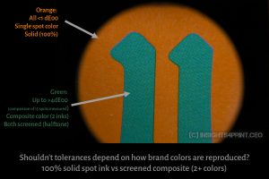
And here is something to think about: shouldn’t we have different tolerances depending on how brand colors are reproduced in print? Shouldn’t we be more tolerant when the brand color is not a spot color (so: composite color of 2+ inks), or when it’s a screened color? The more colors needed in that brand color reproduction – and that can be both process colors or a combination of different spot colors – the higher the chance for variations, ergo, the higher the dE could become. And same with applying a screening to the ink: extra variables will come into play.
I also posted this on LinkedIn. Someone from Techkon confirmed that this is the case: “Yup, that’s common practice among our brand customers. Most jobs are set up with different (tighter) tolerances for spot colors vs process, as well as the different priorities.” However, someone else said that brand colors should always, under all circumstances be within the same tolerances, independent of printing technology or substrate. But that doesn’t seem realistic to me: you can’t expect the same tolerance when printing in coldset on newspaper as when printing on a nice glossy coated paper… And don’t get me started on brown craft paper, which often contains dark spots that are already a few dE00 off. So, I would ignore that statement.
My digital stamps
Recently, I also shared another example of deviations within a sheet on LinkedIn: my personalized stamps. For a few years, I have ordered personalized stamps for my New Year’s greeting cards, which show a part of the same image that is on my personalized greeting cards.
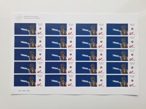
This year I ordered three sheets, more or less A4 sized. And I measured every column, every other row. The reference was the top left stamp on the first sheet. Let’s look at the differences…
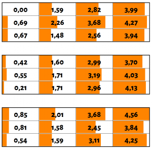
So, here we have a rather small sheet (+/- A4), digitally printed, and the deviations go up to 4,6 dE00…
Why is this important?
Some people are suggesting, demanding ever smaller deviations in print. But they seem to forget how complex printing is and how many variables there are in the materials in the process. Including how you will build your color: a solid spot color, a screened spot color, or a composite color made up of 2 or more screened colors?
And this results in a kind of Russian roulette situation when demanding tiny tolerances: depending on where you measure in the sheet, across the web, the print job might be inside or outside the specified tolerances… As long as we cannot control every variable into the tiniest detail – e.g. to prevent or cure the mottling in the packaging examples above – promoting or enforcing tiny tolerances is just not serious, and not acceptable.




Hey Eddy
Very interesting as always. In the case of SMS brand colours, printed in standard CMYK, it is possible for the designer to set up a custom SMS colourbar – right below the standard colourbar but outside the cropmarks so the printer can monitor the SMS colours independently – see description of this process here https://www.spot-nordic.com/sms/printers/
Tracking and maintaining brand colours in print is not a Russian roulette – but it is a constant challenge – a chase if you like and to do it the prepress department and the printers in the pressroom always have to be on their toes, so it is save to say that it is not a job for the faint at heart.
Fortunately these days we have more tools to monitor colour than just 20 years ago and although I hate to write this, one day most printing will be done digitally, which makes it even easier to maintain colour – through a calibration process that only takes a few minutes every morning before you begin production, – or even for every new job. In analog printing such “calibration” takes as much as a full day per papertype.
As for the greenblue colours in your sample it would be terribly interesting to know the colour difference between the two cartons you bought – and especially it would be interesting to get a copy of the master PDF to compare. Could you try to contact them and get a copy for us to look at?
But in general of course brands should use premium paper, to ensure that the borders of the paper are “closed” (in the case of sheetfed printing) and that temperature and moisture in the pressroom are correct – approx. 20°C/50% moisture.
I’m sorry Ingi, but you are missing my biggest point, and it IS Russian roulette: you are not in control of the complete sheet, of every cm² where that brand color is reproduced. What you can probably control within a certain margin, with calibration and current tools, is that control bar. But not every single cm² in the complete sheet.
As the multiple measurements and the close-up of the ‘green’ example clearly show, there is ‘natural’ variation in print production, due to many variables. Mottling caused these 4+ dE00 deviations. Can you control mottling on every individual cm² on a sheet during printing? I guess not. E.g. mottling can be caused by the roughness of the substrate, especially paper and board are not ‘smooth’ surfaces. You can not control that surface roughness during printing. That’s why it IS Russian roulette: measure different spots in the full sheet, and you will get differences, even rather large differences when printing a brand color that is a composite of 2 or more screened inks (like your SMS colors) on a paper or similar ‘rough’ substrate.
Hey Eddy
Each brand should decide what substrates are used for printing their colours. In many cases brands do leave it up to their printers to pick the paper to be used – but that is a mistake of course, since printers will simply pick the cheapest paper they can find in the category if it is left to them.
What brands can do to prevent this is that they should have their jobs prepared by people who know what they are doing and deliver the jobs in final CMYK (not Adobe RGB) – with the destination CMYK icc profile embedded.
The designer should additionally know what type of paper is appropriate for Fogra 39, Fogra 47, Fogra 51, Fogra 52 – and for American designers, – CRPC3 and CRPC6, – and they should either request a certain brand of paper to be used – or make clear to the printer that the papertype needs to be in accordance to the print standard (embedded with the PDF).
There are “rough” papers of low quality and there are rough papers of high quality. An example of a rough paper of high quality is the Arctic Papers Munken Pure and Munken Lynx, where you can even download paper specific icc profiles for each papertype to force the colour as close to Fogra 47 as possible.
It is absolutely true that in offset printing there is a slight difference in colour from top to bottom of the sheet, especially if you are printing on large sheets, and for some reason this has not yet been resolved with software (to my best knowledge at least). I am not sure if this problem is “linear” – or if it varies between press types, – which would mean that each press manufacturer should provide their users with icc profiles for their presses to correct the difference in TVI from top to bottom.
But until this is solved in software, what we can at least do is to use good quality paper to avoid mottling etc. to the extent possible.
I can’t of course comment on this one job you are studying since I don’t know what paper was used and what the quality of the printer/press/inks etc. is. Perhaps they just had a bad day but decided to take the chance and hope that the customer wouldn’t notice the problems.
I know that this would not have happened if the customer was a customer of Spot-Nordic and the colours were official SMS colours.
The best jobs are printed when the customer knows exactly what he wants and what he can ask for. This is normally not the case.
Best regards
Ingi
Ingi, again: you did NOT address the core of my article. You can NOT control every individual cm² of a print, ergo: you could get deviations inside e.g. a sheet due to variables you do not have under control. That’s why print quality control can be Russian roulette, especially with tiny tolerances.
I cannot address the problem anymore than I have since I have never had a complaint by anyone stating that they were happy with the colour in one position on the same sheet and unhappy with the same colour in another location on the same sheet, which leads me to suspect that you have to have a really bad printer having a really bad day to trigger this problem. I would however really like to get a copy of the master PDF of this job as it was delivered as well as to know what paper was used.
You yourself have advocated that even a dE of 4-5 in brand colours doesn’t change anything, so it comes like a bit of surprise to me if you are now concerned that print customers should always brace themselves to see those differences, due to paper problems.
I don’t share your concern and in fact I am convinced that in 95% or more of all cases, by using premium paper and inks and with good colour measurement hardware and software (closed loop/inline) – and prepress and press operators that know exactly what they are doing, the difference between the same colour on the same sheet should never be more than a dE00 of 1-2 in either direction, whether you are printing a CMYK colour or a Pantone spot colour.
At the same time, just like we cannot control whether all displays and monitors in the world are calibrated to display sRGB colours correctly, I cannot guaranty that all printshops do everything they can to keep their colour under control on each press. There will be good printers and there will be bad ones. However brand owners that know exactly what they want and what they can ask for, when they request a quote, can weed out the bad printers and locate the good ones – that are ready to commit to a MAX dE00 of 1, 2 or 3 in printing of the respective brand colour.
That is exactly why i am such a big fan of using MAX dE00 for brands, rather than “just leaving it to your printer”.
Brand owners should always own their brands – including managing their own colour.
Ingi: you never had a complaint about that because nobody has ever done the test that I did. But the moment someone starts doing that – since inline color quality system are being offered these days – you will encounter this. Mark my words.
On dE: as I’ve said numerous times: the applicable ISO standards have decent specifications on tolerances. That’s what both brand owners and printers should focus on. Not the silly idea that a 1 or 2 dE00 would impact sales, for which there is absolutely no scientific proof as I showed many times before…
BTW: did you look at the numbers in my article? With a 4 or 5 dE00 tolerance compared to the specified brand color, these numbers will be no problem (given the nature of dE00: the ‘right’ color is probably somewhere in the middle of the deviations). But it WILL with your 2 dE00. And certainly with a 1 dE00 tolerance.
And don’t forget the main conclusion of the study by Michael Abildgaard Pedersen, the one you recently shared on LinkedIn:
“𝗢𝗻𝗹𝘆 𝟭𝟯.𝟳 % (31) of these 226 print products had a color difference ≤ 𝟯 Δ𝗘𝟮𝟬𝟬𝟬. More than 𝟱𝟬% of the 226 print products had a color difference 𝗮𝗯𝗼𝘃𝗲 𝟲 Δ𝗘𝟮𝟬𝟬𝟬 and 𝟭𝟵% (43) had a color difference 𝗮𝗯𝗼𝘃𝗲 𝟭𝟬 Δ𝗘𝟮𝟬𝟬𝟬.”
The results of Michael’s research were dreadful in my opinion.
It is my hope that colourimetric / LAB based colour order systems like the Spot Matching System will help reduce the dE00 in all categories of printing. Knowing what LAB value a brand colour should be is the first criteria and for sure even today most printers are still printing Pantone spot colours using only an old Pantone guide to match the colours.
As long as printshops get away with this, the dE’s will remain 6-10 at an average and designers and printers will continue to agree that “this is as good as it gets”.
Ingi, again: you can NOT control every individual cm² of a print, ergo: you could get deviations inside e.g. a sheet due to variables you do not have under control. That’s why print quality control can be Russian roulette, especially with tiny tolerances. So also for users of SMS colors, when targeting a max 2 dE00 tolerance.
Sure, there will always be some dE. That is a constant.
But the key question remains whether you believe that printing a known CIELAB target v.s. printing mixed Pantone colours using a few year old Pantone Formula Guide / or say printing SMS CMYK brand colours on a carefully fingerprinted/”tweaked” press (with all the bells and whistles – proper calibration in the case of digital printing presses and closed loop /inline measurement of ink density for offset printing presses, v.s. printing CMYK on a press that is set to print only to the tolerances of ISO 12647 will not help reduce the average and MAX dE’s in printing?
The goal should of course always be to bring the dE00 down to a level where the colour difference from target to print is acceptable when comparing the two side by side, – just like I did when I was matching my colour to my Pantone Formula Guide during my printing days. What is “acceptable” again depends on the brand owner and may even depend on the job being printed.
And I did that test, to check what is acceptable: https://www.insights4print.ceo/2024/09/the-wisdom-of-the-crowd-has-spoken-the-2de00-myth-busted/
And do you know what you answered to that question on LinkedIn? I caught you ‘off guard’. I made a screenshot, in case you can’t remember…
Oreo even accepted a 10 dE00 difference, when they changed their logo. https://www.insights4print.ceo/2024/10/the-biggest-print-quality-experiment-ever/
Father forgive them for they do not know what they do 😉
You just showed perfect normal behavior: outside the print bubble, small color differences just don’t matter. Even for people involved in printing, when that ‘printing’ part of their brain is turned off.
You perfectly showed what I wanted to achieve with that small test: small color differences don’t matter. It’s product quality that matters, e.g. for FMCG products, not a 2 dE00 in brand color reproduction on the packaging.
I strongly protest being referred to as normal. But I agree, SMALL colour differences in print are acceptable (2-3 dE00 at the most) but large colour differences are not, so anything above 3 needs to be evaluated at least to see what went wrong, so the job can be at least corrected the next time. Then we have different types of jobs where the tolarences of the brand owner may be higher than normal – perhaps this beer pack for instance. I don’t know really, but I think it should be up to the brand owner/customer to decide what is an acceptable dE00 for each job. That is why god invented spectros.
As long as brand owners base their decission on how consumers act in real life. Not on unproven myths and fearmongering that a small deviation in brand color would hurt sales.
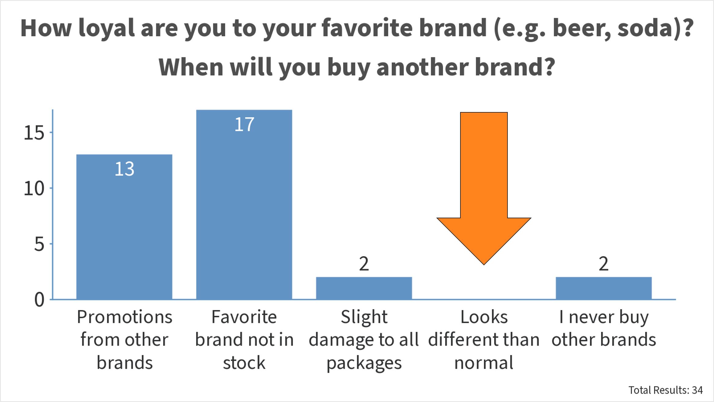
As proven before consumers are only disloyal when their favorite brand is out of stock, or due to promotions by other brands. Not when it looks different than usual (like e.g. a small deviation in brand color).
Funny story: I asked that same question last year during FOGRA Colour Management Café (!!!), with at least two people from X-Rite/PANTONE (!!!) attending. And guess what: NOBODY picked the option ‘looks different’! Not one!!! In a color related setting!!! Just because I didn’t use the word ‘color’ in the question, but a more general description ‘looking different’, they were caught off guard and showed their real attitude towards brand loyalty: looking different doesn’t matter…
The idea that you need to be within a just noticable difference (like 2 dE00) is completely unfounded. And in a real world setting, it’s even impossible to achieve: the tiniest difference in lighting (shadow, different angle), or even positioning will result in a different color. But fortunately, our brain corrects for that. It’s only spectrophotometers and camera’s that register such small deviations. Unless you specifically go looking for these differences, like in a press room. But there the samples are laid flat (it’s not a 3D world), and under a very bright light (P1: 2000 lux). Only then you will notice these tiny differences. More: https://www.insights4print.ceo/2023/01/the-real-world-isnt-flat-and-how-this-influences-color/
My point is simply that in print – especially today, we expect a certain professionalism and consistency in colour.
Just as when you take your car to be repaired after a crash and parts need to be replaced in the exterior of the car, you expect the new part to be the same colour as the original.
If you SEE a difference in colour, you would probably complain, – or at least I would.
This is not about different light or different viewing angle etc. This is about the colour your ordered looking right and measuring close to the target / reference LAB value, – if you are lucky enough to know the LAB value of your brand colour. Is that too much too ask?
There is a HUGE difference between a part of your car (value: $$$$) and a FMCG package (value: a fraction of a $). You can not use the same standards (or expectations) for both. That’s unprofessional. One is a product with a lifetime of many years, maybe a decade. Plus: it’s placed right next to the original part (with 1, max 2 mm space), perfectly aligned in the same plane. The other is thrown away right after the contents is used, and in a shop, it’s NOT aligned in the same plane, not close next to each other.
And it IS about different light, different viewing angles etc. That’s real life, and that will change color perception. Real life is not flat, it’s not like the press console. Just look at these pictures! https://www.insights4print.ceo/2023/01/the-real-world-isnt-flat-and-how-this-influences-color/
Plus – once again – you are neglecting the reality of print in real life, the topic of this post: you can NOT control every cm² of a sheet, of a roll.