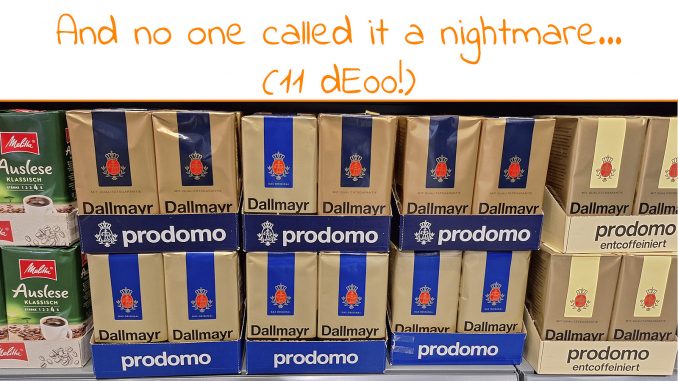
I love LinkedIn. It’s a place to keep in contact with old friends and meet new friends. It’s a place where much technological, business, and scientific information is shared. And it’s a great place to conduct small experiments. Which I do from time to time. And my latest test reveals a few important things. E.g. that not one person called a clearly visible color difference between two adjacent packages – 11 dE00! – a nightmare… Let’s dig in!
CONTENTS: That special brand | Predictive Processing | The Red Cross Test | Why is this important?
It all starts with my preference for a specific brand of German coffee, Dallmayr Prodomo. I discovered it many years ago when my then-girlfriend and I made regular stops in Germany when traveling. But there is one issue: Dallmayr Prodomo isn’t sold in Belgium, where I live. So, from time to time, I have to make a trip to Germany to buy that coffee. Which I, of course, combine with another activity, like driving home from drupa last year. Because I can really enjoy those little things in life, like the special taste of a specific brand of coffee, it’s not a burden for me to take the time to plan something that can be combined with coffee shopping.
A few weeks ago, I had planned such a trip. A small detour when doing another activity. And in the shop where I eventually bought the coffee, I noticed these different packages, or better: different versions of the package. Some have a vibrant blue, while others have a darker blue. So, I had to take a picture of these to share on LinkedIn and see how people would respond.

BTW: I bought the entire middle tray in the picture, with both vibrant and darker blue packages.
When I created a post on this on LinkedIn, I carefully picked my words. I avoided using words that had any relation to color, print, or quality. I also tried to tell a positive story: me enjoying the little things in life and going the extra mile (literally) to get these.

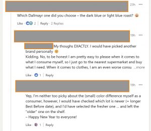
After a day, over 1500 people viewed the post. Some people liked it, some found it funny. But amazingly: only a few people commented… And the comments were, how should I state this, ‘gentle’. Only two of the initial comments mentioned color, plus one extra who replied to a comment. But not that it was a nightmare, even on the contrary: yes, there is a difference, but – and I quote literally – “To be honest I am pretty easy to please when it comes to what I consume myself (…)” This is an important quote: it’s from someone who on other occasions vigorously defends a maximum 2 dE00 tolerance for brand colors… Read that again. And let it sink in.

It’s an 11 dE00 difference between the vibrant and the dark blue, and nobody said it was unacceptable or a nightmare. Nobody went into overdrive and called the printing company incompetent. No one of the 2000+ individuals who viewed the post, with many from the printing industry and ALL of them consumers, cared to complain about that 11 dE00 difference. Think about that.

By the way, the gold is also quite different: 9 dE00.
Predictive processing
Next to the test on LinkedIn, there’s also another interesting thing to share: how my brain reacted during the shopping experience. And I don’t know if you have ever tried to actively observe what is happening in your brain, but that can be fascinating!
I obviously noted the color difference. I knew the vibrant blue was the ‘right’ color, it has always been like that (more or less). Those packages were the ones I could trust. But those darker ones, what about those? Are they the real stuff? Or not? Should I buy those or not?
To be sure I got the proper coffee, I checked the rest of the package: it had a slight redesign, but it was the right logo. It had the proper product name: Prodomo (Dallmayr has several types of coffee, and I prefer that one). Plus, the price was right, or better, similar to what I paid the previous time. With these extra checks, I decided it had to be right. Most points of recognition were correct. Added 14/01/2025: I contacted Dallmayr and they confirmed they did a redesign of that package.
And this is what many people tend to forget: the brand color is a cue, a way to recognize a product, but it’s not the only one! There are more! Like the shape of the logo, the design of the package, the written product information, and even the price (within a specific range).
In my opinion, this perfectly fits a theory called ‘predictive processing’. Our brain consumes a lot of power, especially when filtering and interpreting all kinds of sensory data. To limit the processing and therefor energy needed, my brain used a ‘mental model’ of what Dallmayr Prodomo should look like. And when I had enough cues to confirm these packages conformed to that mental model, when enough boxes were ticked, my brain stopped further processing sensory information, it just consumes too much energy…

My conclusion: if one of these elements of the mental model doesn’t fit our memory, we will resort to other factors to evaluate whether it’s the right product. And that’s where some product rebranding/redesigns have gone wrong. The Tropicana case is the best-known one, there were too many changes.
To show how that mental model, that predictive processing could work, look at the image below. You know who this is, right?

Interesting, isn’t it? You have that famous portrait of Abraham Lincoln in your mind, you have a ‘mental model’ of what it looks like. And the image above has just enough information to make you conclude it’s the Lincoln portrait. Although, when looking at it objectively, it’s just a bunch of weird black lines…
BTW, that image was generated by Akiyoshi Kitaoka, professor psychology at the Ritsumeikan University (Osaka, Japan). His X account is worth following!
The Red Cross test
A long time ago, I published a test on this website with three variations of the Red Cross logo and asked participants which was right, which was wrong, and why that one was wrong with the following possibilities: wrong color, wrong shape, or both.

The number of participants is not huge: 35, but remember that many, if not most, of the color-related studies I’ve seen had fewer participants.
Which one is the right one is a mixed result. However, except for one outlier, there is a massive agreement on which one is wrong. And also why: wrong shape. Half of the participants also think it’s the wrong color, the other half thinks it’s the right color.


Conclusion? Shape matters more than color. And that’s what I witnessed in my brain: when checking the shape of the Dallmayr Prodomo (logo, package design), that was correct.
Why is this important?
First, the wording of your questions is essential when doing a survey or test. Just because I didn’t mention the words color, quality, or print didn’t trigger the ‘print part’ of the viewers’ brains. Leaving them in a more ‘average consumer’ state. If I had asked whether this kind of color difference was acceptable or not, the discussion would have been completely different; at least some people would have called it a disgrace, a disaster. ‘Framing’ is a real danger when doing research and surveys. You have to make sure the participants have no idea what the goal of your test is, you should not steer participants in a specific direction, even when it’s unintended.
The second conclusion shows that without the print part of our brain activated, we are very tolerant towards color differences. It will not be the nightmare that some people predict. If consumers like a product, they will buy it, even if the color on the package looks a bit different. The call for a maximum 2 dE00 tolerance is not founded. I still have never seen evidence that even a 4 or 5 dE00 difference will impact sales. As I said many times before, all those studies on the importance of color, are on the right ‘color category’, not on Lab-values and tiny tolerances. It’s fear-mongering by people who are selling color-related products and services.
For the record, I do encourage people to use tools that help measure and control color to get production within a reasonable margin. These will improve efficiency and productivity. But a 2 dE00 tolerance? It’s a ‘print bubble’ myth. There is no need for that, a somewhat higher deviation will not impact sales. Just check the recent redesign of the Oreo logo. Even with a 10+ dE00 change in brand colors, there were no reports about declinging sales (contrary to the Tropicana redesign). People only care about tiny tolerances in print when it’s part of their job description to care about tiny tolerances. And only while on the job, as this test clearly showed…
PS: Conducting surveys and tests is not easy. You should be very careful with the test’s design and the wording used. A long time ago, I designed a test to check what color differences are visible to humans. In that test, executed by a student (Jens Adriaensen), 8 variations of a small product package were compared with a reference, and participants were asked if they noticed a color difference. Just out of curiosity, I decided to include an identical copy (< 0,3 dE00). Guess what: almost 1 out of 3 ‘print professionals’ claimed to see a difference between those identical copies! Why? Because they were asked if they noticed a color difference, and being a color professional, they had to see a difference. One of the participants even noticed a considerable difference… (a young guy who thought he had to prove himself as a professional). More about that test and the conclusions in this article!


For the record, Isimply assumed it was another type of coffee, since it is a completely different colour.
And for the record, this is your comment: “To be honest I am pretty easy to please when it comes to what I consume myself (…)”
Plus: the tray clearly states the name of the product (Prodomo), which I also mentioned in my post… And both light / dark blue packages are in that same tray, with the name ‘Prodomo’ clearly stated on it. And also the trays, clearly stating the product name, come in a light and dark version.