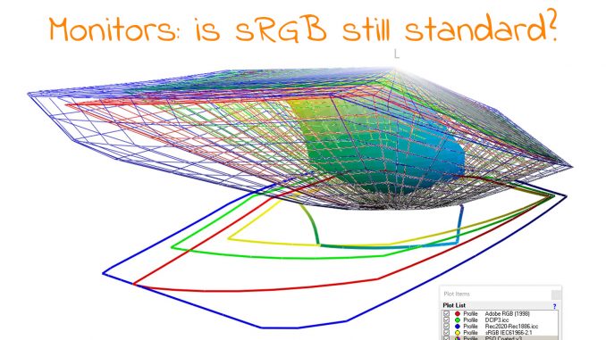
Monitors: is sRGB still standard?
Last year, I got a new monitor at work, a 4K monitor, nice! My regular job (the one that pays the bills) is not in the printing industry, so ‘color’ is not at the top […]

Last year, I got a new monitor at work, a 4K monitor, nice! My regular job (the one that pays the bills) is not in the printing industry, so ‘color’ is not at the top […]
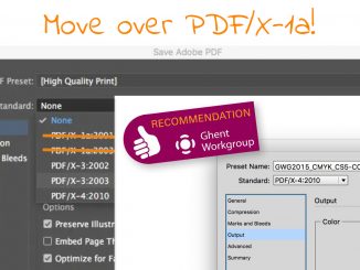
It was a surprise when I read the recent message from the GWG: ‘Stop using a 20-year-old standard’! My first reaction was: what??? The GWG promotes standards! But then I noticed the ‘20’, and it […]
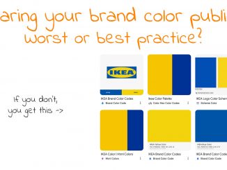
Brands are proud of their brand logo and their brand colors. They spend a lot of time and money to get that perfect logo. And a lot of time is spent on creating a brand […]
Initially, I had planned to write an article about two issues I spotted in Black Friday publicity folders I received last week. Two issues that could have easily been prevented with a little bit […]
Earlier this year, I published an article with studies showing how long consumers interact with a package while shopping. On average, the ‘Total Fixation Duration’ was less than a second. Coca-Cola cans? One-tenth of a […]
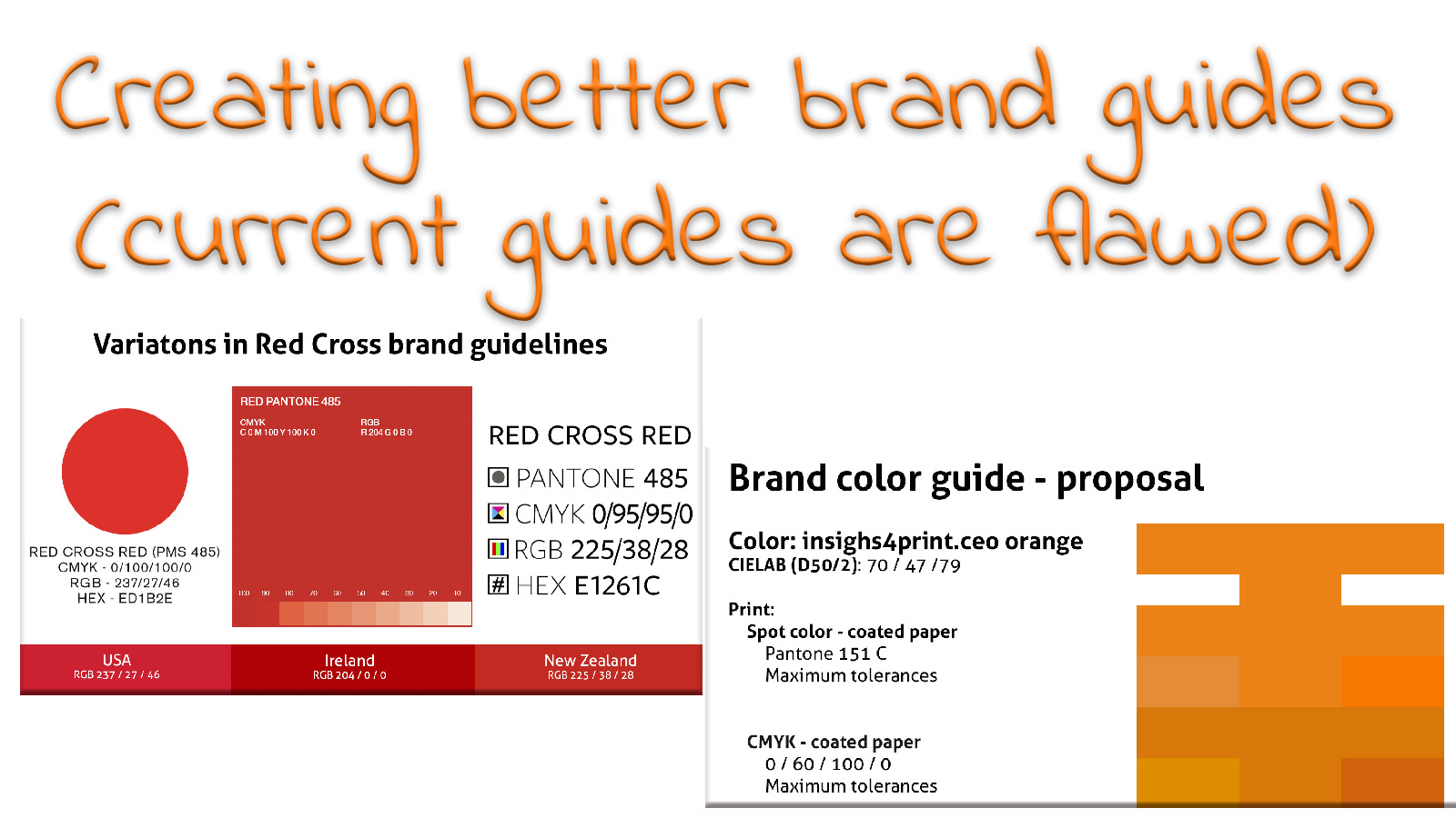
Brand color guides are flawed, ambiguous, and incomplete; studies have shown that. But what are we going to do about that? Well, here is the answer: Project BBCG, a Better Brand Color Guide. With the […]
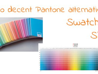
Printing in color, when looking at commercial printing, is these days highly standardized in CMYK, worldwide. And even packaging and labels are moving towards a fixed color set. However, there was a time when printing […]
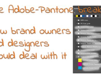
Designers, brand owners, and the like have heavily relied on the Pantone libraries in Adobe Illustrator, InDesign, and Photoshop. But the romance is over. Later this year, these libraries will no longer be included in […]
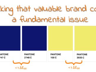
The company logo, the brand colors, it’s an important choice for every company. Global companies spend massive amounts of money on picking the ‘right’ color. However, there is a rather fundamental issue with choosing a […]
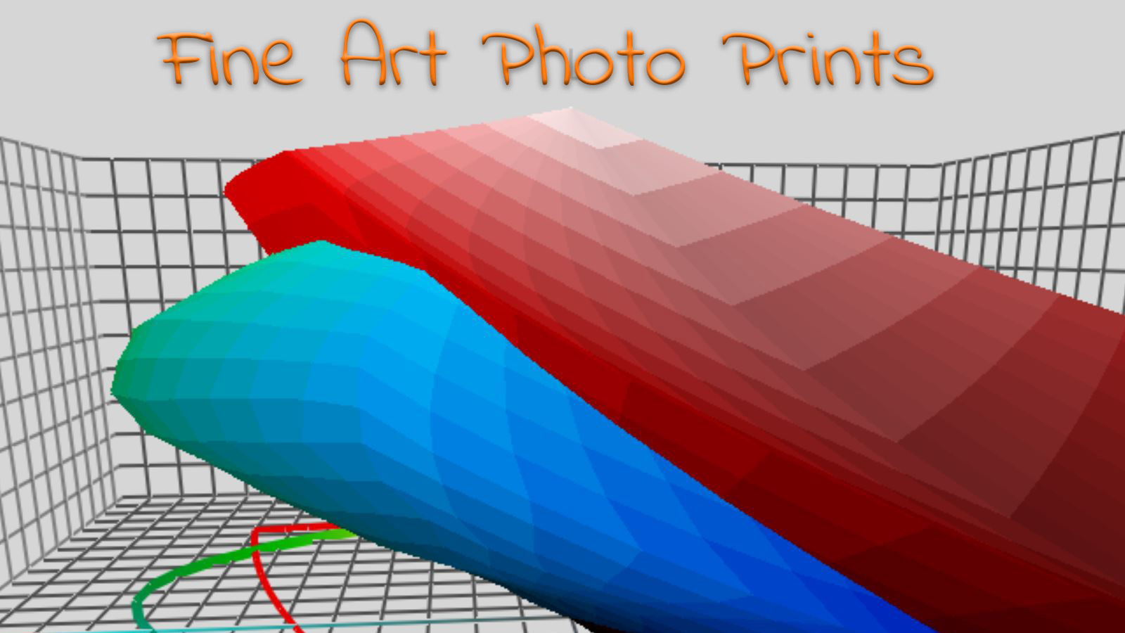
I’m disappointed, frustrated. A few weeks ago, I ordered two large format prints (100 cm wide) of images from my photobook on the lockdown in Antwerp. Both had – of course – a large number […]

In a previous post, I already covered the fact that not all black is designed equal. ‘Black’ can be composed in different ways when going to print. And this is becoming very relevant when designing […]
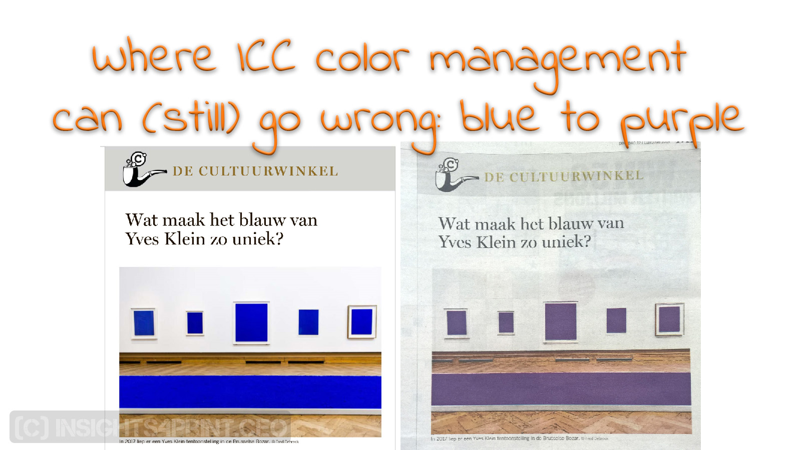
It has been an interesting week. Tuesday my newspaper had an article on the (in)famous Yves Klein Blue. But the printed color was purple… Later this week, I noticed some images with better conversions, but […]
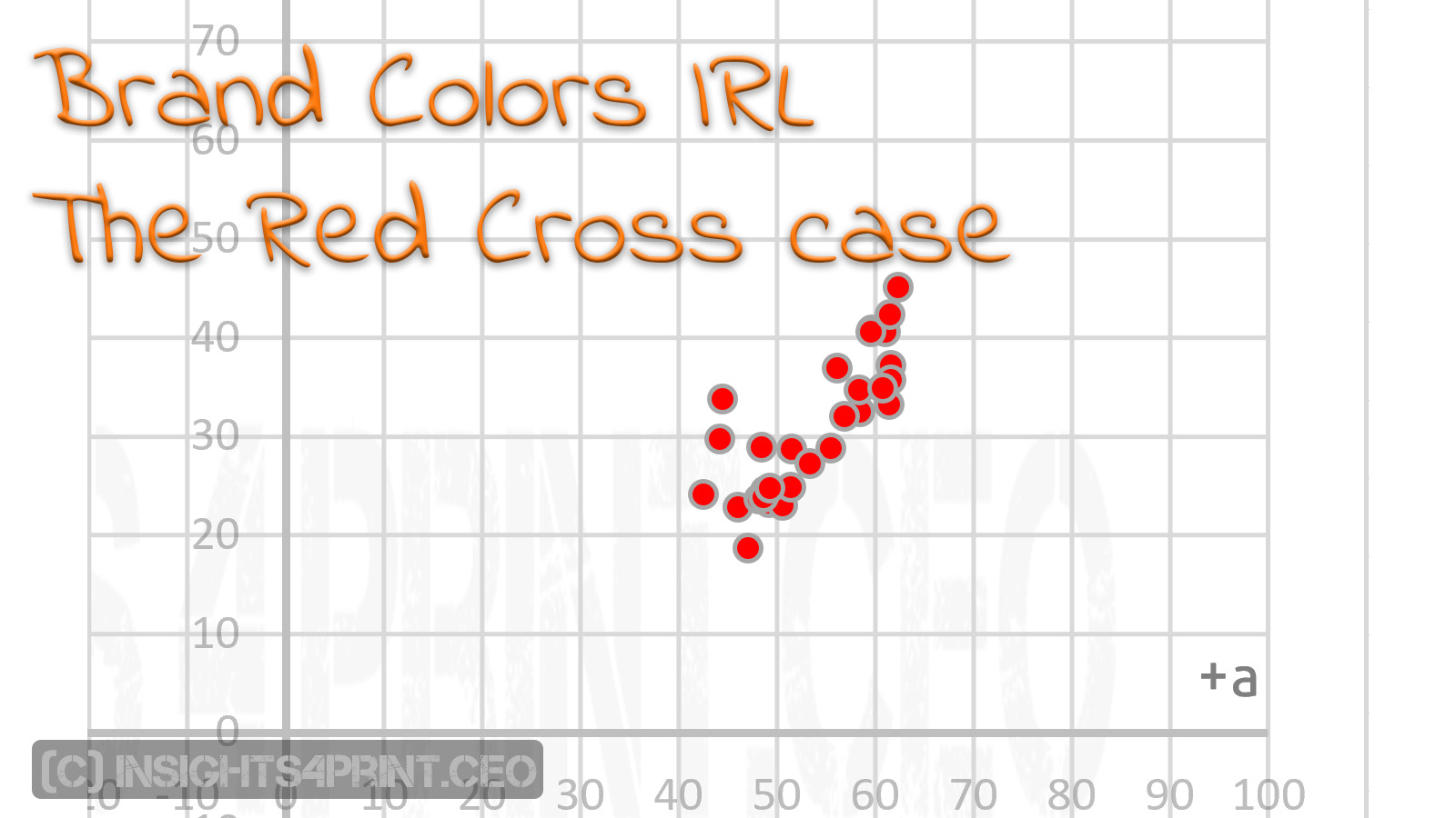
At the end of the year, I receive lots of letters. From charities to be precise. And the one that stands out – from a color perspective – is the one from the Red Cross. […]
In case you wondered: I’m not the only one with a special interest for brand colors in real life. Recently I came across two research papers by Michael Abildgaard Pedersen from the Danish School of […]
In my previous article, I discussed the tolerances that the tools used in print quality control have. At least: in theory. To check this in practice, I launched a survey: ‘Your color guide and You’. […]
(c) insights4print.ceo - 2016-2025