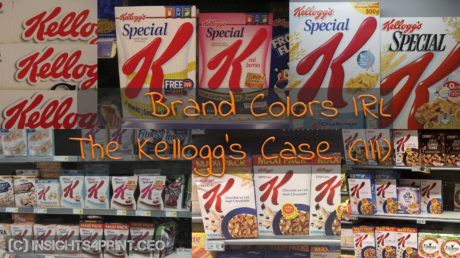
Brand colors IRL: The Kellogg’s Case (III)
Kellogg’s red has had my attention for almost two decades. I have used examples of Special K boxes in seminars for a very long time. But I have also made pictures during that period and […]

Kellogg’s red has had my attention for almost two decades. I have used examples of Special K boxes in seminars for a very long time. But I have also made pictures during that period and […]

Where does innovation start? You can find all kinds of complicate theories on that, but it is simple: innovation starts with observation. […]
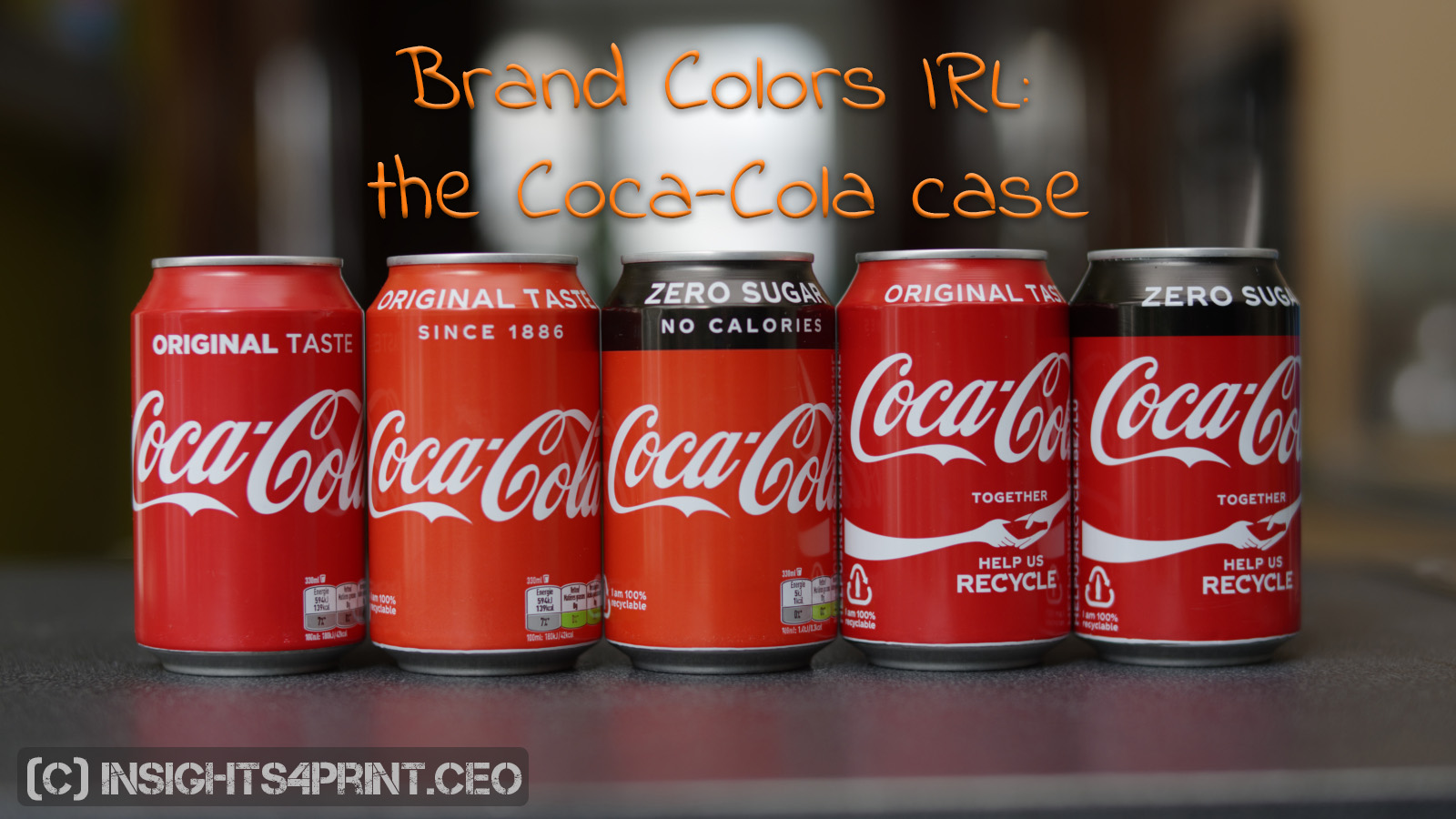
After having seen how my color memory messed up with a package of Kellogg’s, I thought that it happened again when the cans of Coca-Cola seemed much lighter and a bit more yellowish than usual. […]
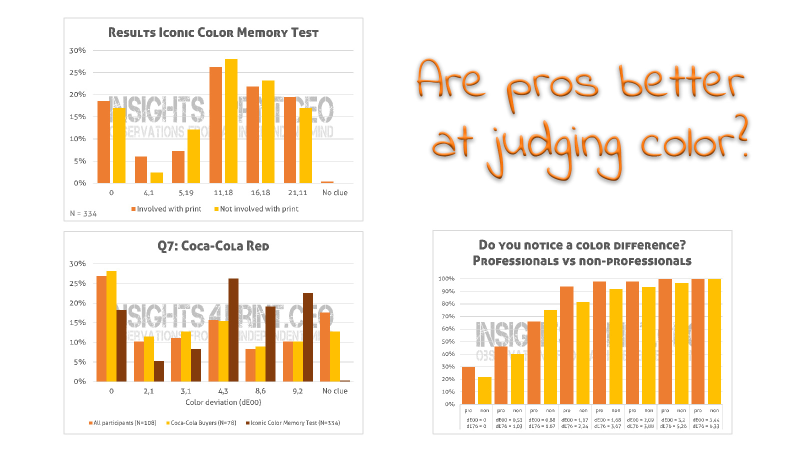
Are professionals better at judging color? Your immediate response will probably be: “Of course, they’re professionals!” It would seem no more than logical. But based on some tests, the answer might not be that straight […]
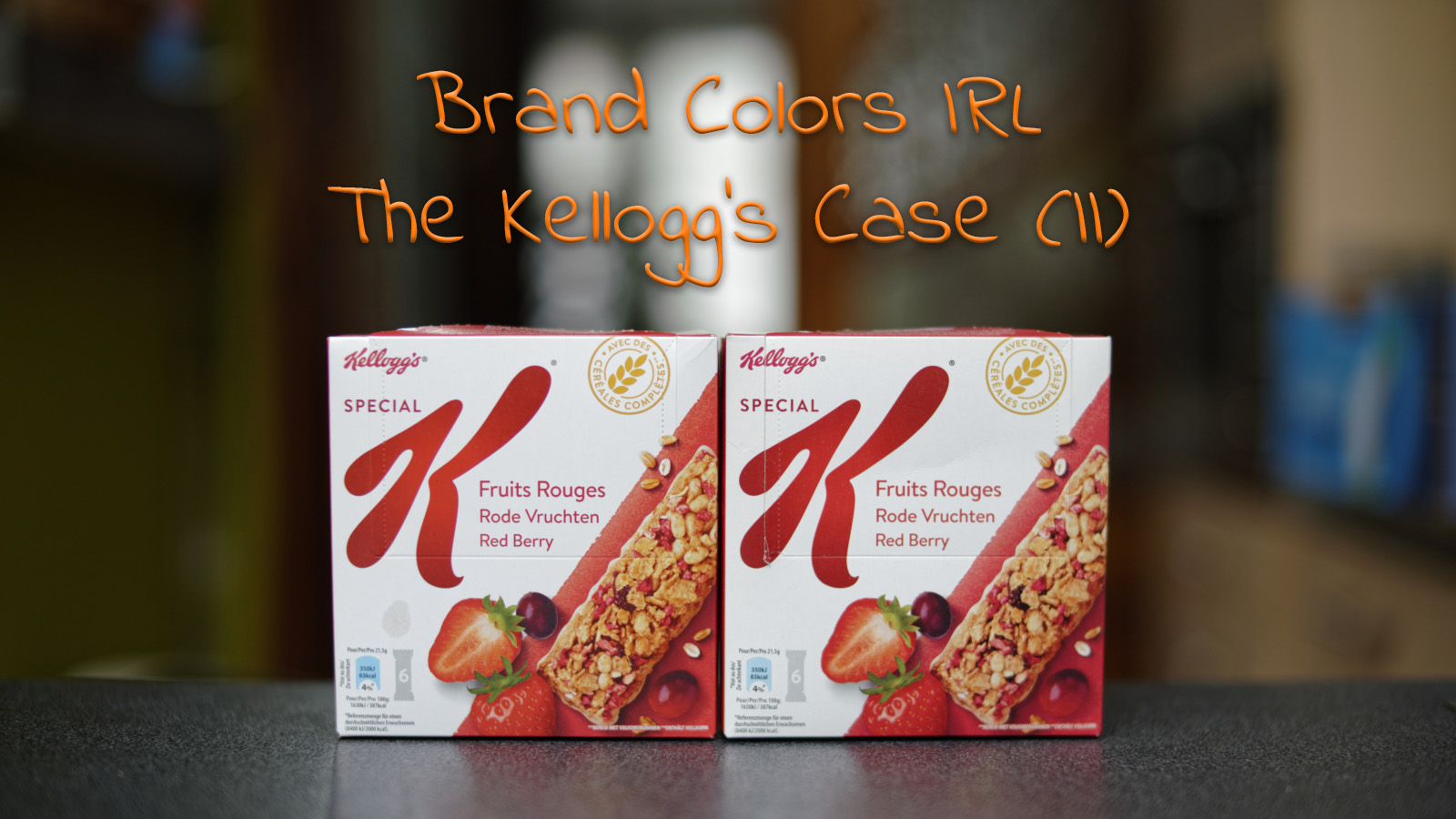
When I went shopping some time ago, I noticed that a box of Kellogg’s Special K Fruits looked very different to me. The red in the logo looked much lighter than usual. So – contrary […]
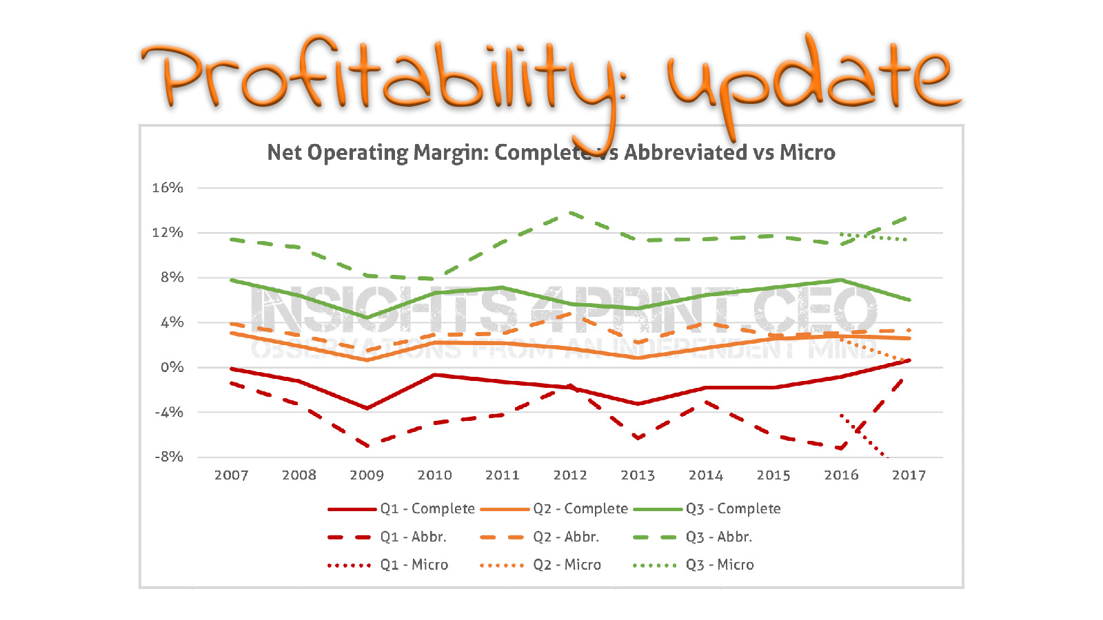
These are my favorite statistics: the financial ratios derived from the annual accounts that companies are required to file. The most recent figures were published earlier this week, time for an update. And this time, […]
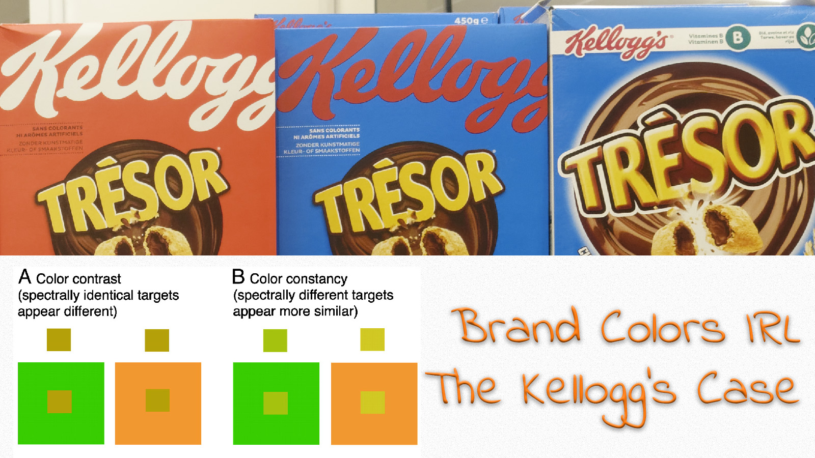
Kellogg’s is launching new packaging for several of its products. Well, at least in my country. With both old and new types of packaging next to each other on the shelves, it’s an interesting topic […]
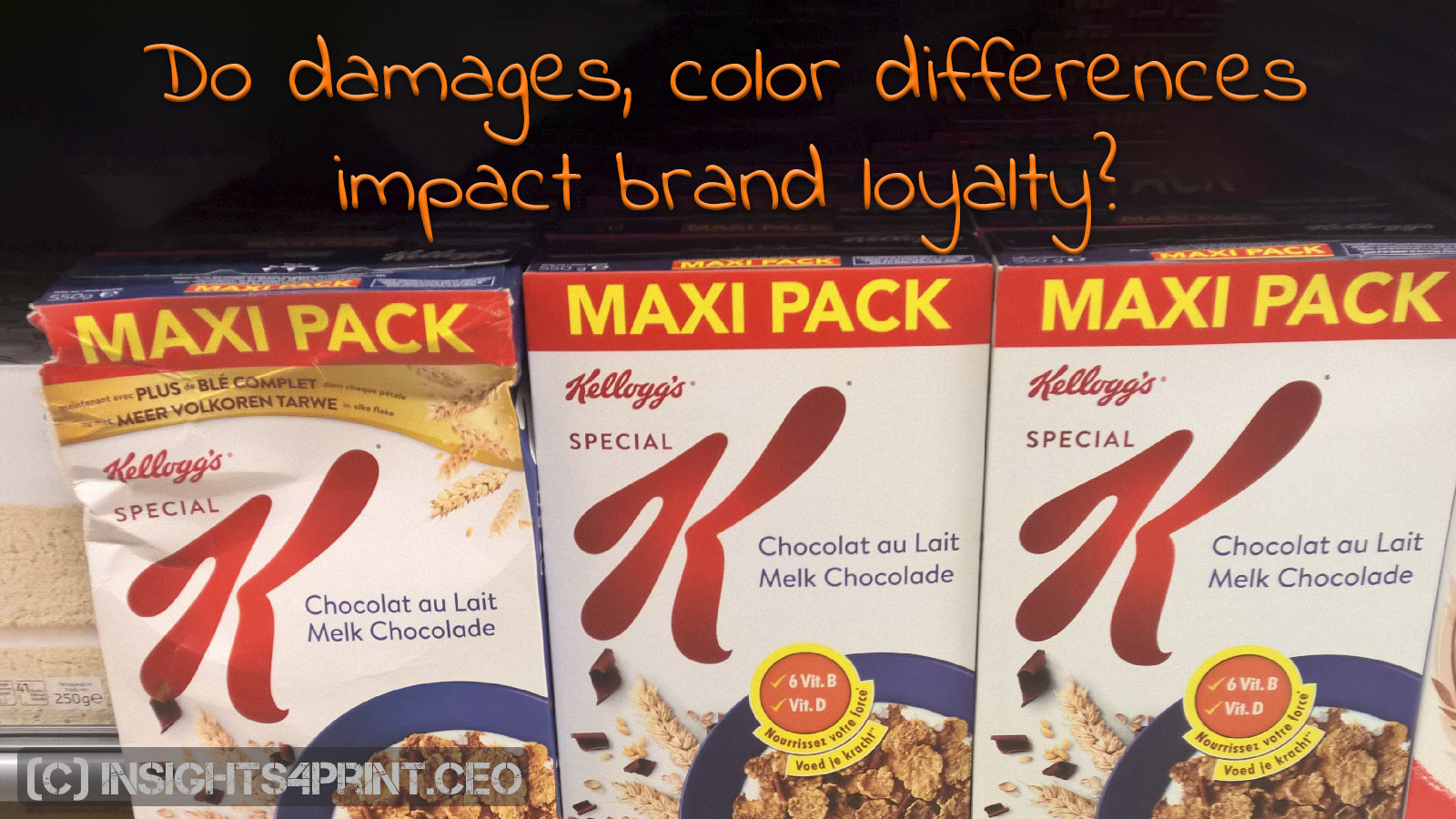
The package of a product is important: it not only ships and protects products, it also conveys the identity of a brand. Brands are very proud of their unique brand image, they demand no less […]
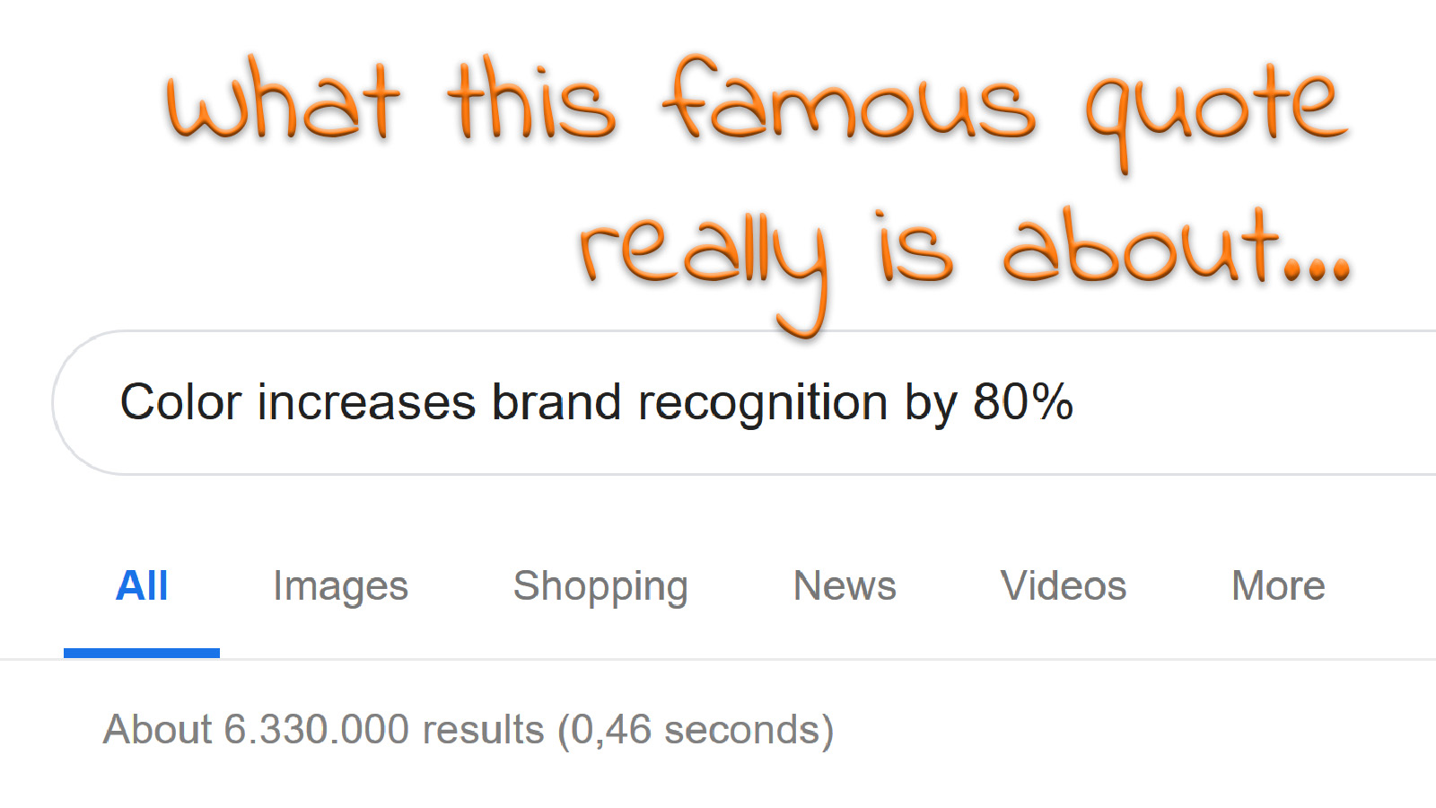
“Color increases brand recognition by 80%”, it’s a quote that is often used in the printing industry, e.g. to demand super tight tolerances in print production. I went on a search to find the original […]
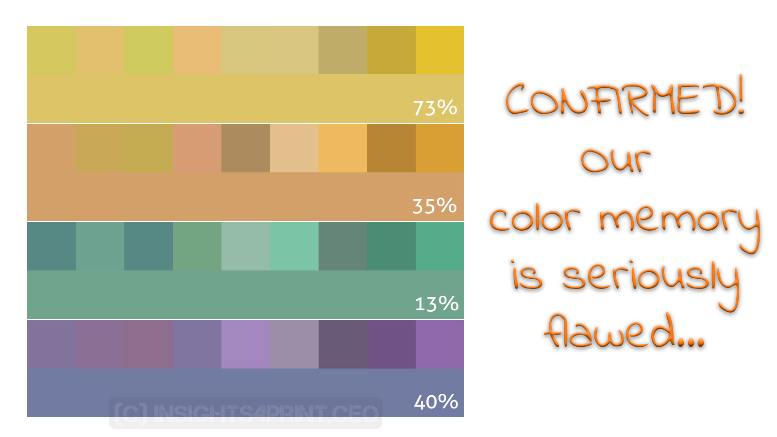
Color is important, that’s something everyone in the printing industry agrees on. But how good are we, as human beings, when dealing with color? In this article, I will discuss two studies. The first concluded […]
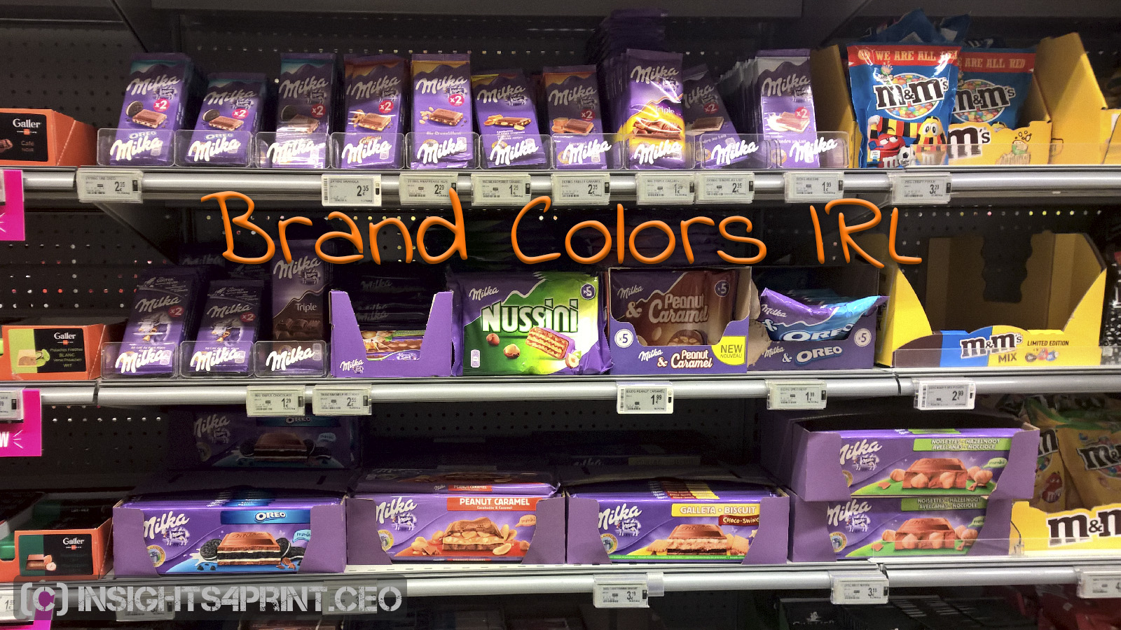
The publication of the groundbreaking color study did generate some attention. Especially my plea for a more realistic, less fanatic approach to color tolerances in real life seemed provocative to some. I e.g. got a […]
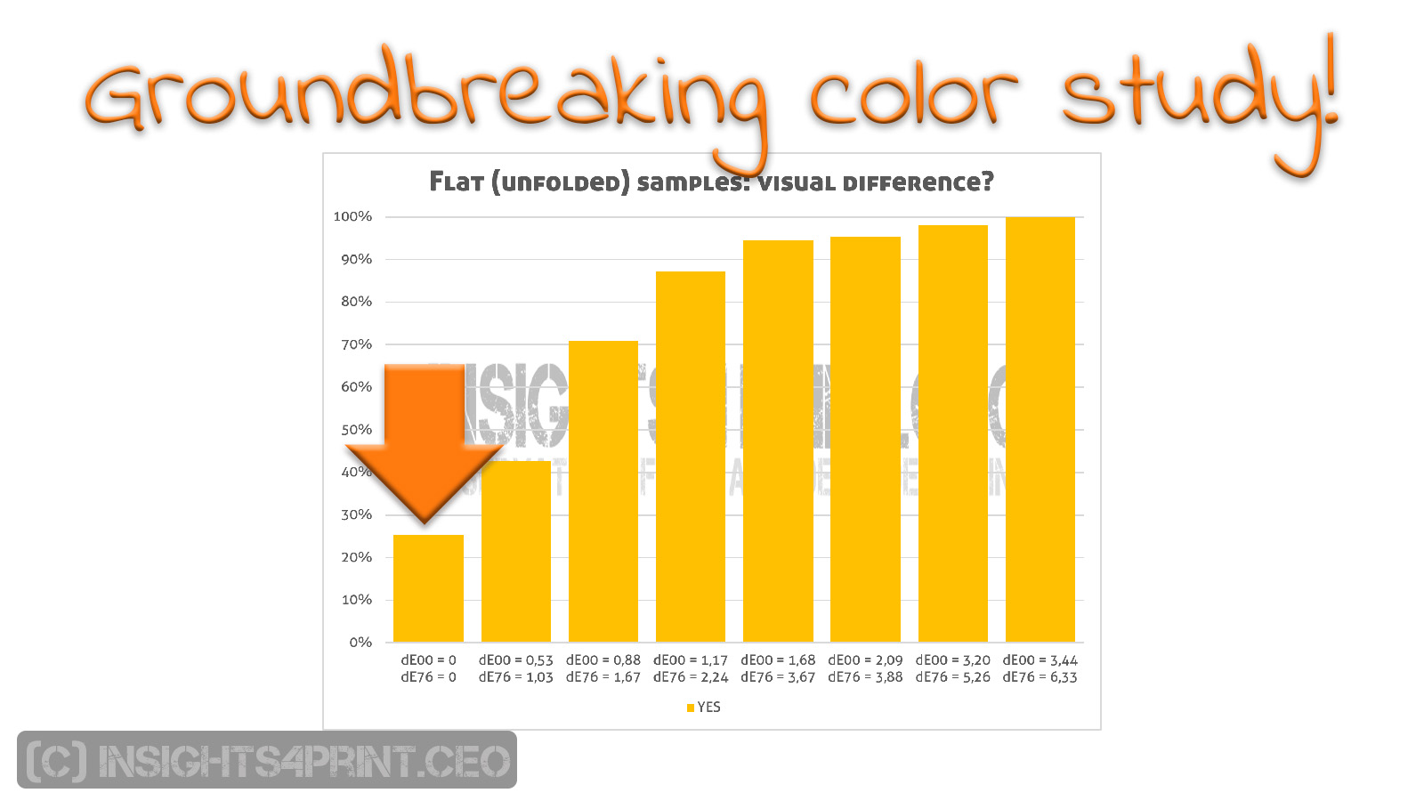
You can find them in attics and basements: unknown treasures. At the campus of the AP university college in Antwerp, there is such a treasure. A groundbreaking study on the perception of color deviations. The […]
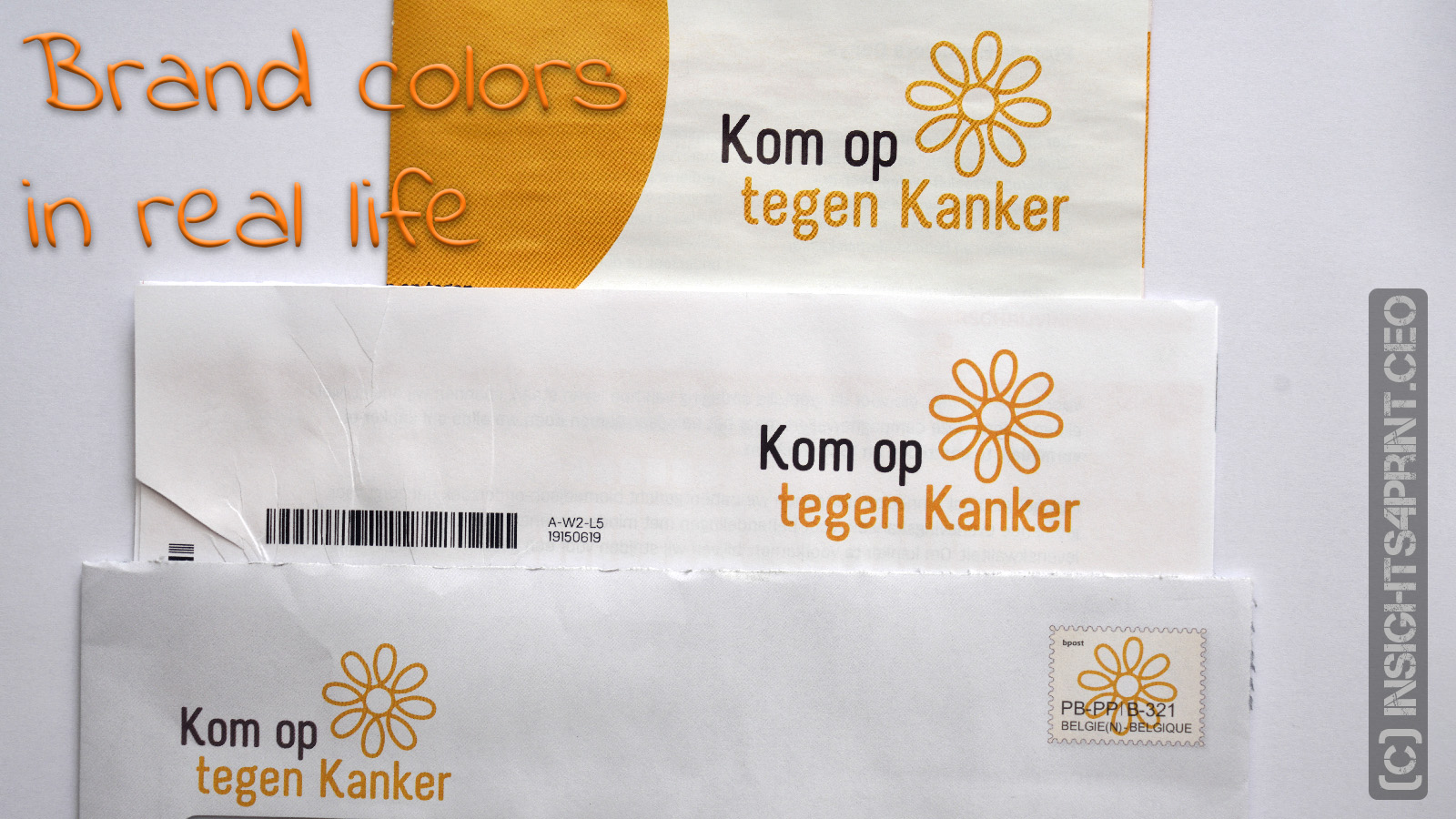
Right after I had published the article about real-life factors influencing color appearance in packaging, I opened my mailbox and found another very nice example. This one with a number of factors influencing color appearance […]

Checking your (physical) mailbox and collecting, opening the mail pieces is packed with emotions, positive emotions. A recent study in France proves this, with the help of new technologies. And this emotion-packed experience is something […]

Blockchain, it’s probably going to be the most used buzzword in boardrooms this year. According to Gartner’s Hype Cycle, it has just passed the ‘peak of inflated expectations’. And that’s what we see: everyone is […]
(c) insights4print.ceo - 2016-2025